High-Contrast Display Serif

Blackstone Sans + The Lumina Awesome
Pairs sculptural editorial warmth with Blackstone Sans's clean modern geometry.
Inspect The Lumina Awesome specimenDisclosure: MakerFileHub may earn a commission from qualifying purchases via paid links on this page. How our links work.
Substantial plain capitals with round O and blunt diagonal K and R legs
Blackstone Sans shows black uppercase words over a pale architectural cover, where substantial nearly even strokes form rounded B and O bowls, flat arms and blunt diagonal legs on the K and R, and the two title lines keep a straightforward block rhythm without swashes or outlines.
Paid link
Get this fontProject & layout blueprintsAt-a-glance maker compatibility
Sturdy stroke walls and open counters weed cleanly on adhesive vinyl, HTV apparel film, and cut cardstock.
Visual anatomy & craft review
The strokes stay substantial and even, the bowls round, the arms flatten and the diagonal legs end blunt. That plainness is the character: the face reads as an architectural caption rather than a display face, which is why the sample sets two block rows on a pale ground. The application icons and promotional labels are cover information, so test your own headings, keep 18 pt as the floor and check the blunt legs in small sizes. The blunt legs are the detail that weakens: below 18 pt the K and the R lose their footing and read as an H or a P, so keep the floor at 18 pt and check them at 1:1.
Substantial plain capitals with round O and blunt diagonal K and R legs
Two-font hierarchy recipes
Tested contrast partners — pairing Blackstone Sans with grounded secondary typography.
Blackstone Sans + The Lumina Awesome
Pairs sculptural editorial warmth with Blackstone Sans's clean modern geometry.
Inspect The Lumina Awesome specimen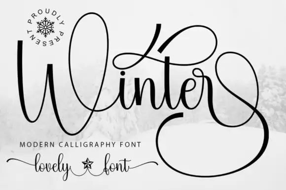
Blackstone Sans + Winter
Introduces organic movement on pull-quotes, signatures and gift tags.
Inspect Winter specimenPractical applications
Concrete hierarchy, scale and production guidance tailored to Blackstone Sans’s stroke geometry.
The plain caps give a studio an even mark, and the round O holds a two-word name at 26 pt on a plate, where the blunt legs stay crisp when etched.
Hierarchy & layout recipe
Etch a 300 by 100 mm plate: set the name at 26 pt on one row, keep 14 mm of clear ground beneath before the street at 8 pt, and keep 16 mm of margin for the corner fixings.
Pre-production check
Etching softens blunt leg ends; check the artwork at final size before the plate is cut, keeping 0.5 mm minimum.
The plain caps suit a running head, and the even weight stays readable at 9 pt across a page, where the rounded bowls hold their shape at small sizes.
Hierarchy & layout recipe
Print a 210 mm page: set the running head at 9 pt on one line, keep 6 mm of clear ground above the first column, and keep the head in a single colour so it recedes behind the body.
Pre-production check
Below 8 pt the round bowls close; check the printed page and hold the head at 9 pt or above.
The block caps read on a door, and the flat arms hold an office name at 36 pt on a printed plate, where the blunt diagonals stay clear from the corridor.
Hierarchy & layout recipe
Print a 300 by 120 mm plate: set the office name at 36 pt on one row, keep 14 mm of clear ground beneath before the hours at 11 pt, and keep 16 mm of margin for the fixings.
Pre-production check
Promotional labels are not part of the letters; check your file before promising extras on the plate.
Technical & licence verification
Confirm included OTF/TTF/WOFF formats, full glyph tables and licence coverage on the live store page before batch production.
Closest visual alternatives
Matched across letterform anatomy, stroke behaviour and craft applications.
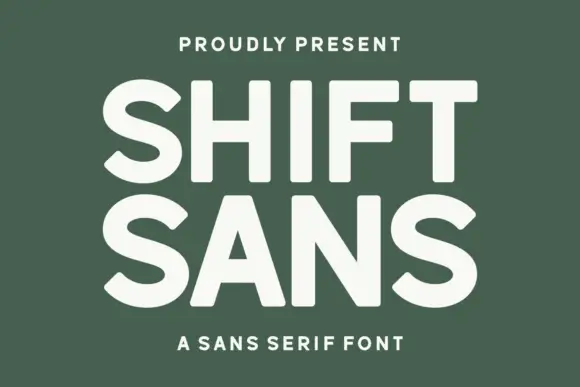
Bold high-x-height grotesque
Shift Sans is a bold grotesque in cream on green: very tall x-height, short ascenders, flat terminals and slightly narrow counters, with two stacked lines filling the plate and a tracked caption above and below, so the pair reads as a contemporary poster headline.
Ideas for this font
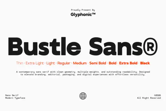
Dense rounded mixed case with open e bowls and a compact high t shoulder
Bustle shows black mixed-case lettering on white in a heavy treatment, where broad nearly even strokes surround compact bowls, the e opens horizontally, the u stays rounded and the t carries a compact shoulder high above the baseline.
Ideas for this font
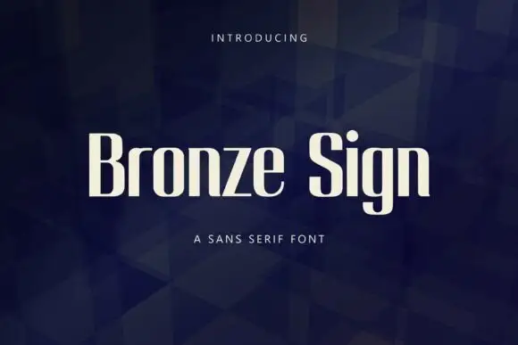
Narrow upright sans letters with softened rectangular bowls
Bronze Sign is a condensed sans display face: tall narrow caps and lowercase with a closed aperture, tight spacing and a flat, even stroke that reads like a sign painter's block letter.
Ideas for this font

Open rounded mixed case with a tall t and broad circular bowls
Cultivo shows a large black title-case name across the lower part of a pale beige cover, where light to moderate nearly even strokes form an open C, a broad u and near-circular bowls, the t finishes with a rounded lower turn and the v opens a clean diagonal.
Ideas for this font
Same independent foundry
Allow optional Google Analytics to measure visits and catalogue actions. Your search words and notes are not included. Privacy & storage