Modern Grotesque Body

Halfgrunge Typewriter + One More
Creates crisp high-hierarchy contrast beneath Halfgrunge Typewriter headlines across menus, websites and labels.
Inspect One More specimenDisclosure: MakerFileHub may earn a commission from qualifying purchases via paid links on this page. How our links work.
Rough-stamped grunge display typewriter slab
Halfgrunge Typewriter is a wide, muscular uppercase typewriter display font roughened with pitted metal-stamp texture and irregular edges.
Paid link
Get this fontProject & layout blueprintsAt-a-glance maker compatibility
Fine grain and micro-texture excel in 300 DPI print, sublimation, and screen print rather than small vinyl weeding.
Visual anatomy & craft review
Halfgrunge Typewriter is a rough-stamped display typewriter slab in which each letter carries ink squash at the edges, an uneven baseline and small voids where the type hit the paper badly. The stamping marks are drawn rather than applied, so a one-colour print keeps them, and the uneven baseline means a word box grows vertically. It needs roughly 24 mm for the ink squash and the voids to read, and it is best in one dense black on an uncoated text sheet, or a single weary blue on newsprint.
Gritty · Press-stamped · Vintage
Two-font hierarchy recipes
Tested contrast partners — pairing Halfgrunge Typewriter with grounded secondary typography.
Halfgrunge Typewriter + One More
Creates crisp high-hierarchy contrast beneath Halfgrunge Typewriter headlines across menus, websites and labels.
Inspect One More specimen
Halfgrunge Typewriter + Easy Handwriting
Adds a warm human signature touch for 1-to-3-word callouts without competing against structured serif capitals.
Inspect Easy Handwriting specimenPractical applications
Concrete hierarchy, scale and production guidance tailored to Halfgrunge Typewriter’s stroke geometry.
A rough-stamped typewriter reads as a typed label rather than a designed logo, which is what a small press wants on its card back. The ink squash holds at 18 mm, and one black pass prints the card and the stamp on cheap stock with no registration risk.
Hierarchy & layout recipe
Card back 85 x 55 mm, word 18 mm, details 7/9 pt, 5 mm margins. Stamp 60 x 30 mm, word 10 mm, 3 mm margins. Envelope 160 x 110 mm, word 12 mm, 10 mm margins.
Pre-production check
On a small stamp the uneven baseline lifts some letters half a millimetre and the address reads as misaligned printing. Keep the face to 14 mm and above on stamps, and check one impressed stamp before the run.
A typed look gives an essay a working-note voice rather than an editorial one, which suits a piece about writing or archives. The voids and the squash read at 24 pt in a header, and the face pairs honestly with a text serif body underneath.
Hierarchy & layout recipe
Header 24 pt with 6 mm squash clearance, body 9/13 pt in two columns of 82 mm, 18 mm margins and a 10 mm head. Byline strap 10 pt with 4 mm above. Caption note 8/11 pt in the outer margin.
Pre-production check
At 8 pt the caption note fills its voids and reads as a fuzzy grey line beside a crisp body serif. Keep the face to headers of 20 pt and above, set captions in the body face, and proof one page at 1:1.
A stamped typewriter reads as a label typed at the press rather than a designed brand, which is what a small cider maker wants on its crates. The squash holds at 30 mm on a card, and one ink prints the labels, the crate cards and the poster on the same kraft stock.
Hierarchy & layout recipe
Bottle label 70 x 50 mm, word 16 mm, 4 mm margins. Crate card 120 x 80 mm, word 26 mm, 8 mm margins. Poster A3, word 90 mm, details 26 mm, 18 mm margins.
Pre-production check
A 70 x 50 mm bottle label at 16 mm wicks the ink into wet-strength paper and the voids close, so the label prints as a solid smear. Use a coated label stock or raise the word to 22 mm, and check one label on the bottle.
Technical & licence verification
Confirm included OTF/TTF/WOFF formats, full glyph tables and licence coverage on the live store page before batch production.
Closest visual alternatives
Matched across letterform anatomy, stroke behaviour and craft applications.
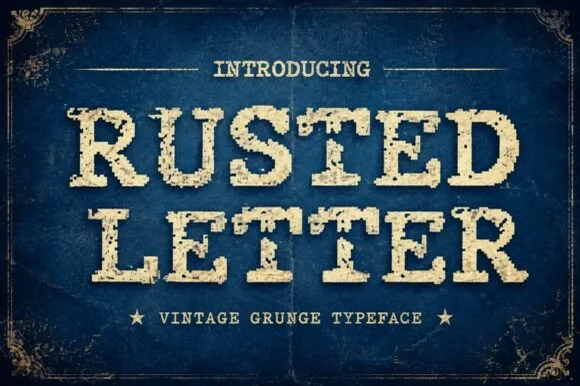
Vintage grunge slab caps
Rusted Letter is a vintage grunge slab in cream on navy: heavy bracketed serifs, wide caps, and a corroded texture that eats into the edges and speckles the interiors, framed with hairline ornaments and two stars, so the pair reads as a stamped shipping crate rather than a modern slab.
Ideas for this font
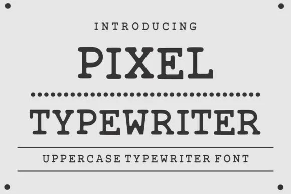
Classic ink-stamped vintage mechanical typewriter slab serif
Pixel Typewriter is actually a classic vintage mechanical typewriter slab serif (not a blocky 8-bit pixel font) with warm ink-ribbon edges!
Ideas for this font
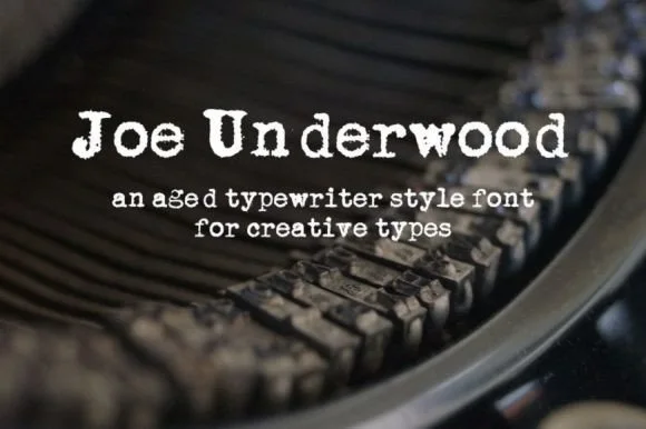
Heavy ribbon-inked Underwood typewriter slab
Joe Underwood is a bold, ink-rich vintage typewriter font modeled on classic mechanical typebars striking fresh cloth ribbon.
Ideas for this font
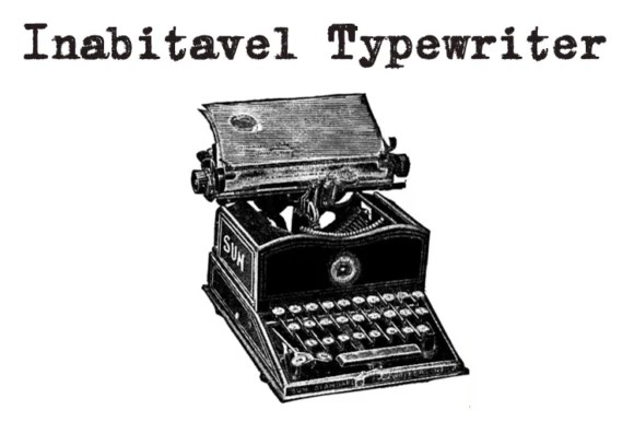
Authentic carbon-ribbon 1910 mechanical typewriter serif
Inabitavek Typewriter ('Inabitavel Typewriter') is an authentic antique mechanical-ribbon font capturing true 1910s cloth-ink strike bleed.
Ideas for this font
Same independent foundry
Allow optional Google Analytics to measure visits and catalogue actions. Your search words and notes are not included. Privacy & storage