Modern Grotesque Body

Outlaw Saga + Miniplate
Creates crisp high-hierarchy contrast beneath Outlaw Saga headlines across menus, websites and labels.
Inspect Miniplate specimenDisclosure: MakerFileHub may earn a commission from qualifying purchases via paid links on this page. How our links work.
Wide geometric western slab
Outlaw Saga is a wide geometric western slab in blue on a pale desert scene: square letters with heavy horizontal arms, deep rectangular counters and stepped serifs that flare at the ends, set on two lines with two small boxed lines beneath.
Paid link
Get this fontProject & layout blueprintsAt-a-glance maker compatibility
Sturdy stroke walls and open counters weed cleanly on adhesive vinyl, HTV apparel film, and cut cardstock.
Visual anatomy & craft review
The two words are stacked and the drawing is a wide slab at the geometric end: the arms are heavy, the counters are rectangles, and the serifs step outward at the corners, which gives the face the look of a cut sign rather than a printed letterpress. Because the letters are wide, the plate sets short words on two lines, and the blue on a pale ground keeps the shapes crisp against the washed-out desert behind. The two boxed lines beneath name the style and the studio, and the boxes are period furniture that suits the frontier subject. Because the counters are square and large, the face reads at distance and on a stencil, which is where the cut-sign reference pays off, and the flat colour keeps the plate honest about that use.
Slab, western, geometric, bold
Two-font hierarchy recipes
Tested contrast partners — pairing Outlaw Saga with grounded secondary typography.
Outlaw Saga + Miniplate
Creates crisp high-hierarchy contrast beneath Outlaw Saga headlines across menus, websites and labels.
Inspect Miniplate specimen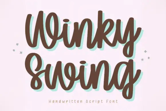
Outlaw Saga + Winky Swing
Adds a warm human signature touch for 1-to-3-word callouts without competing against structured serif capitals.
Inspect Winky Swing specimenPractical applications
Concrete hierarchy, scale and production guidance tailored to Outlaw Saga’s stroke geometry.
A wide western slab reads as a cut sign, and the square counters stay open on a fascia where a narrow slab would fill in at distance.
Hierarchy & layout recipe
Paint a 1,200 by 400 mm fascia: the joint at 130 mm cap height, the hours in a 24 mm slab, and a 5 mm rule. Keep 28 mm margins and paint two colours on a light board.
Pre-production check
Check the fascia at six metres, where the stepped serifs can read as damage; keep the steps even. Confirm the 24 mm hours read at three metres and that the rule clears the fixings.
A western slab sets a fair poster as a period bill, and the wide letters fill the width with one line instead of stacking three rows.
Hierarchy & layout recipe
A2 poster: the fair at 100 mm cap height, the dates in a 26 mm slab, and the venue at 11 mm. Keep 28 mm margins and print two colours on a warm stock.
Pre-production check
Check the poster at five metres, where the square counters can look empty; keep the spacing tight. Confirm the 11 mm venue reads at three metres and that the lines clear the trim.
A geometric western slab gives a themed celebration an authentic board, and the square shapes cut cleanly in vinyl for a quick sign.
Hierarchy & layout recipe
Cut a 900 by 350 mm vinyl: the greeting at 100 mm cap height, the names at 45 mm, and the date at 20 mm. Keep 30 mm margins and apply to a stained board.
Pre-production check
Check the cut at 900 mm, where a stepped serif can tear on weeding; keep the step above 4 mm. Confirm the 20 mm date reads from the door and that the letters sit level.
Technical & licence verification
Confirm included OTF/TTF/WOFF formats, full glyph tables and licence coverage on the live store page before batch production.
Closest visual alternatives
Matched across letterform anatomy, stroke behaviour and craft applications.
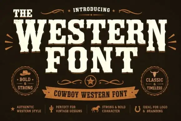
Heavy western capitals with pinched sides
The Western is a heavy western display in cream on dark brown: tall capitals with pinched waists, wedge serifs and a rough printed edge, laid out with a ribbon banner and two round badges.
Ideas for this font
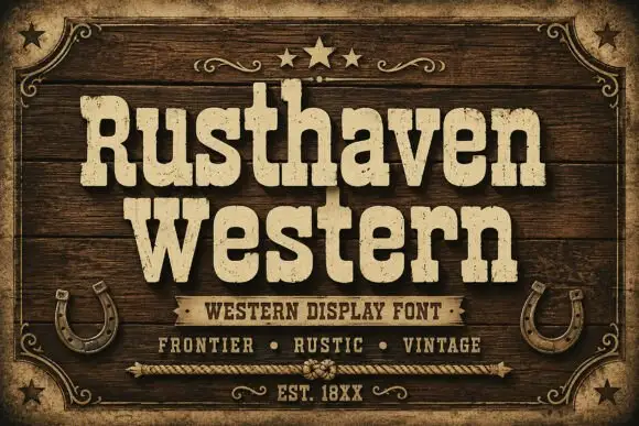
Weathered western slab display
Rusthaven Western is a weathered western slab in cream on dark timber: heavy slabs with softened corners, a chipped edge and a speckled fill, set in two lines with a ribbon banner, stars and horseshoes, so the pair reads as a brand burned into a barn door.
Ideas for this font
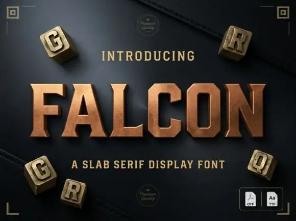
Slab serif display with bevelled cuts and sharp square serifs
Falcon is a slab serif display in which the stems stay broad, the serifs turn square and the corners carry a bevel, so a single word reads as a cast metal plaque rather than as a headline.
Ideas for this font
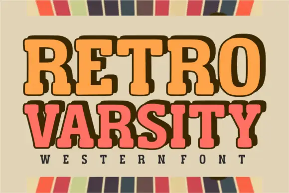
Retro western varsity slab
Retro Varsity is a western-flavoured varsity slab in orange and coral on a sage ground: heavy rounded slabs with deep shoulders, a slight bounce and an extrusion on one line, flanked by a striped border top and bottom with a tracked line naming the category beneath.
Ideas for this font
Same independent foundry
Allow optional Google Analytics to measure visits and catalogue actions. Your search words and notes are not included. Privacy & storage