Modern Grotesque Body

Rusthaven Western + Furion
Creates crisp high-hierarchy contrast beneath Rusthaven Western headlines across menus, websites and labels.
Inspect Furion specimenDisclosure: MakerFileHub may earn a commission from qualifying purchases via paid links on this page. How our links work.
Weathered western slab display
Rusthaven Western is a weathered western slab in cream on dark timber: heavy slabs with softened corners, a chipped edge and a speckled fill, set in two lines with a ribbon banner, stars and horseshoes, so the pair reads as a brand burned into a barn door.
Paid link
Get this fontProject & layout blueprintsAt-a-glance maker compatibility
Fine grain and micro-texture excel in 300 DPI print, sublimation, and screen print rather than small vinyl weeding.
Visual anatomy & craft review
The two words are stacked and the drawing is a western slab softened by wear: the serifs are heavy, the stems are wide, and the edges are eaten away so the letters look routed rather than printed. The counters stay open despite the damage, which is what keeps the pair readable at a distance, and the spacing is generous so both words read as separate plates. The composition is a full period set: a ribbon banner with a tracked subtitle, three stars above, a rope rule, horseshoes in the lower corners and a small est. line at the foot, all in the same two tones on a dark wood ground. That framing is what turns a display face into a finished sign.
Western, weathered, slab, rustic
Two-font hierarchy recipes
Tested contrast partners — pairing Rusthaven Western with grounded secondary typography.
Rusthaven Western + Furion
Creates crisp high-hierarchy contrast beneath Rusthaven Western headlines across menus, websites and labels.
Inspect Furion specimen
Rusthaven Western + Abigail
Adds a warm human signature touch for 1-to-3-word callouts without competing against structured serif capitals.
Inspect Abigail specimenPractical applications
Concrete hierarchy, scale and production guidance tailored to Rusthaven Western’s stroke geometry.
A weathered western slab reads as a routed timber sign, and the damage built into the face means a routed board looks intentional rather than roughly finished.
Hierarchy & layout recipe
Route a 1,200 by 500 mm board: the name at 160 mm cap height, a 6 mm outline cut, the strapline in a 28 mm slab. Keep 40 mm margins so the chips stay inside the board and paint two colours on bare timber.
Pre-production check
Check the routed cut at 160 mm, where a chip under 5 mm can break out of the grain; widen the smallest details. Confirm the 28 mm strapline reads at four metres and that the board survives a season outdoors under cover.
A weathered slab sets a rustic venue without a costume, and the generous spacing lets two long names sit on one line above the details.
Hierarchy & layout recipe
A5 invitation: the names at 26 pt, the venue in a 9.5 pt roman, and the date at 8 pt caps. Keep 20 mm margins, print one ink on a kraft card, and keep the slab to the names so the details stay legible.
Pre-production check
Check the 26 pt names on kraft, where the chipped edges can merge with the paper texture; keep the ink dark. Confirm the 9.5 pt venue reads at arm's length and that the names clear the trim by 12 mm.
A weathered western slab gives a rural memoir a cover that looks made rather than designed, and the ornament from the family carries the frame without a photograph.
Hierarchy & layout recipe
Set the title at 90 mm cap height across 230 mm, the subtitle in a 12 pt slab, and the author at 9 pt caps. Print one ink on a textured stock and keep the stars and rule to the upper third.
Pre-production check
Check the title at thumbnail size, where the wear reduces contrast; keep the cream light. Confirm the 9 pt author survives the matte laminate and that the rule clears the trim by 10 mm.
Technical & licence verification
Confirm included OTF/TTF/WOFF formats, full glyph tables and licence coverage on the live store page before batch production.
Closest visual alternatives
Matched across letterform anatomy, stroke behaviour and craft applications.
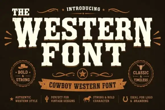
Heavy western capitals with pinched sides
The Western is a heavy western display in cream on dark brown: tall capitals with pinched waists, wedge serifs and a rough printed edge, laid out with a ribbon banner and two round badges.
Ideas for this font
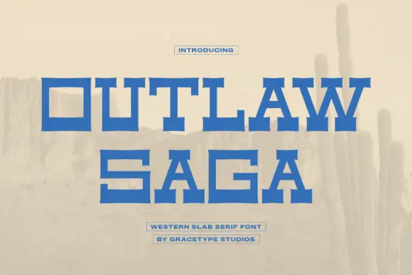
Wide geometric western slab
Outlaw Saga is a wide geometric western slab in blue on a pale desert scene: square letters with heavy horizontal arms, deep rectangular counters and stepped serifs that flare at the ends, set on two lines with two small boxed lines beneath.
Ideas for this font
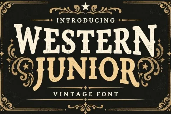
Vintage western slab with scrollwork frame
Western Junior is a vintage western display face in cream and gold on black: rounded slab capitals with small spurs and a dusty surface, set inside an elaborate scrollwork frame with stars, a rule and a banner.
Ideas for this font
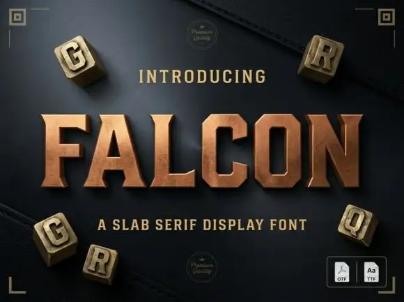
Slab serif display with bevelled cuts and sharp square serifs
Falcon is a slab serif display in which the stems stay broad, the serifs turn square and the corners carry a bevel, so a single word reads as a cast metal plaque rather than as a headline.
Ideas for this font
Same independent foundry
Allow optional Google Analytics to measure visits and catalogue actions. Your search words and notes are not included. Privacy & storage



