Modern Grotesque Body

Falcon + Prime Nordic
Creates crisp high-hierarchy contrast beneath Falcon headlines across menus, websites and labels.
Inspect Prime Nordic specimenDisclosure: MakerFileHub may earn a commission from qualifying purchases via paid links on this page. How our links work.
Slab serif display with bevelled cuts and sharp square serifs
Falcon is a slab serif display in which the stems stay broad, the serifs turn square and the corners carry a bevel, so a single word reads as a cast metal plaque rather than as a headline.
Paid link
Get this fontProject & layout blueprintsAt-a-glance maker compatibility
Sturdy stroke walls and open counters weed cleanly on adhesive vinyl, HTV apparel film, and cut cardstock.
Visual anatomy & craft review
The F sets three square arms on a broad stem, the A carries a wide bar under a flat apex, the L turns a right angle, the C cuts a square crescent and the N holds two stout stems with a bevelled diagonal, all at a slab weight with square serifs and cut corners that catch the light. The bevel is the character: it is drawn rather than rendered, which is why the sample sets one word in metal tones on a dark table. Because the shapes are solid and open, the face reads from 26 pt and holds a plaque at 200 pt, and it prints in one ink. The dark surface, the letter blocks, the small badges and the format marks are presentation; the metallic display word is the face.
Slab · Display · Sharp
Two-font hierarchy recipes
Tested contrast partners — pairing Falcon with grounded secondary typography.
Falcon + Prime Nordic
Creates crisp high-hierarchy contrast beneath Falcon headlines across menus, websites and labels.
Inspect Prime Nordic specimen
Falcon + Abigail
Adds a warm human signature touch for 1-to-3-word callouts without competing against structured serif capitals.
Inspect Abigail specimenPractical applications
Concrete hierarchy, scale and production guidance tailored to Falcon’s stroke geometry.
The bevelled slabs read as cast metal, and the heavy stems hold a one-word name at 40 mm on an engraved plate in two tones.
Hierarchy & layout recipe
Engrave a 300 by 120 mm plate: set the word at 40 mm, cut the bevel at 30 degrees, and keep 20 mm of border so the square serifs sit clear of the fixing screws.
Pre-production check
Screws drilled close to a square serif crack the plate; check the layout and keep every serif 15 mm from a fixing hole.
The slab weight gives a technical cover its tone, and the square serifs hold a title at 80 pt on a plain ground in one ink.
Hierarchy & layout recipe
Print an A4 cover: set the title at 80 pt across the upper half, set the subtitle in a 10 pt sans beneath, and keep 25 mm of margin so the bevelled corners are inside the trim.
Pre-production check
A slab title set tight to the trim looks cropped; check the imposed cover and centre the word on its optical mass.
The heavy slabs read from the end of a lane, and the bevelled corners catch daylight on a painted board at 110 mm in one colour.
Hierarchy & layout recipe
Paint a 900 by 300 mm board: set the words at 110 mm, keep 35 mm of border, and paint the bevel as a line rather than a gradient so it reads at a distance.
Pre-production check
A painted bevel that fades along the stroke looks like a fault; check the board and keep the line even across the word.
Technical & licence verification
Confirm included OTF/TTF/WOFF formats, full glyph tables and licence coverage on the live store page before batch production.
Closest visual alternatives
Matched across letterform anatomy, stroke behaviour and craft applications.
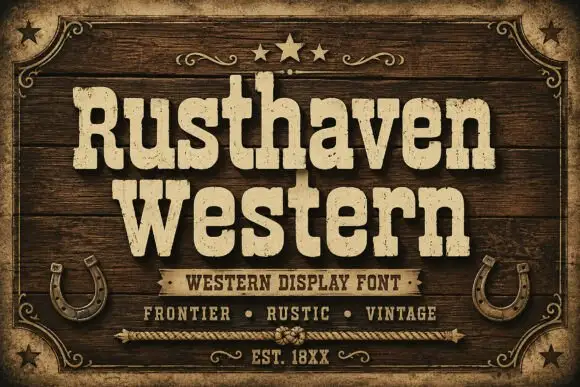
Weathered western slab display
Rusthaven Western is a weathered western slab in cream on dark timber: heavy slabs with softened corners, a chipped edge and a speckled fill, set in two lines with a ribbon banner, stars and horseshoes, so the pair reads as a brand burned into a barn door.
Ideas for this font
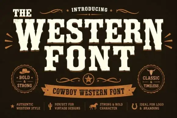
Heavy western capitals with pinched sides
The Western is a heavy western display in cream on dark brown: tall capitals with pinched waists, wedge serifs and a rough printed edge, laid out with a ribbon banner and two round badges.
Ideas for this font
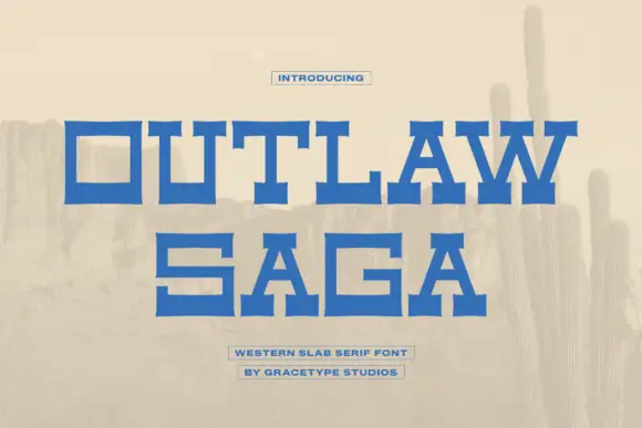
Wide geometric western slab
Outlaw Saga is a wide geometric western slab in blue on a pale desert scene: square letters with heavy horizontal arms, deep rectangular counters and stepped serifs that flare at the ends, set on two lines with two small boxed lines beneath.
Ideas for this font
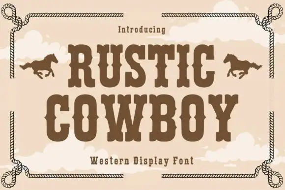
Condensed western display with a rope frame
Rustic Cowboy is a condensed western display in brown on tan: spurred slab letters with small wedge serifs inside a drawn rope border, with a galloping horse on either side.
Ideas for this font
Same independent foundry
Allow optional Google Analytics to measure visits and catalogue actions. Your search words and notes are not included. Privacy & storage