Neutral Sans Workhorse

Northslash + Taught
Lets Northslash own the focal silhouette while handling secondary copy, sizing and subheads cleanly.
Inspect Taught specimenDisclosure: MakerFileHub may earn a commission from qualifying purchases via paid links on this page. How our links work.
Condensed distressed display with scratched edges
Northslash is a condensed heavy display in olive green on a mountain landscape: narrow capitals with squared corners, flat terminals and a scratched, worn surface, with a script line above and below.
Paid link
Get this fontProject & layout blueprintsAt-a-glance maker compatibility
Cut solid base, outline, and shadow layers in separate vinyl colors and align on registration marks.
Visual anatomy & craft review
Two lines are set across a photograph: the first in heavy condensed capitals, the second in the same face at a smaller size, and above and below them a thin brush script carries the introductions. The display face is narrow with squared corners, flat terminals and tight fitting, so a long word fits the width of a page without going small, and the surface is broken by fine scratches that run across the letters in one direction, as though the ink had been scraped. The wear is even enough that the word stays readable at the size of a poster, and the script lines are drawn in a light warm ink so they do not compete with the block. The ground is a mountain road at sunset in warm haze, which gives the olive type something to sit against without much contrast, and that low contrast is part of the look. Northslash is a display face for outdoor apparel, posters, packaging and event graphics with a rugged feel, and it needs a large size and a photographic ground.
Condensed, scratched, rugged
Two-font hierarchy recipes
Tested contrast partners — pairing Northslash with grounded secondary typography.
Northslash + Taught
Lets Northslash own the focal silhouette while handling secondary copy, sizing and subheads cleanly.
Inspect Taught specimen
Northslash + Majestic Letters
Grounds bold display lettering with classic typographic authority on posters, badges and apparel.
Inspect Majestic Letters specimenPractical applications
Concrete hierarchy, scale and production guidance tailored to Northslash’s stroke geometry.
A condensed scratched face sets a rugged tone, and the narrow forms fit a long title on a cover without dropping the size.
Hierarchy & layout recipe
Print a 230 by 300 mm cover: set the title at 90 pt over two lines, keep 26 mm of clear ground beneath before the subtitle at 12 pt, and hold 18 mm of margin on all four sides.
Pre-production check
A low-contrast ink over a photograph can disappear; proof one cover and check the block against the image.
A condensed display gives a bottle or a patch a rugged identity, and the narrow letters fit a long brand name in a small die.
Hierarchy & layout recipe
Print a 55 by 40 mm patch label: set the brand at 12 pt on one line, keep 4 mm of clear ground beneath before the model at 4.5 pt, and hold 3.5 mm of margin on all four sides.
Pre-production check
Scratches can read as damage on a woven patch; order one sample in the real material before the run.
A rugged face reads at a distance on a trail sign, and the condensed width lets a long route name fit a standard board without dropping size.
Hierarchy & layout recipe
Print a 600 by 400 mm board: set the route at 110 pt over two lines, keep 26 mm of clear ground beneath before the distance at 30 pt, and hold 24 mm of margin on all four sides.
Pre-production check
Outdoor boards fade quickly in strong sun; print one board and keep a spare out of direct light before the season.
Technical & licence verification
Confirm included OTF/TTF/WOFF formats, full glyph tables and licence coverage on the live store page before batch production.
Closest visual alternatives
Matched across letterform anatomy, stroke behaviour and craft applications.
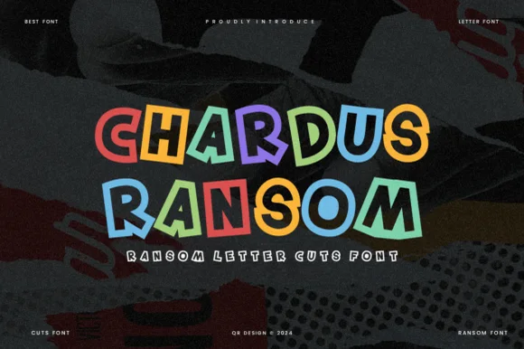
Clean geometric cut-tile ransom display (OTF & TTF)
Chardus Ransom is a crisp, graphic ransom-cut display font alternating solid and outlined letters with tilted geometric rectangle tiles.
Ideas for this font
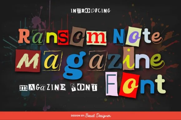
Full-color cut-paper magazine collage ransom font
Ransom Note Magazine is a colorful cut-out collage font placing mismatched serif, sans, and slab letters onto colorful torn magazine paper scraps.
Ideas for this font
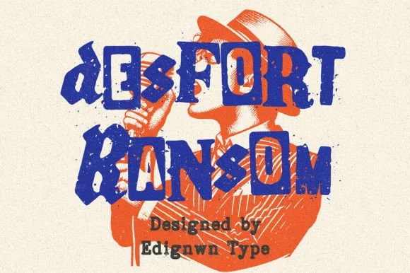
Gritty stamp-distressed mixed-typeface ransom-note font
Desfort Ransom is a rugged, ink-stamped ransom-note typeface mixing serif, sans, and reverse-tile characters with weathered woodblock grit!
Ideas for this font
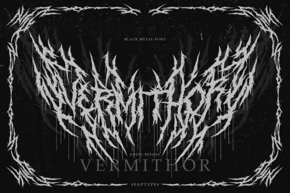
Black metal logo face with thorn spikes
Vermithor is a black metal display in silver on black: letters broken into spiked, thorn-like strokes that fan out and overlap, framed by a thorn border, with a small serif word beneath and tracked capitals in the corners.
Ideas for this font
Same independent foundry
Allow optional Google Analytics to measure visits and catalogue actions. Your search words and notes are not included. Privacy & storage