Neutral Sans Workhorse

Desfort Ransom + Inkora
Lets Desfort Ransom own the focal silhouette while handling secondary copy, sizing and subheads cleanly.
Inspect Inkora specimenDisclosure: MakerFileHub may earn a commission from qualifying purchases via paid links on this page. How our links work.
Gritty stamp-distressed mixed-typeface ransom-note font
Desfort Ransom is a rugged, ink-stamped ransom-note typeface mixing serif, sans, and reverse-tile characters with weathered woodblock grit!
Paid link
Get this fontProject & layout blueprintsAt-a-glance maker compatibility
Fine grain and micro-texture excel in 300 DPI print, sublimation, and screen print rather than small vinyl weeding.
Visual anatomy & craft review
Desfort Ransom is a stamp-distressed ransom face that mixes serif, sans and reverse-tile characters with weathered woodblock grit, so a word reads as letters cut from different sources and glued down. The mismatch is the design, which means the face looks deliberate at 20 mm and chaotic below, and the tiles sit on uneven baselines by default. It needs roughly 22 mm for the tile edges to read, and it is best in cobalt on orange or in black on newsprint grey.
Woodcut-ransom · Gritty-collage · Detective-noir
Two-font hierarchy recipes
Tested contrast partners — pairing Desfort Ransom with grounded secondary typography.
Desfort Ransom + Inkora
Lets Desfort Ransom own the focal silhouette while handling secondary copy, sizing and subheads cleanly.
Inspect Inkora specimen
Desfort Ransom + Svara
Grounds bold display lettering with classic typographic authority on posters, badges and apparel.
Inspect Svara specimenPractical applications
Concrete hierarchy, scale and production guidance tailored to Desfort Ransom’s stroke geometry.
A ransom mix reads as a page assembled from clippings, which is what a punk zine is. The mismatched tiles give the cover texture without a photograph, and the uneven baseline keeps the headline from looking typeset.
Hierarchy & layout recipe
Cover 148 x 210 mm, title 60 mm, cover lines 8/11 pt, 12 mm margins. Opener 420 x 297 mm, headline 110 mm, body 9/13 pt. Flyer A5, title 60 mm, lineup 8/11 pt.
Pre-production check
A photocopied zine at 80 percent reduction erodes the distressed tile edges into dots and the title looks dirty. Print at 100 percent, and check one reduced spread before the run.
Clipped tiles read as a threatening note, which is what a Halloween prop and poster need. The reverse tiles give the word rhythm at 260 mm, and one dark ink on a pale sheet keeps the print cheap for a single night.
Hierarchy & layout recipe
Poster A2, word 260 mm, times 22/28 pt, 30 mm margins and 20 mm trim. Card 105 x 148 mm, word 26 mm, details 8/11 pt. Prop label 90 x 140 mm, word 20 mm, 12 mm margins.
Pre-production check
A ransom word pasted on a damp wall lifts at the tile edges and the poster peels from a corner. Print on 150 gsm minimum and paste with a full coat, and check one poster after a wet night.
Mixed clipped letters read as a DIY brand rather than a designed one, which is what a small punk label sells. The distressed edges survive a one-colour screen print, and the reverse tiles give a short name variety without a second font.
Hierarchy & layout recipe
Tee print 260 x 140 mm, word 55 mm, 40 mm margins. Sticker 80 x 50 mm, word 16 mm, 3 mm die margin and 4 mm clear of the cut. Label 60 x 40 mm, name 9 mm, 3 mm die margin.
Pre-production check
A 9 mm label closes the distressed tile edges into a solid block and the ransom detail disappears. Keep labels at 14 mm or use the clean tiles, and check one applied label before the batch.
Technical & licence verification
Confirm included OTF/TTF/WOFF formats, full glyph tables and licence coverage on the live store page before batch production.
Closest visual alternatives
Matched across letterform anatomy, stroke behaviour and craft applications.
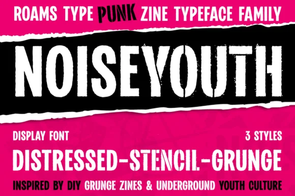
Punk zine display in three distressed styles
Noise Youth is a punk zine typeface family in white and black on magenta: tall condensed capitals shown in distressed, stencil and grunge styles, with ink bands and a caption line about DIY zines.
Ideas for this font
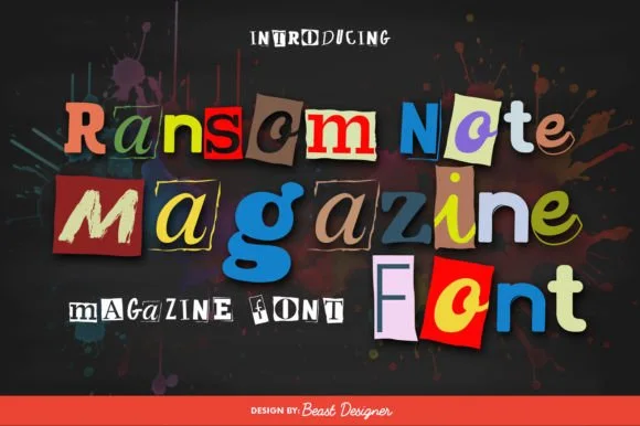
Full-color cut-paper magazine collage ransom font
Ransom Note Magazine is a colorful cut-out collage font placing mismatched serif, sans, and slab letters onto colorful torn magazine paper scraps.
Ideas for this font
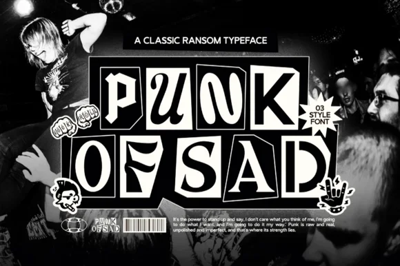
3-style monochrome punk-zine cut-paper ransom font
Punk of Sad is a classic black-and-white punk-zine ransom typeface (3 styles) setting gritty serif/sans letters inside uneven cut-newspaper tiles.
Ideas for this font
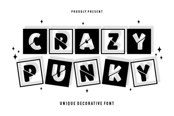
Tilted 3D shadow-boxed ransom tile display
Crazy Punky is a high-contrast monochrome ransom-tile display font placing bold mismatched capitals inside tilted black squares with 3D offset borders.
Ideas for this font
Same independent foundry
Allow optional Google Analytics to measure visits and catalogue actions. Your search words and notes are not included. Privacy & storage