Editorial Serif Anchor

Munchee + Aureline
Anchors Munchee's fluid strokes with crisp Roman proportions on wedding suites, headers and packaging.
Inspect Aureline specimenDisclosure: MakerFileHub may earn a commission from qualifying purchases via paid links on this page. How our links work.
Chalk-textured display
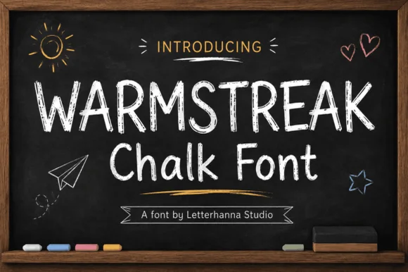
Munchee is a chalk-textured display in cream and pastel on a blackboard: letters drawn with a broken chalky edge, a rounded skeleton with uneven heights, and three further lines in green, blue and purple that show the same face in different chalk colours.
Paid link
Get this fontProject & layout blueprintsAt-a-glance maker compatibility
Fine grain and micro-texture excel in 300 DPI print, sublimation, and screen print rather than small vinyl weeding.
Visual anatomy & craft review
The specimen is a single face used four times: the word at the top in cream, then three lines in different chalk tones that demonstrate how the texture behaves when the colour changes. The letterforms are rounded with a slight lean, the stems are thick, and the edges break up into chalk dust rather than a photographic grain, so the face reads as written on a board instead of printed with a texture overlay. Because the texture is drawn into the outline, it survives scaling better than a bitmap grain, though below about 20 pt the breaks start to read as noise. The ground is a dark board photographed with dust and chalk sticks at the edges, and the script line above the word is set in a contrasting thin hand, which shows the face can be paired with a lighter chalk script.
Chalk, textured, casual, classroom
Two-font hierarchy recipes
Tested contrast partners — pairing Munchee with grounded secondary typography.
Munchee + Aureline
Anchors Munchee's fluid strokes with crisp Roman proportions on wedding suites, headers and packaging.
Inspect Aureline specimen
Munchee + Inkora
Keeps small-scale dates, URLs, nutrition facts and care instructions crisp and legible below script titles.
Inspect Inkora specimenPractical applications
Concrete hierarchy, scale and production guidance tailored to Munchee’s stroke geometry.
A chalk face signals a classroom before a child reads the words, and the broken edges keep a photocopied notice from looking like an administrative memo.
Hierarchy & layout recipe
A3 print on light card: the title at 80 mm cap height, the book list in a 14 mm sans beneath, and one chalk line in a second colour. Keep the type large so the texture reads as chalk rather than as print noise.
Pre-production check
Check the print at A3 on a school copier, where the broken edges can blur into grey; test one copy before the run. Confirm the 14 mm list reads at two metres and that the second colour is distinguishable in mono.
A chalk face reproduces the look of a hand-written board without needing a sign writer, and the texture holds on a printed panel that is wiped clean daily.
Hierarchy & layout recipe
Print a 600 by 900 mm panel: the headings at 90 mm, the items in a 24 mm chalk cut, and the prices in a 20 mm cut. Keep the lettering on a dark ground and specify a matte laminate so the printed chalk does not glare under lights.
Pre-production check
Check the panel at two metres, where the broken edges can read as a dirty print; keep the texture consistent across all four lines. Confirm the 20 mm prices read at arm's length and that the laminate does not lift at the panel's corners.
A chalk display reads as a hand-written sign, which is exactly the register of a children's party rather than a formal invitation, and it prints in one ink.
Hierarchy & layout recipe
A4 print: the child's name at 70 mm, the food labels at 20 mm, and a second chalk colour for one accent word. Keep 20 mm margins and print on a light card so the dark chalk colour carries the design.
Pre-production check
Check the 20 mm labels at arm's length, where the chalk breaks can make short words hard to read; open the spacing for the small sizes. Confirm the accent colour is distinct and that the sign sits flat without curling.
Technical & licence verification
Confirm included OTF/TTF/WOFF formats, full glyph tables and licence coverage on the live store page before batch production.
Closest visual alternatives
Matched across letterform anatomy, stroke behaviour and craft applications.
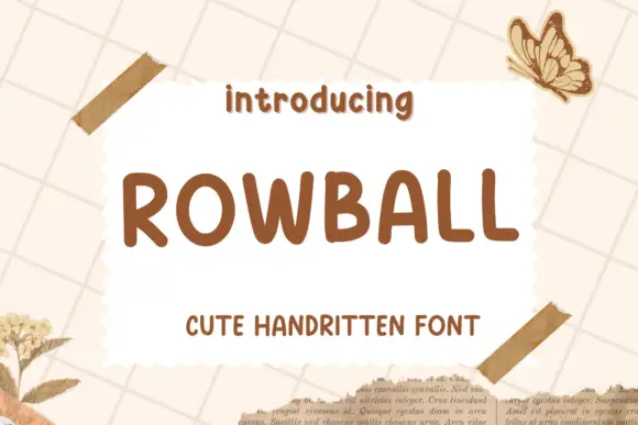
Rounded informal capitals
Rowball is a rounded informal capital hand in brown on cream: fat even strokes, wide open letters with rounded corners, a high x-height and a light bounce that keeps a plain word from looking mechanical.
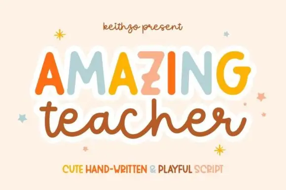
Mixed handwritten display
Amazing Teacher places broad separate capitals in mixed warm colours above a connected lowercase sample in brown, where the top line has blunt rounded ends and the lower t and h rise above the joined rhythm on a cream field with small star marks around the words.
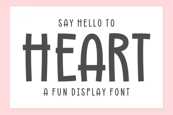
Tall hand-drawn capitals with rough edges and thin raised crossbars
Heart is a tall hand-drawn capital alphabet in which the strokes are narrow and rough-edged, the crossbars sit high and thin, and every letter leans a little, so a word reads as something brushed on a wall.
Ideas for this font
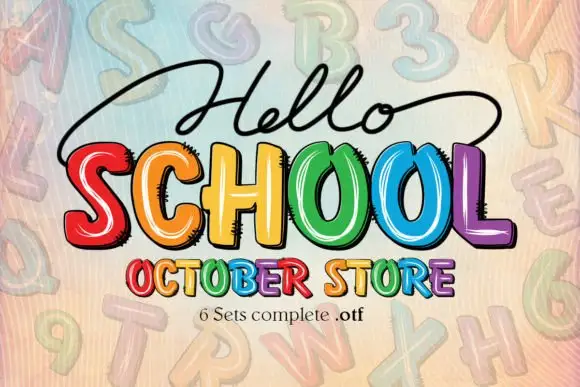
Bright irregular capitals with pale curved highlights and rough dark offsets
Hello School shows chunky irregular capitals in red, orange, yellow, green, blue and violet, where pale curved strokes sit inside the faces, dark rough-edged offsets create a drawn shadow and the large SCHOOL row has tall open counters with uneven widths.
Ideas for this font
Same independent foundry
Allow optional Google Analytics to measure visits and catalogue actions. Your search words and notes are not included. Privacy & storage