Modern Grotesque Body

Gloomscript + Prime Nordic
Creates crisp high-hierarchy contrast beneath Gloomscript headlines across menus, websites and labels.
Inspect Prime Nordic specimenDisclosure: MakerFileHub may earn a commission from qualifying purchases via paid links on this page. How our links work.
Tall narrow mixed case with a curled capital G foot
Gloomscript shows black contrasting serif letters with long upright stems and narrow rounded bowls, where the G extends into a low curled foot and the p descender drops well below an otherwise even line.
Paid link
Get this fontProject & layout blueprintsAt-a-glance maker compatibility
Sturdy stroke walls and open counters weed cleanly on adhesive vinyl, HTV apparel film, and cut cardstock.
Visual anatomy & craft review
The stems run tall and straight, the bowls close narrow, the thick-to-thin shift is pronounced and two letters leave the line, one at the foot of the G and one below the p. The upright serif is the character, and its name misleads: the visible title is not a connected script at all, which is why the sample surrounds a plain serif with aged paper and candle props. Those props are artwork, so keep 18 mm of clearance under the descender at 26 pt and judge the face by its outline alone.
Narrow serif · High contrast · Curled foot
Two-font hierarchy recipes
Tested contrast partners — pairing Gloomscript with grounded secondary typography.
Gloomscript + Prime Nordic
Creates crisp high-hierarchy contrast beneath Gloomscript headlines across menus, websites and labels.
Inspect Prime Nordic specimen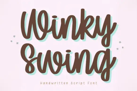
Gloomscript + Winky Swing
Adds a warm human signature touch for 1-to-3-word callouts without competing against structured serif capitals.
Inspect Winky Swing specimenPractical applications
Concrete hierarchy, scale and production guidance tailored to Gloomscript’s stroke geometry.
The tall serif sets a moody heading, and the narrow bowls hold a two-word title at 50 pt across a printed page, where the high contrast keeps the thins visible on coated stock.
Hierarchy & layout recipe
Print a 210 mm page: set the heading at 50 pt on one row, keep 20 mm beneath for the curled G foot, and keep the block inside the column so the p descender stays clear of the body text.
Pre-production check
Fine serifs printed over a tint grey out; check the page and keep the heading on the palest field.
The narrow serif suits a small candle label, and the contrasting bowls stay clear at 20 pt on a 45 mm panel, as long as the descender keeps eight millimetres below it.
Hierarchy & layout recipe
Print a 45 by 60 mm label: set the maker at 20 pt, keep 8 mm of clear ground beneath for the descender, and set the scent at 6 pt in small caps at the foot.
Pre-production check
A high-contrast face printed at 14 pt loses its thins; check the plate proof and hold the maker at 18 pt or above.
The gothic serif sets a supper card, and the even line holds an invitation at 26 pt on an A6 sheet, where the curled G foot needs sixteen millimetres beneath the line.
Hierarchy & layout recipe
Print an A6 card: set the invitation at 26 pt across the upper third, keep 16 mm of clear ground beneath for the G foot, and set the time at 10 pt in a plain serif at the foot.
Pre-production check
Long stems set tight lead to a picket-fence look; check the card and open the tracking slightly.
Technical & licence verification
Confirm included OTF/TTF/WOFF formats, full glyph tables and licence coverage on the live store page before batch production.
Closest visual alternatives
Matched across letterform anatomy, stroke behaviour and craft applications.
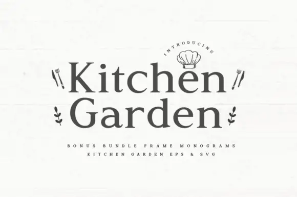
Friendly rounded serif with a low contrast and warm curves
Kitchen Garden is a friendly serif in which the serifs round off, the contrast stays low and the bowls widen, so a two-word title reads as a plaque over a farmhouse kitchen door.
Ideas for this font
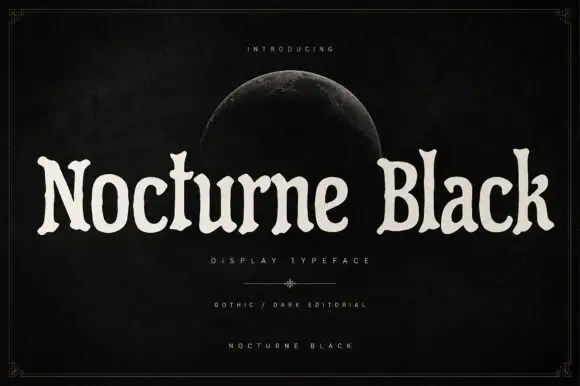
Soft uneven serif display
Nocturne Black is a soft uneven serif in cream on a black ground: rounded bowls, flared ends, slightly irregular widths and a wide fitting, set as one long line beneath a small introducing line and a half moon, with a descriptor and two credit lines at the foot inside a fine frame.

Elegant feminine serif
Olivia Serif is an elegant serif in black on warm cream: high contrast, bracketed serifs, a large x-height and round bowls, set in title case on one line with a smaller serif line beneath, two tracked caps lines under that, and a fine ornamental frame with fleurons at the corners.
Ideas for this font

Fine serif title with large upper and lower loops
Amilea shows pale yellow high-contrast letters with fine tapered serifs and broad rounded lowercase over a dark portrait, where a thin loop curves below the capital A and a tall upper flourish crosses the central ascender before sweeping right.
Same independent foundry
Allow optional Google Analytics to measure visits and catalogue actions. Your search words and notes are not included. Privacy & storage