Modern Grotesque Body

Corner Stories + Mansory
Creates crisp high-hierarchy contrast beneath Corner Stories headlines across menus, websites and labels.
Inspect Mansory specimenDisclosure: MakerFileHub may earn a commission from qualifying purchases via paid links on this page. How our links work.
Narrow mixed case set above broad fine capitals in a contrast serif
Corner Stories is a contrast serif supplied in two proportions: a narrow mixed-case setting for running titles and a broad fine capital cut for display, so one page can carry both a subtitle and a wide masthead.
Paid link
Get this fontProject & layout blueprintsAt-a-glance maker compatibility
Crisp hairline serifs shine on stationery, foil stamping, and packaging; add slight offset for small decals.
Visual anatomy & craft review
The narrow cut keeps the letters slim with a moderate contrast: the o closes an oval counter, the r holds a short arm and the e loops back high, which lets a long line run in a modest measure. The broad capital cut opens the same skeleton wide, with hairline horizontals and a heavy vertical stress, so a single word fills a plate at 80 pt. That pairing is what the specimen shows: a narrow line above and a broad capital line beneath, and the contrast between the two proportions is the design decision rather than the contrast inside either cut. Both want coated stock at display sizes. The pale ground, the black ink, the feather and ribbon are presentation; the serif is the two lines.
Narrow · Broad · Contrasted
Two-font hierarchy recipes
Tested contrast partners — pairing Corner Stories with grounded secondary typography.
Corner Stories + Mansory
Creates crisp high-hierarchy contrast beneath Corner Stories headlines across menus, websites and labels.
Inspect Mansory specimen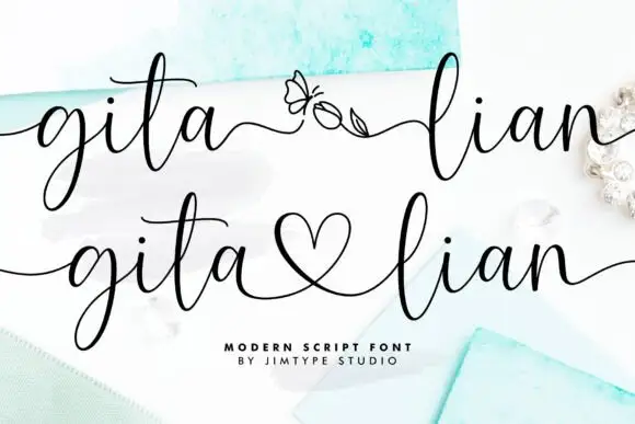
Corner Stories + Gita Lian
Adds a warm human signature touch for 1-to-3-word callouts without competing against structured serif capitals.
Inspect Gita Lian specimenPractical applications
Concrete hierarchy, scale and production guidance tailored to Corner Stories’s stroke geometry.
The broad capitals give a cover masthead its width while the narrow cut carries the issue line, so one page reads as a considered hierarchy.
Hierarchy & layout recipe
Print an A5 cover: set the journal name in the broad capitals at 60 pt, set the issue and date in the narrow cut at 10 pt beneath, and keep 16 mm of margin so the hairline stress stays inside the trim.
Pre-production check
A broad capital line under a narrow subtitle looks unbalanced; check the cover at final size and keep the subtitle measure shorter than the masthead.
The pair suits a trade built on proportion, and the narrow cut carries an address at 8 pt while the broad capitals hold the name at 20 pt.
Hierarchy & layout recipe
Print an A5 letterhead: set the studio name in the broad capitals at 20 pt at the head, set the address in the narrow cut at 8 pt at the foot, and keep 20 mm of margin so the hairlines are not lost against the paper edge.
Pre-production check
A hairline address printed on a laser printer vanishes; check one sheet on the actual stock and set that line in a text weight instead.
The broad capitals announce a section while the narrow cut carries the list beneath, which is what a printed catalogue needs across many pages.
Hierarchy & layout recipe
Print an A4 opener: set the section title in the broad capitals at 54 pt, set the items in the narrow cut at 9 pt at 13 pt leading, and hold 18 mm between the two so the hairlines do not crowd the list.
Pre-production check
A broad title over a tight list can look top-heavy; check the opener at final size and increase the gap rather than shrinking the title.
Technical & licence verification
Confirm included OTF/TTF/WOFF formats, full glyph tables and licence coverage on the live store page before batch production.
Closest visual alternatives
Matched across letterform anatomy, stroke behaviour and craft applications.

Swashed vintage editorial serif with a slanted italic companion
Majestic Letters is a vintage editorial serif in which the capitals carry curled swashes, the contrast runs high and a slanted italic companion is supplied, so a title page can mix upright and leaning forms from one family.
Ideas for this font
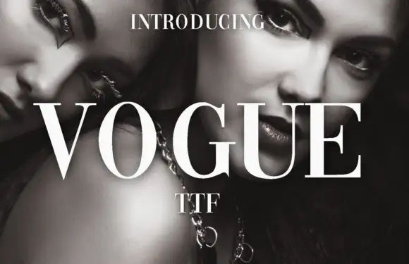
High-contrast didone with hairline serifs
Vogue is a high-contrast didone serif in white over a black-and-white beauty photograph: hairline serifs, a very thin crossbar on the A, a round O and a G with a fine spur, set in capitals as a magazine masthead.
Ideas for this font
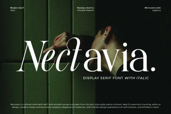
Minimalist display serif with italic
Nectavia is a refined minimalist serif in white over a dark green portrait: moderate contrast, smooth curves, a clean stem and sharp serifs, set in title case on one line with a small italic line beneath and three tracked notes across the top.
Ideas for this font
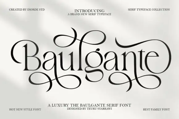
Tall high-contrast serif with looping figure-eight extensions in regular and slant
Baulgante is an elegant high-contrast serif in which the stems stay narrow, the bowls round broadly and repeated figure-eight extensions loop above and below the line, and the family ships in regular and slant so a suite can shift its axis.
Ideas for this font
Same independent foundry
Allow optional Google Analytics to measure visits and catalogue actions. Your search words and notes are not included. Privacy & storage



