Modern Grotesque Body

Victorink + Modern Heritage
Creates crisp high-hierarchy contrast beneath Victorink headlines across menus, websites and labels.
Inspect Modern Heritage specimenDisclosure: MakerFileHub may earn a commission from qualifying purchases via paid links on this page. How our links work.
Distressed Victorian serif
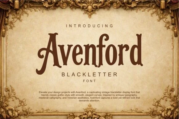
Victorink is a narrow ornamental serif printed on aged parchment: uneven spurs, curled ends, chipped edges and a heavy printing texture, set in two stacked lines with a small descriptor beneath and a paragraph of description at the foot, framed by engraved acanthus leaves.
Paid link
Get this fontProject & layout blueprintsAt-a-glance maker compatibility
Sturdy stroke walls and open counters weed cleanly on adhesive vinyl, HTV apparel film, and cut cardstock.
Visual anatomy & craft review
The plate is a period mock-up, and the paragraph at the foot is unusually honest for a specimen: it names the influences and the features in plain words instead of a slogan, which tells a buyer more than a claim would. The letters are a narrow Victorian serif with curled ends and chipped edges, so the word reads as a letterpress print from a worn block, and the narrow fitting means a long name sits on one line. That construction sets a moderate size floor, because the chipped edges and the fine serifs close first. The acanthus frame is staging. It suits a label, a cover and a sign for a heritage subject.
Serif, victorian, distressed, ornamental
Two-font hierarchy recipes
Tested contrast partners — pairing Victorink with grounded secondary typography.
Victorink + Modern Heritage
Creates crisp high-hierarchy contrast beneath Victorink headlines across menus, websites and labels.
Inspect Modern Heritage specimen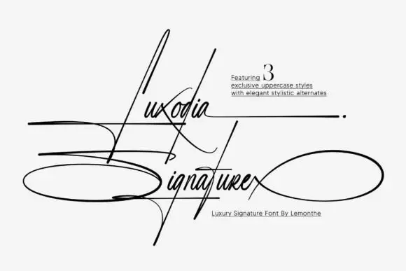
Victorink + Luxodia Signature
Adds a warm human signature touch for 1-to-3-word callouts without competing against structured serif capitals.
Inspect Luxodia Signature specimenPractical applications
Concrete hierarchy, scale and production guidance tailored to Victorink’s stroke geometry.
A Victorian label reads as a house with age, and the chipped edges survive a letterpress pass where a clean serif would look new.
Hierarchy & layout recipe
Print a 55 by 85 mm label: the house at 12 pt, the expression at 8 pt, and the year at 7 pt. Keep 5 mm inside the die and keep the serifs above 0.3 mm.
Pre-production check
Check the 12 pt house on the label, where a serif can fill; keep it above 0.3 mm. Confirm the 7 pt year reads on the shelf and that the label holds in a cellar.
A Victorian serif frames a period cover, and the printing texture does the work of an illustration without one. It suits a period novel.
Hierarchy & layout recipe
Set the title at 80 mm cap height across 175 mm, the author in a 11 pt serif, and the imprint at 8 pt. Print two colours on a textured stock, keeping 22 mm margins and 0.3 mm as the finest stroke.
Pre-production check
Check the title at 80 mm, where an edge can clot; keep the counters open. Confirm the 8 pt imprint survives lamination and that the frame clears the trim.
A period serif reads as a market bill, and the narrow letters fit a long venue name on a small card. It fits a venue name.
Hierarchy & layout recipe
A6 card: the market at 28 pt, the dates in a 10 pt serif, and the venue at 9 pt. Keep 15 mm margins, print two colours on a cream card and leave 12 mm at the foot for the address.
Pre-production check
Check the 28 pt heading at home-print resolution, where a chip can fill; keep the counters open. Confirm the 9 pt venue reads at arm's length and that the card folds flat.
Technical & licence verification
Confirm included OTF/TTF/WOFF formats, full glyph tables and licence coverage on the live store page before batch production.
Closest visual alternatives
Matched across letterform anatomy, stroke behaviour and craft applications.
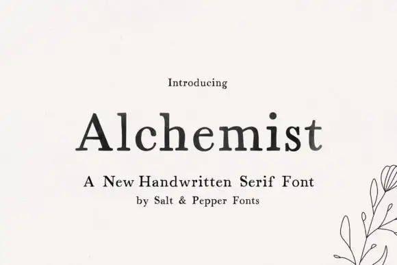
Soft handwritten serif with irregular small details
Alchemist shows black mixed-case letters with modest contrast and softly uneven edges, where a wide A and rounded lowercase bowls sit beside a tall h and a lightly curved t terminal, and the title rests on cream next to a small botanical line drawing and handwritten-serif wording.
Ideas for this font
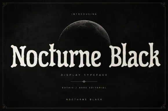
Soft uneven serif display
Nocturne Black is a soft uneven serif in cream on a black ground: rounded bowls, flared ends, slightly irregular widths and a wide fitting, set as one long line beneath a small introducing line and a half moon, with a descriptor and two credit lines at the foot inside a fine frame.
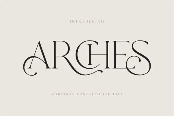
Decorative ligature serif
Arches sets one word in dark ink on a warm neutral field, where wide flat serifs sit on hairline cross strokes, the A climbs to a sharp apex, the R leg sweeps into a long horizontal tail that runs beneath the following letters and the S closes with an extended curl.
Ideas for this font

Swashed vintage editorial serif with a slanted italic companion
Majestic Letters is a vintage editorial serif in which the capitals carry curled swashes, the contrast runs high and a slanted italic companion is supplied, so a title page can mix upright and leaning forms from one family.
Ideas for this font
Same independent foundry
Allow optional Google Analytics to measure visits and catalogue actions. Your search words and notes are not included. Privacy & storage