Neutral Sans Workhorse

Westforge + Monure
Lets Westforge own the focal silhouette while handling secondary copy, sizing and subheads cleanly.
Inspect Monure specimenDisclosure: MakerFileHub may earn a commission from qualifying purchases via paid links on this page. How our links work.
Heavy notched western slab
Westforge is a heavy western slab in black on an aged cream sheet: fat capitals with long pale inset tracks running through each stem, notched side contours, blunt serifs and a slight swell, framed by a thick ornamental border, a ribbon line and a horseshoe, with a desert scene along the foot.
Paid link
Get this fontProject & layout blueprintsAt-a-glance maker compatibility
Sturdy stroke walls and open counters weed cleanly on adhesive vinyl, HTV apparel film, and cut cardstock.
Visual anatomy & craft review
The plate is a printed label rather than a specimen, and the frame, the ribbon and the desert scene all belong to the same register: a western goods label. The drawing is a heavy slab with inset tracks and notched sides, so each stem reads as a planed board rather than as a stroke, and the inset is the device that keeps a very heavy face from becoming a solid mass. That construction sets a large size floor, because the tracks close first. The border and the horseshoe are supplied ornament, and the ribbon line is product copy. It suits a package, a sign and a shirt, and the aged ground is a treatment rather than a feature of the font.
Decorative, western, heavy, vintage
Two-font hierarchy recipes
Tested contrast partners — pairing Westforge with grounded secondary typography.
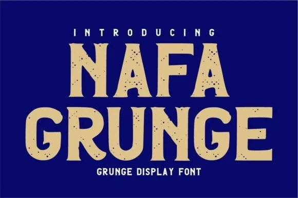
Westforge + Monure
Lets Westforge own the focal silhouette while handling secondary copy, sizing and subheads cleanly.
Inspect Monure specimen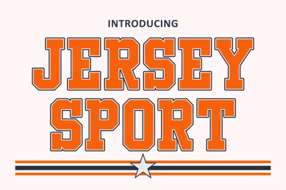
Westforge + Jersey Sport
Grounds bold display lettering with classic typographic authority on posters, badges and apparel.
Inspect Jersey Sport specimenPractical applications
Concrete hierarchy, scale and production guidance tailored to Westforge’s stroke geometry.
A western label reads as a small-batch product, and the inset tracks give a heavy face texture on a small die. The inset gives a small die texture.
Hierarchy & layout recipe
Print a 50 by 80 mm label: the brand at 13 pt, the blend at 8 pt, and two colours on a kraft stock. Keep 4 mm inside the die and keep the inset above 0.5 mm at that size.
Pre-production check
Check the 13 pt brand on kraft, where the tracks can close into a bar; keep them above 0.5 mm. Confirm the 8 pt blend reads at arm's length and that the label takes a fold.
A heavy western face reads at the end of a drive, and the notched contours catch the light on a cut panel. It reads at the end of a drive.
Hierarchy & layout recipe
Fabricate a 1,200 by 420 mm panel: the ranch at 140 mm cap height, the number in a 30 mm slab, and a 5 mm rule. Keep 30 mm margins and cut from painted steel with a matte finish.
Pre-production check
Check the panel at 140 mm, where an inset can fill with paint; keep it above 6 mm. Confirm the 30 mm number reads at ten metres and that the rule clears the fixings.
A western display prints as staff kit, and the black weight reads on a light shirt where a thin face would look weak. It prints as staff kit.
Hierarchy & layout recipe
Print a 260 mm chest graphic: the bar at 60 mm cap height, the year at 26 mm, and one ink on a light shirt. Keep the narrowest inset at 4 mm and place the graphic 80 mm below the collar.
Pre-production check
Check the screen at actual mesh, where a 4 mm inset can fill; open it to 5 mm. Wash-test one shirt and confirm the notches stay sharp after five cycles.
Technical & licence verification
Confirm included OTF/TTF/WOFF formats, full glyph tables and licence coverage on the live store page before batch production.
Closest visual alternatives
Matched across letterform anatomy, stroke behaviour and craft applications.
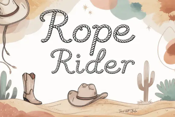
Rope-stroke western display
Rope Rider is a drawn display in dark brown on a watercolour desert ground: sloping mixed case in which every stroke is hollow and marked with diagonal strands so the letters read as rope, set in two lines over dunes with boots, hats and cacti drawn at the edges.
Ideas for this font
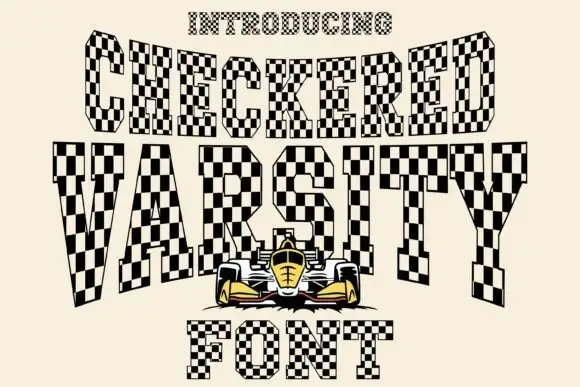
Clipped slab capitals filled with alternating black and pale checkerboard squares
Checkered Varsity sets tall italic capitals whose strokes are filled with a black and cream racing chequer, so every letter looks cut from a flag and the whole word leans forward.
Ideas for this font
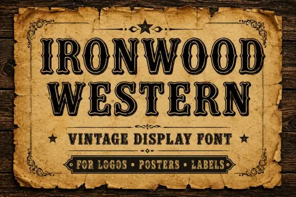
Western capitals with narrow inset lines and notched sides
Ironwood Western shows heavy black capitals with fine pale inset contours and repeated small notches along the upright sides, where flared serif ends and tight bowls create a dense two-row sign-like title.
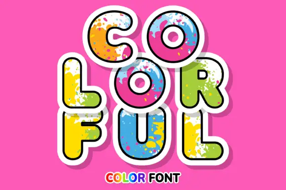
Rounded sticker-like capitals with bright paint splashes and broad white edging
Colorful sets fat rounded caps in a solid colour with a spatter of paint across the letter, a white sticker outline and a soft shadow, so a word looks like a painted cut-out.
Ideas for this font
Same independent foundry
Allow optional Google Analytics to measure visits and catalogue actions. Your search words and notes are not included. Privacy & storage