High-Contrast Display Serif

Thyga + Things
Pairs sculptural editorial warmth with Thyga's clean modern geometry.
Inspect Things specimenDisclosure: MakerFileHub may earn a commission from qualifying purchases via paid links on this page. How our links work.
Heavy condensed rounded sans
Thyga is a heavy condensed sans in black on light grey: tall narrow lowercase with tight spacing, round bowls that almost close, and a period set as a solid square, so the word reads as a contemporary retail mark rather than as text.
Paid link
Get this fontProject & layout blueprintsAt-a-glance maker compatibility
Sturdy stroke walls and open counters weed cleanly on adhesive vinyl, HTV apparel film, and cut cardstock.
Visual anatomy & craft review
The specimen sets the word in lower case with a full stop, which immediately frames the face as a brand mark rather than as running text. The drawing is a heavy grotesque compressed into a narrow width: the stems are thick, the apertures are tight, and the counters of the a and the g are small ovals, while the t and the h keep short straight ascenders that hold the line. Because the spacing is tight, the letters almost touch, and the square period closes the word with a block rather than a dot. The weight and compression mean the face works at logo sizes but would be hard to read at length, which is exactly how the sample uses it. The ground is a flat light grey, and there is no other type on the page, so the specimen makes one claim about weight.
Heavy, condensed, rounded, modern
Two-font hierarchy recipes
Tested contrast partners — pairing Thyga with grounded secondary typography.
Thyga + Things
Pairs sculptural editorial warmth with Thyga's clean modern geometry.
Inspect Things specimen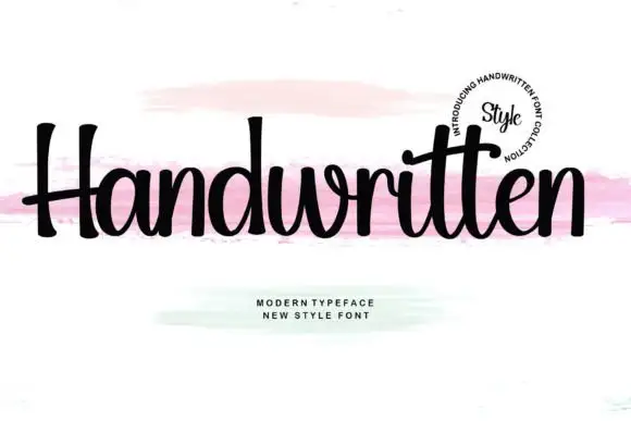
Thyga + Handwritten
Introduces organic movement on pull-quotes, signatures and gift tags.
Inspect Handwritten specimenPractical applications
Concrete hierarchy, scale and production guidance tailored to Thyga’s stroke geometry.
A heavy condensed mark gives a clothing label a silhouette that reads on a tag, a tote and a shopfront, and the tight spacing turns the name into a single graphic rather than a row of letters.
Hierarchy & layout recipe
Set the mark at 40 pt with tracking at minus 25 units, then build an 18 pt version with tracking at zero for woven labels. Keep the square period only above 20 pt, and always leave clear space equal to the cap height.
Pre-production check
Check the 18 pt woven label, where the tight counters close first; open the tracking for that size. Confirm the mark reads from 15 m on a shopfront and that the square period does not merge into the final letter at 40 pt.
A heavy condensed face gives a cover the density of a fashion advertisement, and the tight spacing lets a long title fill a portrait cover without losing cap height.
Hierarchy & layout recipe
Set the title at 150 pt across 200 mm, the year in a 12 pt sans at the foot, and a 0.5 pt rule at the head. Keep the title on a flat ground and set the cover lines in a light grotesque so the weight contrast does the work.
Pre-production check
Check the title at 150 pt, where the tight tracking can fuse two letters; add 10 units of spacing for the cover. Confirm the 12 pt year reads at newsstand distance and that the rule does not crowd the ascenders.
A heavy sans reads at distance and signals a contemporary design course, and the condensed width fits a long school name onto a horizontal banner.
Hierarchy & layout recipe
Print 1,200 by 500 mm: the show name at 200 mm cap height, the dates in a 40 mm sans, and the venue at 25 mm. Keep 50 mm of clear space around the display and print one colour on a pale ground so the weight reads as the message.
Pre-production check
Check the banner at ten metres, where the tight counters can close visually; open the tracking slightly for the large format. Confirm the 25 mm venue reads from five metres and that the display clears the banner's eyelets.
Technical & licence verification
Confirm included OTF/TTF/WOFF formats, full glyph tables and licence coverage on the live store page before batch production.
Closest visual alternatives
Matched across letterform anatomy, stroke behaviour and craft applications.

Bold neo-grotesk display sans with hooked double-story g
Memoir Slang is a heavy, tight-set modern sans-serif distinguished by crisp neo-grotesk geometry and sharp, horned ear details.
Ideas for this font
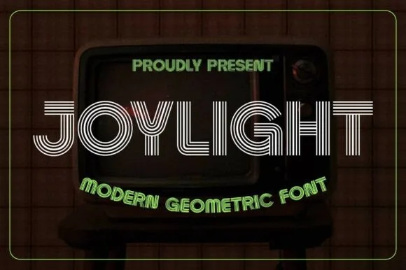
5-line concentric 1980s CRT-TV & synth-funk multiline sans
Joylight is a sleek retro-futuristic multilinear display font tracing geometric uppercase letters in five crisp parallel neon-ready tracks.
Ideas for this font
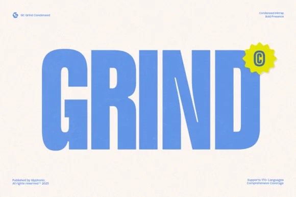
Heavy condensed inktrap display sans
Gc Grind is a bold condensed sans-serif engineered with subtle corner inktraps and flat industrial curves across 170+ languages.
Ideas for this font

Slim contemporary geometric sans with architectural cuts
Bielchon is a crisp, light-to-regular modern sans-serif featuring tall x-height, circular bowls, and subtle stencil-like notched joins.
Ideas for this font
Same independent foundry
Allow optional Google Analytics to measure visits and catalogue actions. Your search words and notes are not included. Privacy & storage