Editorial Serif Anchor

Luno + Brenco
Anchors Luno's fluid strokes with crisp Roman proportions on wedding suites, headers and packaging.
Inspect Brenco specimenDisclosure: MakerFileHub may earn a commission from qualifying purchases via paid links on this page. How our links work.
Playful rounded display with an uneven edge
Luno Display is a playful display face in black on cream: fat rounded letters with a slightly uneven outline, a bouncy baseline and quirky joins, shown among soft pastel shapes with a small capital line and a pill-shaped note.
Paid link
Get this fontProject & layout blueprintsAt-a-glance maker compatibility
Weld or Unite overlapping script joins into one continuous vector path before sending to the blade.
Visual anatomy & craft review
The two words are set on one line and the face is a cheerful display: the stroke is thick and even, the corners are rounded but not regular, the o is a fat ring with a small notch, the d and the p close into full bowls, the l and the i stand tall with blunt tops, and the baseline lifts between letters so the word looks hand-set. The outlines wobble slightly rather than following a perfect curve, which is what keeps a heavy face friendly instead of mechanical, and the letters are spaced closely enough to read as one mass. Around the block soft pastel shapes float on the page, a coral blob, a teal patch, a yellow star, a scatter of dots and a hand-drawn ring, and two small capital lines plus an orange pill name the product and its uses. Luno Display is a playful face for logos, packaging, social graphics and children's products, and it wants a short word at a large size and a light ground with colour around it.
Playful, rounded, cheerful
Two-font hierarchy recipes
Tested contrast partners — pairing Luno with grounded secondary typography.
Luno + Brenco
Anchors Luno's fluid strokes with crisp Roman proportions on wedding suites, headers and packaging.
Inspect Brenco specimen
Luno + Corven
Keeps small-scale dates, URLs, nutrition facts and care instructions crisp and legible below script titles.
Inspect Corven specimenPractical applications
Concrete hierarchy, scale and production guidance tailored to Luno’s stroke geometry.
A rounded friendly face works as a wordmark on a shopfront, and the even weight reproduces on a cup, a napkin and a sign without redrawing.
Hierarchy & layout recipe
Print a 700 by 250 mm fascia sign: set the name at 150 pt on one line, keep 40 mm of clear ground beneath before the street number at 30 pt, and hold 30 mm of margin on all four sides.
Pre-production check
A wobbling outline can look like a signwriting error at large scale; proof one panel and look at it from across the street.
A playful face sets the tone for a young party, and the fat letters stay legible in a photograph shared on a phone screen.
Hierarchy & layout recipe
Print a 105 by 148 mm card: set the greeting at 30 pt over two lines, keep 14 mm of clear ground beneath before the details at 9 pt, and hold 12 mm of margin on all four sides.
Pre-production check
A bouncy baseline on two lines needs more leading than a straight face; proof one card and check the descenders clear.
A rounded display reads at the size of a stall sticker, and the pastel palette suits a cold drink sold in the sun at a summer market.
Hierarchy & layout recipe
Print a 70 mm round sticker: set the word at 18 pt on one line, keep 8 mm of clear ground inside the die, and hold the artwork 6 mm clear of the circle edge.
Pre-production check
Pastel on a white sticker loses contrast outdoors; print one sticker and check it in daylight before the sheet.
Technical & licence verification
Confirm included OTF/TTF/WOFF formats, full glyph tables and licence coverage on the live store page before batch production.
Closest visual alternatives
Matched across letterform anatomy, stroke behaviour and craft applications.
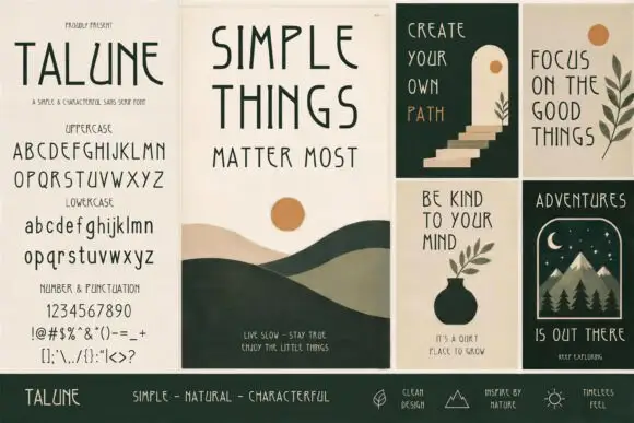
Irregular drawn sans across panels
Talune is a drawn sans in dark green and rust across a set of four poster panels: narrow irregular capitals on the specimen panel, with the full uppercase, lowercase, numerals and punctuation listed, and three illustrated panels showing the face set as a phrase over simple nature drawings.
Ideas for this font
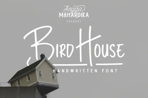
Thin informal marker mixed case with towering capitals and long cross-strokes
Bird House is a thin informal marker hand in which the first capital towers over a narrow lowercase body, the H rises especially high and a long cross-stroke travels across the second word, so a name reads as a quick marker sketch.
Ideas for this font
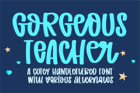
Cute hand-lettered capitals with a bouncing baseline and alternates
Gorgeous Teacher is a hand-lettered capital alphabet in which each letter sits at a slightly different height, the strokes stay rounded and a set of alternates swaps the rounder forms in, so a word reads as a marker drawing.
Ideas for this font
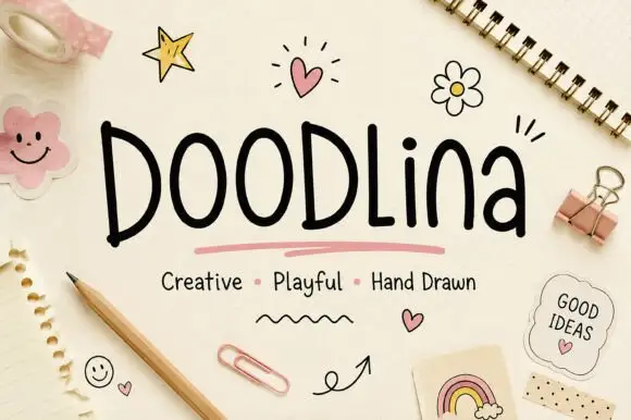
Tall narrow hand-drawn letters with uneven weights and a level baseline
Doodlina is tall narrow hand-drawn lettering in which the letters keep a level baseline but vary in weight, so a word reads as something drawn with a felt tip rather than written with a pen.
Ideas for this font
Same independent foundry
Allow optional Google Analytics to measure visits and catalogue actions. Your search words and notes are not included. Privacy & storage



