Editorial Serif Anchor

Talune + Mewah
Anchors Talune's fluid strokes with crisp Roman proportions on wedding suites, headers and packaging.
Inspect Mewah specimenDisclosure: MakerFileHub may earn a commission from qualifying purchases via paid links on this page. How our links work.
Irregular drawn sans across panels
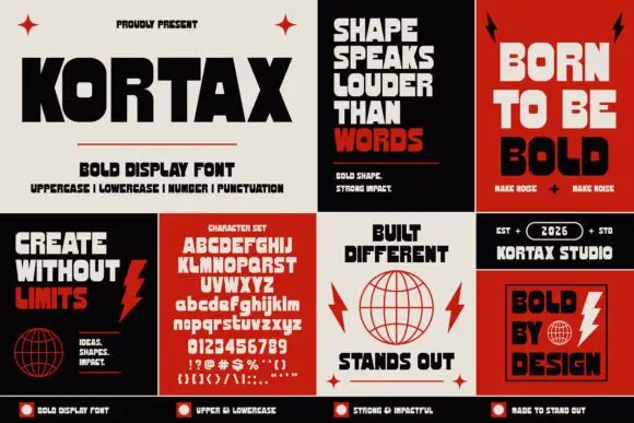
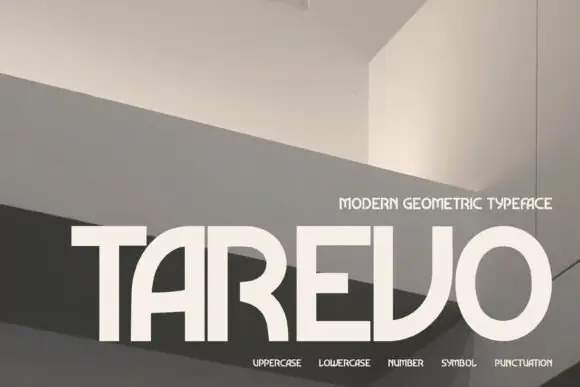
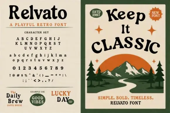
Talune is a drawn sans in dark green and rust across a set of four poster panels: narrow irregular capitals on the specimen panel, with the full uppercase, lowercase, numerals and punctuation listed, and three illustrated panels showing the face set as a phrase over simple nature drawings.
Paid link
Get this fontProject & layout blueprintsAt-a-glance maker compatibility
Weld or Unite overlapping script joins into one continuous vector path before sending to the blade.
Visual anatomy & craft review
The plate is a small campaign rather than a specimen: one panel lists the character set, one sets a phrase over hills and a sun, and two more set short phrases beside drawn objects, so the buyer sees the face in use at three sizes and on three backgrounds. The drawing is a narrow sans with slightly irregular stems and rounded ends, which reads as drawn rather than as a monoline, and the lowercase is simple enough to set a phrase in. Because the strokes are thin and even, the face holds at poster size and needs a size floor for small print, which the panel layout makes visible. The nature drawings are staging that names the register, and the numeral row shows that the figures match the letters.
Handwritten, drawn, natural, simple
Two-font hierarchy recipes
Tested contrast partners — pairing Talune with grounded secondary typography.
Talune + Mewah
Anchors Talune's fluid strokes with crisp Roman proportions on wedding suites, headers and packaging.
Inspect Mewah specimen
Talune + Prime Nordic
Keeps small-scale dates, URLs, nutrition facts and care instructions crisp and legible below script titles.
Inspect Prime Nordic specimenPractical applications
Concrete hierarchy, scale and production guidance tailored to Talune’s stroke geometry.
A drawn sans reads as handmade rather than corporate, which suits a garden centre where everything else is printed and plain.
Hierarchy & layout recipe
A2 board: the centre at 80 mm cap height, the hours in a 20 mm sans, and the phone at 11 mm. Keep 28 mm margins and paint two colours on a pale board.
Pre-production check
Check the board at four metres, where an irregular stem can look like a mistake; keep the irregularity consistent. Confirm the 11 mm phone reads at two metres and that the board survives rain.
A drawn face suits an outdoor event, and the simple shapes hold over a flat illustrated background without a second design.
Hierarchy & layout recipe
A3 poster: the event at 70 mm cap height, the times in a 18 mm sans, and the meeting point at 10 mm. Keep 25 mm margins and print two colours on a light stock.
Pre-production check
Check the A3 at four metres, where a thin stroke can fade in daylight; keep the weight up. Confirm the 10 mm meeting point reads at arm's length and that the poster clears the trim.
A drawn sans gives a maker's card a personal hand, and the simple lowercase sets a short message without a script. A short message suits a drawn hand.
Hierarchy & layout recipe
A6 card: the greeting at 20 pt, the message at 9.5 pt, and the signature at 10 pt. Keep 16 mm margins and print one ink on a cream card. Leave 12 mm at the foot for the maker's line.
Pre-production check
Check the 9.5 pt message on cream card, where a thin stem can break; keep the size above 10 pt. Confirm the greeting reads at arm's length and that the card takes an envelope.
Technical & licence verification
Confirm included OTF/TTF/WOFF formats, full glyph tables and licence coverage on the live store page before batch production.
Closest visual alternatives
Matched across letterform anatomy, stroke behaviour and craft applications.
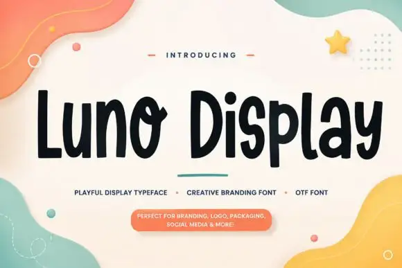
Playful rounded display with an uneven edge
Luno Display is a playful display face in black on cream: fat rounded letters with a slightly uneven outline, a bouncy baseline and quirky joins, shown among soft pastel shapes with a small capital line and a pill-shaped note.
Ideas for this font
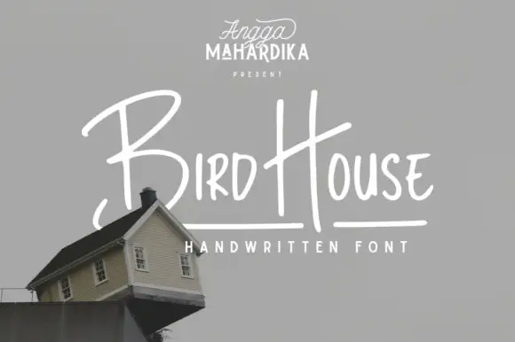
Thin informal marker mixed case with towering capitals and long cross-strokes
Bird House is a thin informal marker hand in which the first capital towers over a narrow lowercase body, the H rises especially high and a long cross-stroke travels across the second word, so a name reads as a quick marker sketch.
Ideas for this font
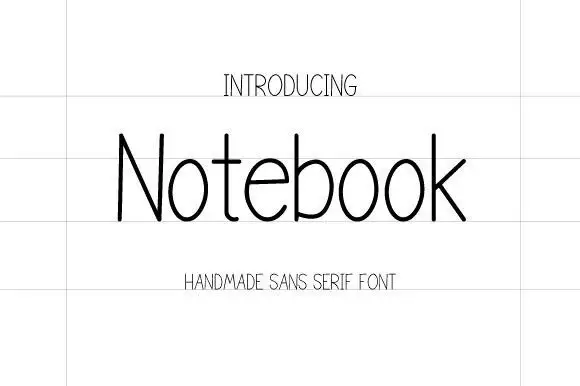
Thin handmade sans
Notebook is a thin handmade sans in near-black on a lined sheet: tall narrow letters with hairline strokes, a very large x-height, open counters and a slight irregularity in the stems, set as one word with a tracked label above and below in the same weight.
Ideas for this font
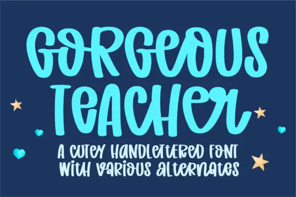
Cute hand-lettered capitals with a bouncing baseline and alternates
Gorgeous Teacher is a hand-lettered capital alphabet in which each letter sits at a slightly different height, the strokes stay rounded and a set of alternates swaps the rounder forms in, so a word reads as a marker drawing.
Ideas for this font
Same independent foundry
Allow optional Google Analytics to measure visits and catalogue actions. Your search words and notes are not included. Privacy & storage