Editorial Serif Anchor

Gorgeous Teacher + Askinо
Anchors Gorgeous Teacher's fluid strokes with crisp Roman proportions on wedding suites, headers and packaging.
Inspect Askinо specimenDisclosure: MakerFileHub may earn a commission from qualifying purchases via paid links on this page. How our links work.
Cute hand-lettered capitals with a bouncing baseline and alternates
Gorgeous Teacher is a hand-lettered capital alphabet in which each letter sits at a slightly different height, the strokes stay rounded and a set of alternates swaps the rounder forms in, so a word reads as a marker drawing.
Paid link
Get this fontProject & layout blueprintsAt-a-glance maker compatibility
Sturdy stroke walls and open counters weed cleanly on adhesive vinyl, HTV apparel film, and cut cardstock.
Visual anatomy & craft review
The G hooks a long arm, the o sits high, the r flattens its shoulder, the g drops a curled tail, the e closes a wide eye and the s wobbles a shallow spine, all at a rounded marker weight with soft ends and a visible bounce. The bounce is the character: no two letters share a baseline exactly, which is why the sample sets two stacked words and lets them rock. Because the strokes are round and open, the face holds at 20 pt and cuts cleanly in card, and the alternates let a repeated letter be varied. The navy ground, the small hearts and stars, and the two lines beneath are presentation; the turquoise hand-lettered words are the face.
Hand-lettered · Bouncy · Cute
Two-font hierarchy recipes
Tested contrast partners — pairing Gorgeous Teacher with grounded secondary typography.
Gorgeous Teacher + Askinо
Anchors Gorgeous Teacher's fluid strokes with crisp Roman proportions on wedding suites, headers and packaging.
Inspect Askinо specimen
Gorgeous Teacher + Limited Coffee
Keeps small-scale dates, URLs, nutrition facts and care instructions crisp and legible below script titles.
Inspect Limited Coffee specimenPractical applications
Concrete hierarchy, scale and production guidance tailored to Gorgeous Teacher’s stroke geometry.
The bouncing caps suit a primary school sheet, and the round open strokes stay legible at 24 pt on a second-generation photocopy.
Hierarchy & layout recipe
Print an A4 newsletter: set the header at 24 pt across the top, set the body in a 10 pt sans beneath, and keep 15 mm of margin so the highest bouncing letter is inside the print area.
Pre-production check
A bouncy line printed tight to the margin looks cropped; check the sheet and centre the header on the middle of the bounce rather than the lowest letter.
The marker shapes read across a long party table, and the visible bounce gives a plain name card some energy at 48 mm of print.
Hierarchy & layout recipe
Print an A5 sign: set the name at 48 mm, set the age at 24 pt in the same cut beneath, and keep 15 mm of border so the rounded strokes are not cut by the fold of the tent card.
Pre-production check
A tent fold through a round stroke cracks the print; check the folded sign and keep the word above the fold line.
The hand-lettered register suits a small maker, and the round strokes hold a short brand name at 22 pt on a kraft label.
Hierarchy & layout recipe
Print a 70 by 45 mm label: set the brand name at 22 pt, set the month line in a 7 pt sans beneath, and keep 5 mm from the die so the curled descender is inside the cut.
Pre-production check
A curled tail cut by the label die looks broken; check the die and raise the word 2 mm rather than shortening the tail.
Technical & licence verification
Confirm included OTF/TTF/WOFF formats, full glyph tables and licence coverage on the live store page before batch production.
Closest visual alternatives
Matched across letterform anatomy, stroke behaviour and craft applications.
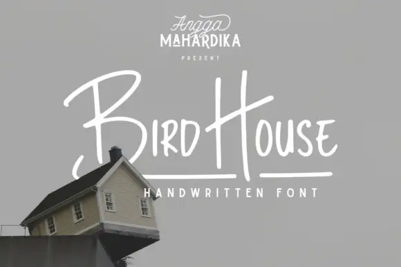
Thin informal marker mixed case with towering capitals and long cross-strokes
Bird House is a thin informal marker hand in which the first capital towers over a narrow lowercase body, the H rises especially high and a long cross-stroke travels across the second word, so a name reads as a quick marker sketch.
Ideas for this font
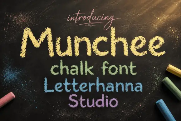
Chalk-textured display
Munchee is a chalk-textured display in cream and pastel on a blackboard: letters drawn with a broken chalky edge, a rounded skeleton with uneven heights, and three further lines in green, blue and purple that show the same face in different chalk colours.
Ideas for this font
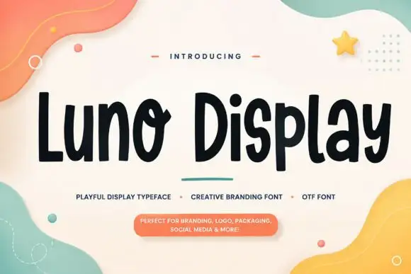
Playful rounded display with an uneven edge
Luno Display is a playful display face in black on cream: fat rounded letters with a slightly uneven outline, a bouncy baseline and quirky joins, shown among soft pastel shapes with a small capital line and a pill-shaped note.
Ideas for this font
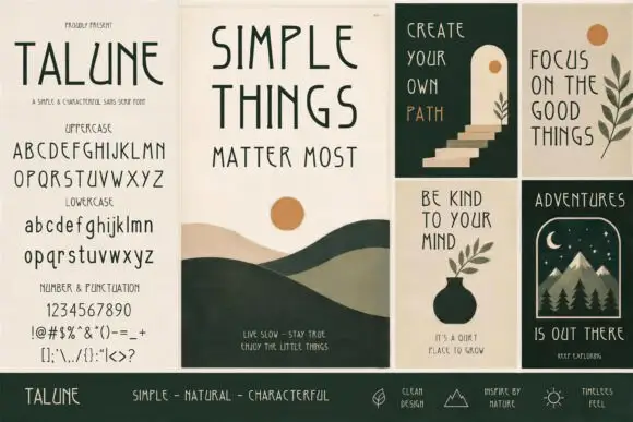
Irregular drawn sans across panels
Talune is a drawn sans in dark green and rust across a set of four poster panels: narrow irregular capitals on the specimen panel, with the full uppercase, lowercase, numerals and punctuation listed, and three illustrated panels showing the face set as a phrase over simple nature drawings.
Ideas for this font
Same independent foundry
Allow optional Google Analytics to measure visits and catalogue actions. Your search words and notes are not included. Privacy & storage