Neutral Sans Workhorse

Poppy Grove + Sailors
Lets Poppy Grove own the focal silhouette while handling secondary copy, sizing and subheads cleanly.
Inspect Sailors specimenDisclosure: MakerFileHub may earn a commission from qualifying purchases via paid links on this page. How our links work.
Simple rounded block capitals
Poppy Grove is a rounded block capital display in two warm inks: Poppy in vermilion and Grove in olive on a cream ground, with flat-sided letters, soft corners and a small drawn poppy above and below.
Paid link
Get this fontProject & layout blueprintsAt-a-glance maker compatibility
Sturdy stroke walls and open counters weed cleanly on adhesive vinyl, HTV apparel film, and cut cardstock.
Visual anatomy & craft review
POppy sits above GROVE in the same fat block face, and each letter is built from straight stems and soft rounded corners: the P and the R carry full round bowls, the O and the G are almost circular, and the letters are spaced wide enough that the two rows read as a calm block rather than as a shout. The two words are printed in different colours, which is the only decoration besides a tiny drawn flower above the top line and a pair of poppies at the foot, and the ground is a cream that holds both inks without vibration. Two letter-spaced captions frame the specimen. The face is a friendly display for shop signs, packaging and posters: it needs size for the round counters to stay open, it works in one or two inks, and its even weight makes it a good choice for a short phrase that has to be read from a distance.
A friendly block cap face in two earth colours
Two-font hierarchy recipes
Tested contrast partners — pairing Poppy Grove with grounded secondary typography.
Poppy Grove + Sailors
Lets Poppy Grove own the focal silhouette while handling secondary copy, sizing and subheads cleanly.
Inspect Sailors specimen
Poppy Grove + Augler
Grounds bold display lettering with classic typographic authority on posters, badges and apparel.
Inspect Augler specimenPractical applications
Concrete hierarchy, scale and production guidance tailored to Poppy Grove’s stroke geometry.
Rounded capitals are warm without being cute, and a two-colour board matches the flowers a couple is actually using rather than a stock palette.
Hierarchy & layout recipe
Print a 500 by 350 mm board: set the greeting at 90 pt across two rows, keep 24 mm of clear ground beneath before the names at 22 pt, and hold 22 mm of border on all four sides.
Pre-production check
Vermilion on a printed board shifts toward orange in sunlight; print one board on the intended material and check the ink before the set.
The colours come from the product, so a florist can label a jar without inventing a palette, and two inks is a realistic print cost.
Hierarchy & layout recipe
Print a 55 by 45 mm label: set the shop name at 14 pt on one row, keep 5 mm of clear ground beneath before the street at 4.5 pt, and hold 4 mm from the widest letter to the die line.
Pre-production check
Two inks on a kraft label turn muddy; print one label on the real stock and check the olive before the order.
A calm block poster reads from a doorway, and the warm pair of inks says handmade rather than corporate before a visitor reads a word.
Hierarchy & layout recipe
Print an A2 poster: set the market name at 120 pt across two rows, keep 30 mm of clear ground beneath before the date at 16 pt, and hold 24 mm of border on all sides.
Pre-production check
Wide capitals at poster size can look like a slogan; print one at the final size and check the spacing between rows before the run.
Technical & licence verification
Confirm included OTF/TTF/WOFF formats, full glyph tables and licence coverage on the live store page before batch production.
Closest visual alternatives
Matched across letterform anatomy, stroke behaviour and craft applications.
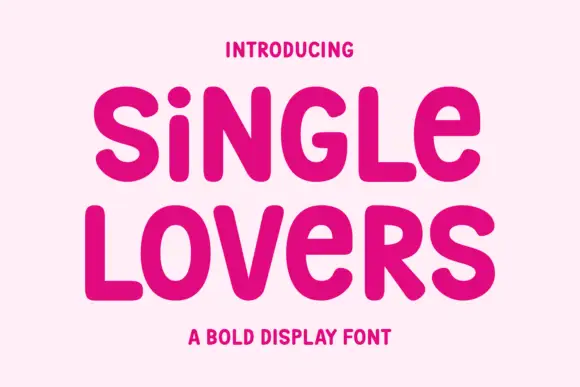
Monoline signature script
Single Lovers is a monoline signature script in near-black on cream: an even stroke, moderate slant, open loops and a soft bounce, set in two words on one line with a long connecting stroke and a small tracked caption beneath.
Ideas for this font
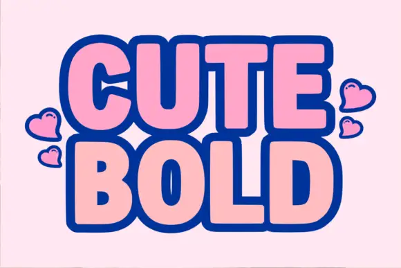
Heavy rounded bold sans with a thick dark outline
Cute Bold is a heavy rounded sans in which the letters swell, the counters close to slots and a thick dark outline wraps each word, so a two-word title reads as a cut sticker made for a scrapbook.
Ideas for this font
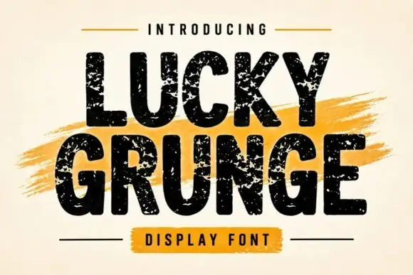
Grunge heavy sans display
Lucky Grunge is a heavy grunge display in black on cream: wide condensed caps with chipped edges, speckled interiors and a slightly rough baseline, set over a dry orange brush swipe with a banner caption, so the pair reads as a stencilled crate label.
Ideas for this font
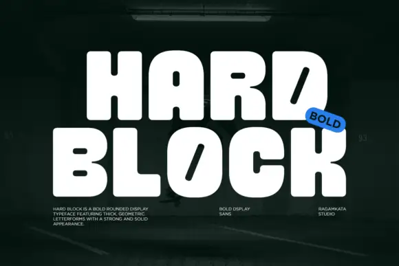
Very heavy rounded blocks with tiny counters and diagonal slots in D and O
Hard Block is a very heavy rounded display in which the capitals sit almost solid, the counters shrink to small pills and the D and O carry a long diagonal slot instead of an open bowl, so two stacked words read as one compact block.
Ideas for this font
Allow optional Google Analytics to measure visits and catalogue actions. Your search words and notes are not included. Privacy & storage