Neutral Sans Workhorse

Seine + Prime Nordic
Lets Seine own the focal silhouette while handling secondary copy, sizing and subheads cleanly.
Inspect Prime Nordic specimenDisclosure: MakerFileHub may earn a commission from qualifying purchases via paid links on this page. How our links work.
Slanted rounded brush capitals
Seine is a slanted rounded brush capital set in dark grey on a deckled cream sheet: very heavy strokes with rounded ends, a strong forward lean, and small capital letters scattered around the sheet as a specimen.
Paid link
Get this fontProject & layout blueprintsAt-a-glance maker compatibility
Sturdy stroke walls and open counters weed cleanly on adhesive vinyl, HTV apparel film, and cut cardstock.
Visual anatomy & craft review
The word is set in capitals across the width, and the face is a brush display: the S is a fat curve, the E has short arms, the I is a single thick bar and the N is built from two heavy strokes with a rounded join, while every end is fully rounded and the whole line leans forward as if painted with a wide brush. There is no contrast and no serif, so a plain word reads as a painted sign, and the lean gives it movement that a straight capital cannot. Small capitals, a question mark and an exclamation are scattered around the sheet at different angles, which shows how the set behaves as a display alphabet rather than a word. The ground is a deckled paper with a dip pen and an ink bottle at the lower left. Seine is a display capital for signage, packaging, posters and apparel.
A fat brush capital on a deckled sheet
Two-font hierarchy recipes
Tested contrast partners — pairing Seine with grounded secondary typography.
Seine + Prime Nordic
Lets Seine own the focal silhouette while handling secondary copy, sizing and subheads cleanly.
Inspect Prime Nordic specimen
Seine + Alerigue
Grounds bold display lettering with classic typographic authority on posters, badges and apparel.
Inspect Alerigue specimenPractical applications
Concrete hierarchy, scale and production guidance tailored to Seine’s stroke geometry.
A painted brush capital reads across a room and looks made for the day, and the lean keeps a plain word from feeling like a printed label.
Hierarchy & layout recipe
Print a 600 by 400 mm board: set the greeting at 96 pt over two lines, keep 24 mm of clear ground beneath before the names at 24 pt, and hold 22 mm of border on all four sides.
Pre-production check
A strong lean can make stacked lines look tipped; print one board at the final size and check the alignment before the set.
A brush capital gives a cover a single confident word, and the heavy stroke reads over a photograph where a fine face would be lost.
Hierarchy & layout recipe
Print a 230 by 300 mm cover: set the cover word at 96 pt on one line, keep 26 mm of clear ground beneath before the cover lines at 11 pt, and hold 24 mm of margin on all four sides.
Pre-production check
Rounded ends can look blobby at large sizes; print one cover at the finished size and judge the finish before the run.
A painted capital holds on a small label and gives a paper bag a sign-written look, and the thick strokes survive a stamp with no fine detail to lose.
Hierarchy & layout recipe
Print a 60 by 45 mm label: set the shop name at 15 pt on one line, keep 5 mm of clear ground beneath before the address at 5.5 pt, and hold 4 mm of margin on all four sides.
Pre-production check
A lean plus a small label can tip the word off centre; print one on the real material and check the balance before the order.
Technical & licence verification
Confirm included OTF/TTF/WOFF formats, full glyph tables and licence coverage on the live store page before batch production.
Closest visual alternatives
Matched across letterform anatomy, stroke behaviour and craft applications.
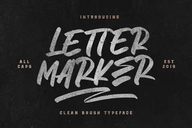
Broad slanted marker capitals
Letter Marker is a broad slanted marker capital set in chalky white on black: thick brush strokes with dry ends, a consistent forward lean and a short underline swash beneath the second line.
Ideas for this font
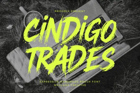
Ragged slanted brush lettering with dry edges and uneven pressure
Cindigo Trades is expressive brush lettering that leans hard to the right, its strokes ragged at the edges and uneven in pressure, so the words look sprayed or painted rather than drawn.
Ideas for this font
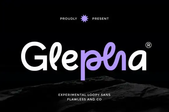
Looped rounded mixed case with interwoven central strokes and a deep p stem
Glepha shows white and purple lettering on black, where a broad open G introduces rounded lowercase forms, the l rises into a narrow loop and the central letters intertwine through a crossing horizontal stroke, while the p drops far below the main bodies and the final a keeps a simple broad bowl.
Ideas for this font
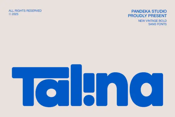
Heavy rounded logo display
Talina is a heavy rounded display in royal blue on a pale sheet: a short name set in very heavy rounded letters with an extended T arm, wide round bowls and an inverted dot-and-stem i that reads as a cut counter, with three small credits in the corners.
Ideas for this font
Same independent foundry
Allow optional Google Analytics to measure visits and catalogue actions. Your search words and notes are not included. Privacy & storage