Modern Grotesque Body

Jersey + Cenura
Creates crisp high-hierarchy contrast beneath Jersey headlines across menus, websites and labels.
Inspect Cenura specimenDisclosure: MakerFileHub may earn a commission from qualifying purchases via paid links on this page. How our links work.
Square athletic capitals with chamfered bowls, hooked J and small slab feet
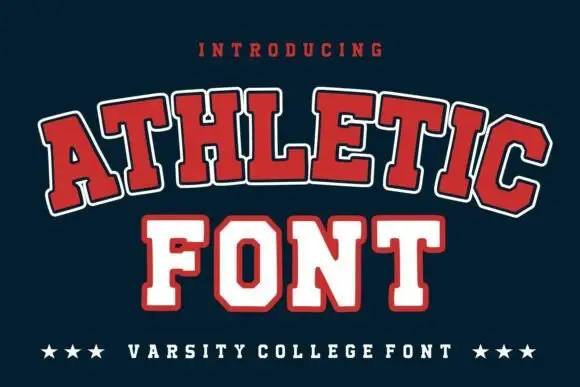
Jersey is a square athletic slab in which the capitals clip their corners, the O chamfers into an octagon, the J hooks under its stem and small slab feet sit flat, so a team name reads as a stadium board.
Paid link
Get this fontProject & layout blueprintsAt-a-glance maker compatibility
Sturdy stroke walls and open counters weed cleanly on adhesive vinyl, HTV apparel film, and cut cardstock.
Visual anatomy & craft review
The J hooks a short tail leftward, the O cuts four corners into a soft octagon, the R drops an angular leg and every stem ends in a small slab projection with an offset edging line around the whole title. The chamfer is the character: it keeps a square letter from looking mechanical, which is why the sample sets one word with a light offset edge. Because the feet are small, the face holds from 30 pt and cuts from three quarters of an inch of cap height; the bottom caption advertises numbers, so check their actual forms in the file. The baseball, helmet and ribbon behind the title are artwork; the blue athletic letters are the face.
Athletic · Chamfered · Offset edge
Two-font hierarchy recipes
Tested contrast partners — pairing Jersey with grounded secondary typography.
Jersey + Cenura
Creates crisp high-hierarchy contrast beneath Jersey headlines across menus, websites and labels.
Inspect Cenura specimen
Jersey + Esmeralda
Adds a warm human signature touch for 1-to-3-word callouts without competing against structured serif capitals.
Inspect Esmeralda specimenPractical applications
Concrete hierarchy, scale and production guidance tailored to Jersey’s stroke geometry.
The chamfered caps read from the far touchline, and the square forms stay solid at 110 mm on a printed vinyl banner in two inks.
Hierarchy & layout recipe
Print a two-metre banner: set the headline at 110 mm, set the fixture details in a 30 mm caps beneath, and keep 45 mm of border so the offset edging is not lost to the hem.
Pre-production check
An offset edge printed under 1 mm disappears at distance; check the finished banner and keep the edging at 2 mm.
The athletic slabs suit fabric, and the square cut keeps the name crisp at 75 mm across a printed cotton chest in one ink.
Hierarchy & layout recipe
Print a 300 mm chest print: set the name at 75 mm, keep the slab feet at 4 mm of ink minimum, and leave 40 mm of clear fabric below for the player number.
Pre-production check
A slab foot under 3 mm fills in on a screen print; check the film at full size and thicken the foot.
The stadium tone suits a doorway sign, and the clipped capitals stay legible at 55 mm on a painted plate in one flat colour.
Hierarchy & layout recipe
Print a 600 by 200 mm plate: set the club name at 55 mm, keep 25 mm of border all round, and set the opening hours in a 12 pt caps at the right end of it.
Pre-production check
A chamfered corner printed to the plate edge looks sheared; check the mounted sign and keep 20 mm of margin.
Technical & licence verification
Confirm included OTF/TTF/WOFF formats, full glyph tables and licence coverage on the live store page before batch production.
Closest visual alternatives
Matched across letterform anatomy, stroke behaviour and craft applications.
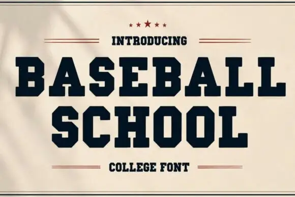
Heavy wide collegiate slabs with hard clipped bowls
Baseball School shows solid dark capitals on cream, where broad slab feet and sharply chamfered B, S and O curves create an athletic silhouette and small counters keep the heavy title dense rather than airy.
Ideas for this font
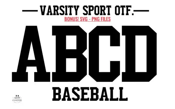
Solid athletic blocks with clipped bowls
Varsity Sport Army is a solid athletic block in black on white: wide slab-serifed capitals with clipped corners, a flat top and foot, and squared counters, shown as an alphabet specimen above the word Baseball.
Ideas for this font
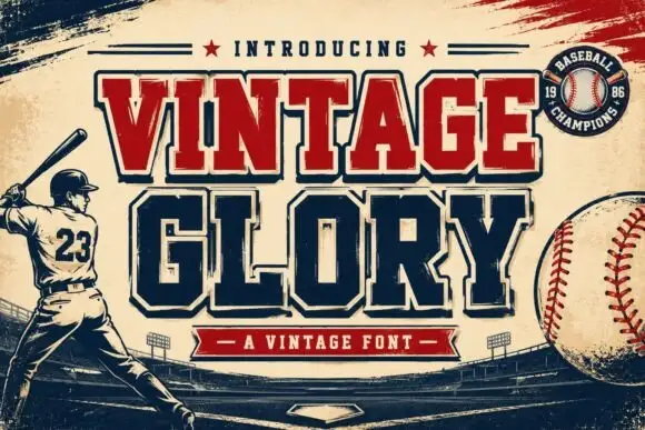
Layered varsity slab with depth
Vintage Glory is a layered varsity slab in red and navy on cream: heavy square serifs, notched corners, a solid extrusion behind every letter that steps down and right, and a round badge with a ball seam, so the two words read as a printed sports pennant rather than a flat headline.
Ideas for this font
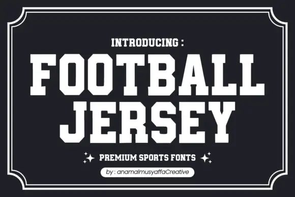
Solid athletic capitals with clipped corners and square slab ends
Football Jersey presents solid white athletic capitals on charcoal inside a double frame, where the O bowls have cut-off corners, the T and J carry broad rectangular terminals and the two rows keep an even dense rhythm with almost no space between the letters.
Same independent foundry
Allow optional Google Analytics to measure visits and catalogue actions. Your search words and notes are not included. Privacy & storage