High-Contrast Display Serif

Sport Grunge + Mewah
Pairs sculptural editorial warmth with Sport Grunge's clean modern geometry.
Inspect Mewah specimenDisclosure: MakerFileHub may earn a commission from qualifying purchases via paid links on this page. How our links work.
Display
Sport Grunge is a heavy condensed sans with a distressed texture: the strokes are solid blocks, and the surface is eaten away by specks and scratches so the letters look stencilled onto a rough wall.
Paid link
Get this fontProject & layout blueprintsAt-a-glance maker compatibility
Fine grain and micro-texture excel in 300 DPI print, sublimation, and screen print rather than small vinyl weeding.
Visual anatomy & craft review
SPORT over GRUNGE fills the card in off-white on a deep green ground, and each letter is a thick block with tight spacing, square terminals and small counters. The distress is applied across the whole word rather than inside each glyph, which is why the two rows look printed with one roller, and the specks vary in size from pinpricks to flecks several millimetres across. A caption band at the foot names the face in a small distressed caps. The construction is a workhorse athletic display: it reads like a team jersey or a gym wall, and it prints in one colour on fabric, board or vinyl. The practical limit is size — at small sizes the distress becomes dirt rather than texture, and the counters fill.
Heavy sans with a distressed, speckled surface
Two-font hierarchy recipes
Tested contrast partners — pairing Sport Grunge with grounded secondary typography.
Sport Grunge + Mewah
Pairs sculptural editorial warmth with Sport Grunge's clean modern geometry.
Inspect Mewah specimen
Sport Grunge + Bunglon
Introduces organic movement on pull-quotes, signatures and gift tags.
Inspect Bunglon specimenPractical applications
Concrete hierarchy, scale and production guidance tailored to Sport Grunge’s stroke geometry.
The face reads as a stencilled jersey, and one colour on a dark shirt is the cheapest way for a gym to look established.
Hierarchy & layout recipe
Print a 280 by 200 mm chest print: set the gym name at 100 pt on one row, keep 24 mm of clear ground beneath before the town at 10 pt, and hold 20 mm from the widest letter to the print edge.
Pre-production check
Coarse mesh closes the small counters; print one pull on the actual shirt and check the O before the run.
The lettering carries across a field and looks painted rather than printed, which suits an event that happens on grass and lets one board stand in for a whole run of banners.
Hierarchy & layout recipe
Print a 700 by 400 mm board: set the event name at 110 pt across two rows, keep 28 mm of clear ground beneath before the times at 15 pt, and hold 26 mm of border on all sides.
Pre-production check
The distress fills with dust outdoors; print one board and look at it in daylight before the set.
Heavy condensed caps fit a long team name on one line, and the worn surface suits a fixture that has been played for a hundred years.
Hierarchy & layout recipe
Print an A2 poster: set the fixture at 120 pt on one row, keep 32 mm of clear ground beneath before the kick-off at 14 pt, and hold 24 mm of margin so the specks at the edge are not trimmed.
Pre-production check
Large distressed areas moire on cheap presses; print one poster at the final size and check a letter before the run.
Technical & licence verification
Confirm included OTF/TTF/WOFF formats, full glyph tables and licence coverage on the live store page before batch production.
Closest visual alternatives
Matched across letterform anatomy, stroke behaviour and craft applications.

Heavy rounded school sans
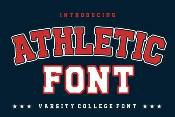
School Bold shows heavy upright sans capitals with rounded corners and tall oval counters: the C opening stays broad and the B closes two small rounded bowls, while the cover adds a white edge and a deep offset shadow.
Ideas for this font

Geometric sans with a variable weight range
Prime Nordic is a geometric sans in white on charcoal, set as two lines of the same name: the first in a light cut and the second in a heavy one, with a small badge tucked at the shoulder stating nine weights and two notes in the corners about the variable file and the language support.
Neutral sans family with variable weights
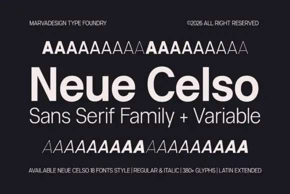
Neue Celso is a neutral sans family shown in pale cream on charcoal: a title line in mixed case with open e bowls, a subtitle in a lighter cut, and above and below it two rows of A samples that step through the weights, with small notes in the corners that state the count, the styles and the glyph set.
Ideas for this font
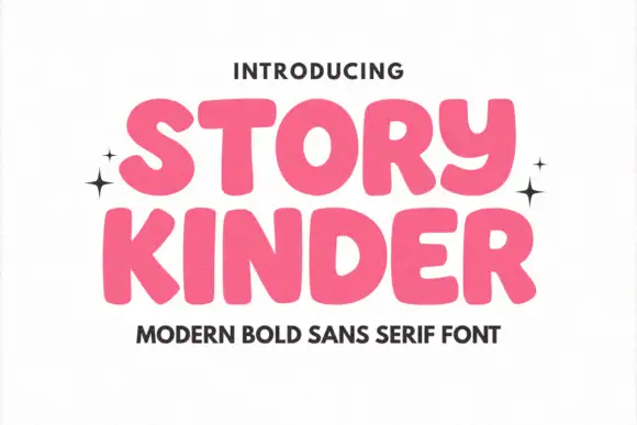
Soft heavy rounded sans
Story Kinder is a soft heavy sans in pink on white: caps with thick rounded strokes, uneven widths, a curved y that drops below the line like a lowercase letter and generous bowls, set in two lines with sparkles at the sides and a plain line beneath naming the style.
Ideas for this font
Same independent foundry
Allow optional Google Analytics to measure visits and catalogue actions. Your search words and notes are not included. Privacy & storage