High-Contrast Display Serif

Bright Darling Duo + Evoire
Pairs sculptural editorial warmth with Bright Darling Duo's clean modern geometry.
Inspect Evoire specimenDisclosure: MakerFileHub may earn a commission from qualifying purchases via paid links on this page. How our links work.
Fine upright capitals paired with a loose slanted signature and long lower stroke
Bright Darling Duo pairs pale upright capitals with a fine slanted signature over a muted floral interior, where the caps keep tall contrasting stems and a curved R leg while the signature runs loose connected strokes with a final loop that descends past the words and overlaps the R.
Paid link
Get this fontProject & layout blueprintsAt-a-glance maker compatibility
Sturdy stroke walls and open counters weed cleanly on adhesive vinyl, HTV apparel film, and cut cardstock.
Visual anatomy & craft review
The caps stay tall and light, the signature stays hairline, the R leg curves out and the final loop drops below the baseline while the two directions overlap near the centre. That overlap is the character: the sample lets the signature cut across the caps rather than sit beneath them, which is why it holds a large calm photograph. The dried roses and the vase belong to the styling. Keep 26 pt for the signature, keep 40 pt for the caps and check the overlap area for contrast before printing pale on pale.
Fine upright capitals paired with a loose slanted signature and long lower stroke
Two-font hierarchy recipes
Tested contrast partners — pairing Bright Darling Duo with grounded secondary typography.
Bright Darling Duo + Evoire
Pairs sculptural editorial warmth with Bright Darling Duo's clean modern geometry.
Inspect Evoire specimen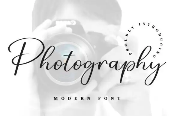
Bright Darling Duo + Photography Font
Introduces organic movement on pull-quotes, signatures and gift tags.
Inspect Photography Font specimenPractical applications
Concrete hierarchy, scale and production guidance tailored to Bright Darling Duo’s stroke geometry.
The pale caps with a fine signature suit an understated suite, where the overlap gives the names movement without a border or crest.
Hierarchy & layout recipe
Print a 120 by 180 mm invitation: set the names in the caps at 40 pt across one row, run the signature at 20 pt across their lower half, keep 22 mm of clear ground beneath, and keep 18 mm of margin.
Pre-production check
Pale letters on pale card lose contrast; check a proof and keep 30 percent tonal separation.
The pairing gives a studio a mark that reads as a printed signature on a print box, which suits the trade rather than a generic brand.
Hierarchy & layout recipe
Print a 60 by 90 mm box label: set the studio name in the caps at 22 pt, run the signature at 12 pt across the lower half, keep 8 mm of clear ground, and keep 6 mm to the die edge.
Pre-production check
The signature hairline fades at 12 pt; check the plate proof and stay on a coated stock for the run.
The duo lets a note carry a formal first line and a handwritten second, which is exactly what a printed thank you card needs.
Hierarchy & layout recipe
Print a 105 by 148 mm card: set the opening in the caps at 24 pt, run the signature line at 14 pt beneath with 10 mm of clear ground, and keep 16 mm of margin at each side.
Pre-production check
The final loop descends past the line; check the card and keep 14 mm before the signature.
Technical & licence verification
Confirm included OTF/TTF/WOFF formats, full glyph tables and licence coverage on the live store page before batch production.
Closest visual alternatives
Matched across letterform anatomy, stroke behaviour and craft applications.
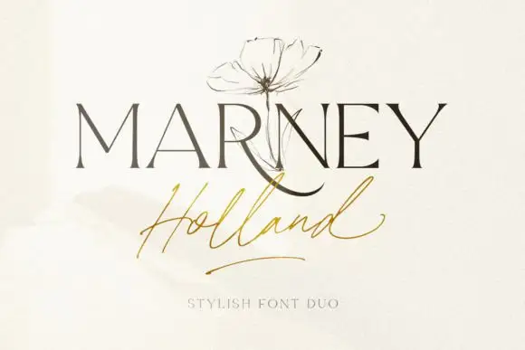
Fine serif and loose signature duo
Marney Holland pairs a tall high-contrast serif capital cut with a loose thin script: the R curls its leg below the serif line, the script runs light through its joins and a long low exit stroke closes the written line.
Ideas for this font
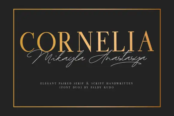
Upright fine serif capitals paired with a thin sweeping signature line
Cornelia pairs a gold serif capital line with a thin signature script, and sets the two on charcoal inside a rule so the pair reads as an engraved card rather than a poster.
Ideas for this font
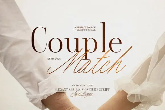
Duo pairing a high-contrast serif with a quick signature script
Couple Match is a two-cut family in which a high-contrast serif sets a formal word and a quick signature script writes the second, so a design gets a staged and a handwritten line from one purchase.
Ideas for this font
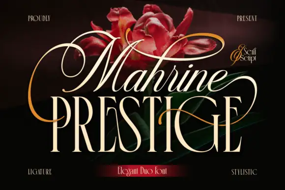
Looping slanted upper lettering above narrow serif capitals
Mahrine Prestige shows a pale slanted upper word with thin connected-looking strokes and large loops, while tall narrow PRESTIGE capitals form a more upright base crossed by a fine sweeping extension, and red flowers with gold flourishes fill the dark background.
Ideas for this font
Same independent foundry
Allow optional Google Analytics to measure visits and catalogue actions. Your search words and notes are not included. Privacy & storage