Modern Grotesque Body

Wonder + Nyxar
Creates crisp high-hierarchy contrast beneath Wonder headlines across menus, websites and labels.
Inspect Nyxar specimenDisclosure: MakerFileHub may earn a commission from qualifying purchases via paid links on this page. How our links work.
Elegant serif with dramatic swashes
Wonder is an elegant serif in cream on a warm blurred portrait: high contrast, a W drawn with long diagonal strokes, and a d whose ascender turns into a swash that loops back over the word and ends in a fine point.
Paid link
Get this fontProject & layout blueprintsAt-a-glance maker compatibility
Sturdy stroke walls and open counters weed cleanly on adhesive vinyl, HTV apparel film, and cut cardstock.
Visual anatomy & craft review
The word is set across the middle of the frame and the drawing is a display serif with one dominant gesture: the W opens wide with thin diagonals, the o and the n stay compact with vertical stress, and the d lifts an ascender that curves left and then sweeps back across the letters, so the swash becomes a second line above the word. The serifs are fine and unbracketed, the hairlines are hairline, and the counters are open, which keeps the word legible despite the ornament. Tracking is generous so the swash can travel without hitting the ascenders, and the whole lockup is centred with small credits at the corners. The ground is a warm, out-of-focus portrait, and the cream type sits on the darker side of the light, which is where a high-contrast serif survives.
Elegant, swashed, editorial, dramatic
Two-font hierarchy recipes
Tested contrast partners — pairing Wonder with grounded secondary typography.
Wonder + Nyxar
Creates crisp high-hierarchy contrast beneath Wonder headlines across menus, websites and labels.
Inspect Nyxar specimen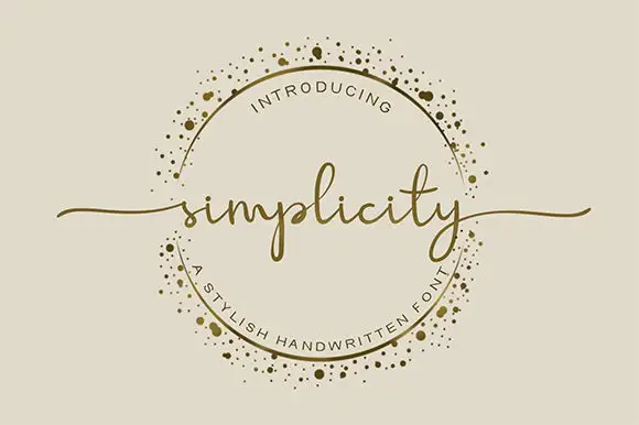
Wonder + Simplicity
Adds a warm human signature touch for 1-to-3-word callouts without competing against structured serif capitals.
Inspect Simplicity specimenPractical applications
Concrete hierarchy, scale and production guidance tailored to Wonder’s stroke geometry.
A swashed serif gives a literary cover its gesture, and the single sweep reads at newsstand size where a busier ornament would look like decoration.
Hierarchy & layout recipe
Set the title at 120 pt across 200 mm with the swash allowed into the top margin, the cover lines in a 9 pt serif, and the issue details at 8 pt. Keep the whole cover to two inks and place the swash over the emptiest part of the image.
Pre-production check
Check the swash against the head margin, where it can be trimmed if the margin is under 15 mm; move the title. Confirm the cover lines read at newsstand distance and that the hairline serifs hold on the chosen stock.
A swashed serif gives an album cover the look of a book jacket, and the fine drawing keeps the cover elegant on a large format.
Hierarchy & layout recipe
Set the couple's names at 46 pt on a 300 mm square cover with the swash rising into the upper third, the date in a 10 pt serif at the foot, and the image full bleed. Keep the swash inside a 20 mm margin.
Pre-production check
Check the swash at full size on the album's coated paper, where a hairline can break in a digital press; proof one spread. Confirm the 10 pt date reads at arm's length and that the names do not overlap the couple's faces.
A swashed serif gives a bridal boutique a mark that feels drawn and ceremonial, and the swash gives the mark a silhouette that survives a small reproduction.
Hierarchy & layout recipe
Set the mark at 34 pt on the bag, 16 pt on the label and 90 mm wide for the window. Keep the swash only above 18 pt and always leave clear space equal to the swash's height above the word.
Pre-production check
Check the 16 pt label version, where the swash turns into a smear; drop the swash below 18 pt. Confirm the window decal holds the fine point of the swash and that the mark reads on a dark shopfront.
Technical & licence verification
Confirm included OTF/TTF/WOFF formats, full glyph tables and licence coverage on the live store page before batch production.
Closest visual alternatives
Matched across letterform anatomy, stroke behaviour and craft applications.
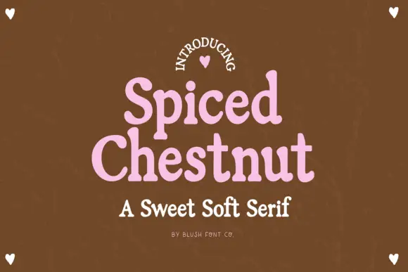
Sweet soft serif with rounded serifs
Spiced Chestnut is a sweet soft serif in pink on brown: heavy rounded letters with softened slab serifs, generous curves and a comfortable weight, set as two stacked words with a line beneath in the same family.
Ideas for this font
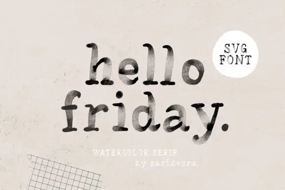
Lowercase typewriter-like forms with mottled gray-black interiors
Hello Friday is a lowercase typewriter-style serif in which the feet round off, the ascenders keep small upper terminals and the fill mottles from pale grey to near black, so a short line reads as uneven ink on a machine-typed page.
Ideas for this font
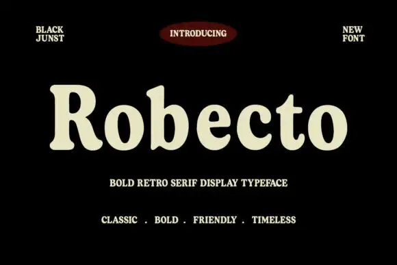
Heavy soft retro serif
Robecto is a heavy soft serif in cream on black: mixed case with thick stems, narrow counters, rounded shoulder ends and short bracketed serifs, set as one large word under a red oval badge and between two small tracked notes, with three tracked lines beneath that name its character.
Ideas for this font
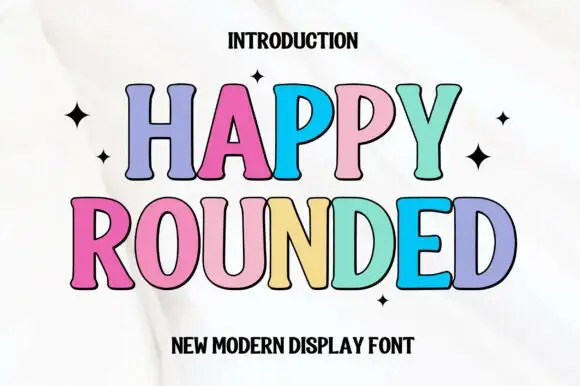
Tall display capitals with softly flared ends and gently bowed stems
Happy Rounded is a tall display serif in which the stems bow gently, the ends flare into soft spurs and the bowls stay wide, so a greeting reads as friendly lettering rather than as a formal title.
Ideas for this font
Same independent foundry
Allow optional Google Analytics to measure visits and catalogue actions. Your search words and notes are not included. Privacy & storage