Editorial Serif Anchor

Les Bridgetise + Resquel
Anchors Les Bridgetise's fluid strokes with crisp Roman proportions on wedding suites, headers and packaging.
Inspect Resquel specimenDisclosure: MakerFileHub may earn a commission from qualifying purchases via paid links on this page. How our links work.
Fine slanted script with expansive capitals
Les Bridgetise is a very fine slanted script whose tall capitals open into long entry loops while the lower-case stays narrow and high-waisted.
Paid link
Get this fontProject & layout blueprintsAt-a-glance maker compatibility
Fine grain and micro-texture excel in 300 DPI print, sublimation, and screen print rather than small vinyl weeding.
Visual anatomy & craft review
Stems are almost monoline but not quite: the upstrokes thin slightly and the capitals carry the only real flourish, which keeps long passages readable while the opening letters do the decorating. The L and B both begin with a wide arc that travels back across the previous word space, and the g descender crosses a low sweeping stroke, so the two flourish zones sit at opposite corners of a line. The buildings behind the sample are a pencil illustration rather than texture inside the face. Because the strokes are light, the face depends on contrast with its background far more than a weightier script would, which is a printing decision rather than a style preference.
Fine · Slanted · Ornamented
Two-font hierarchy recipes
Tested contrast partners — pairing Les Bridgetise with grounded secondary typography.
Les Bridgetise + Resquel
Anchors Les Bridgetise's fluid strokes with crisp Roman proportions on wedding suites, headers and packaging.
Inspect Resquel specimen
Les Bridgetise + Corven
Keeps small-scale dates, URLs, nutrition facts and care instructions crisp and legible below script titles.
Inspect Corven specimenPractical applications
Concrete hierarchy, scale and production guidance tailored to Les Bridgetise’s stroke geometry.
Light even strokes read as engraved calligraphy at stationery sizes, and the capital loops give a short name panel its ornament.
Hierarchy & layout recipe
Set the names at 30 pt on cream stock in a single dark ink, leave 10 mm clear at both ends for the entry loops, and keep the date below in a tracked serif at 9 pt.
Pre-production check
The hairlines vanish on textured card, so proof on the exact stock before printing a full suite.
A fine script over a plain ground gives an archival-feeling cover its ornamental line without adding a decorative border.
Hierarchy & layout recipe
Run the title at 54 pt, place it over a flat tint rather than a photograph, and keep body copy off the cover entirely so the flourish has room on both sides.
Pre-production check
Against a busy image the light strokes lose contrast, so test the background first and then size the script to it.
The narrow lower-case fits a small label while the capital loop supplies the brand signature in one move, without needing a separate logo mark.
Hierarchy & layout recipe
Keep the script at 12 pt on a 60 by 40 mm label, set the product name in a small serif at 8 pt beneath, and leave 4 mm at the right edge for the closing stroke.
Pre-production check
At 12 pt the entry loop is the first thing to disappear, so check it on the actual label stock rather than on screen.
Technical & licence verification
Confirm included OTF/TTF/WOFF formats, full glyph tables and licence coverage on the live store page before batch production.
Closest visual alternatives
Matched across letterform anatomy, stroke behaviour and craft applications.
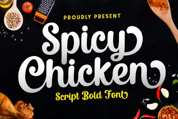
Heavy rounded script with bold swashes
Spicy Chicken is a heavy rounded script in white and cream on a dark kitchen surface: fat connected letters, bold swash terminals and a tight, confident speed.
Ideas for this font
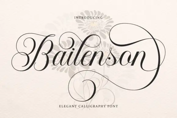
Steeply slanted fine links with thick curved downstrokes
Bailenson runs steeply slanted fine links against thick curved downstrokes, the capital B curls far to the left and the terminal n carries large upper and lower loops that close around the word.
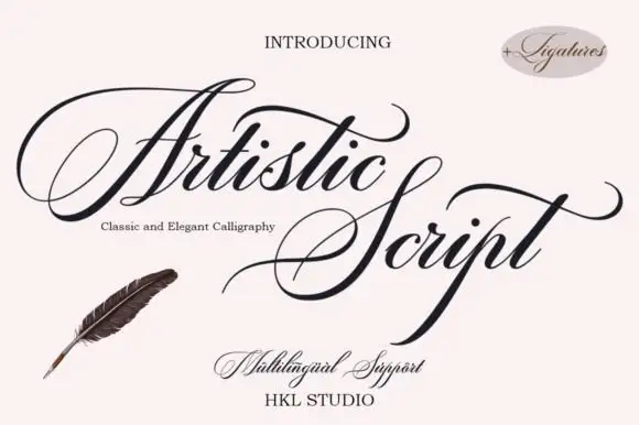
Pointed copper-style script with fine looping connectors and deep descenders
Artistic Script is a pointed copper-style calligraphy in which the downstrokes narrow to a point, the connectors thin to hairlines, the A reaches far to the left and the p drops deep below the line, so a name reads as engraved pen work.
Ideas for this font
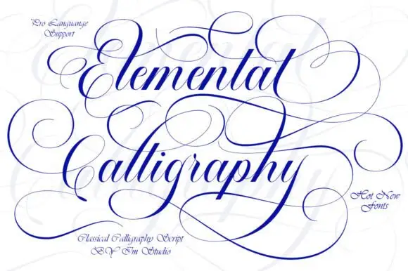
Fine expansive copperplate-style script
Elemental Calligraphy shows high-contrast slanted letters with expansive hairline loops, where the E and C initials and long y returns cross the space around both lines instead of staying inside them.
Same independent foundry
Allow optional Google Analytics to measure visits and catalogue actions. Your search words and notes are not included. Privacy & storage