Editorial Serif Anchor

Dusty Archive + Auretha
Anchors Dusty Archive's fluid strokes with crisp Roman proportions on wedding suites, headers and packaging.
Inspect Auretha specimenDisclosure: MakerFileHub may earn a commission from qualifying purchases via paid links on this page. How our links work.
3-style historical quill calligraphy family (Regular, Rough & Ink!)
Dusty Archive is a refined 3-style historical penmanship script ('REGULAR | ROUGH | INK') with sweeping quill flourishes and stylistic alternates!
Paid link
Get this fontProject & layout blueprintsAt-a-glance maker compatibility
Fine grain and micro-texture excel in 300 DPI print, sublimation, and screen print rather than small vinyl weeding.
Visual anatomy & craft review
Dusty Archive is a historical penmanship script in three styles — regular, rough and ink — with sweeping quill flourishes, tall slanted ascenders and stylistic alternates, so a line reads as a handwritten letter from an archive. The rough and ink versions add simulated bleed and blot, which means the family can carry a suite from clean to aged, and the flourishes need headroom. It needs roughly 22 mm for the flourishes to read, and it is best in chalk ivory on a dark ground or dark ink on aged paper, but best of all in the regular style for text.
3-style-archive · Quill-penmanship · Dark-academia
Two-font hierarchy recipes
Tested contrast partners — pairing Dusty Archive with grounded secondary typography.
Dusty Archive + Auretha
Anchors Dusty Archive's fluid strokes with crisp Roman proportions on wedding suites, headers and packaging.
Inspect Auretha specimen
Dusty Archive + Cenura
Keeps small-scale dates, URLs, nutrition facts and care instructions crisp and legible below script titles.
Inspect Cenura specimenPractical applications
Concrete hierarchy, scale and production guidance tailored to Dusty Archive’s stroke geometry.
Quill penmanship reads as a period document, which is what a history title wants on a cover. The three styles let the same face set a clean subtitle and an aged pull quote, and the flourishes hold at 60 pt on coated stock.
Hierarchy & layout recipe
Cover 152 x 229 mm, title 58 pt with 10 mm flourish clearance, subtitle 12/16 pt, 18 mm margins and 10 mm trim. Spread 420 x 297 mm, opener 90 mm, body 10/15 pt. Quote panel 120 x 90 mm, text 18/24 pt.
Pre-production check
The rough and ink styles simulate blot, and a 12 pt subtitle in either one fills into a dirty block. Use the regular style for text, and keep the other two above 24 pt, checking one printed signature.
Historical penmanship reads as a letter kept in a family archive, which is what a heritage-venue wedding borrows. The clean style sets the details at 9 pt while the flourishes crown the names, and the family covers the whole suite from one file.
Hierarchy & layout recipe
Invitation 130 x 180 mm, names 28 mm with 10 mm flourish clearance, details 9/13 pt, 15 mm margins. Service 105 x 148 mm, heading 14 pt, text 8/11 pt. Vow card 105 x 148 mm, text 9/14 pt.
Pre-production check
A 9 pt detail line in the ink style prints as a smudge on textured card and the venue line becomes unreadable. Set details in the regular style only, and check one proof on the final stock.
Penmanship script reads as a letter rather than a card, which is what a formal thank-you is. The clean style writes a full message at 9 pt, and the flourishes on the salutation give the letter its archive feel without an ornament.
Hierarchy & layout recipe
Sheet 148 x 210 mm, salutation 20 mm, body 9/13.5 pt, 20 mm margins. Note 105 x 148 mm, greeting 16 mm, body 8/11 pt. Tag 50 x 90 mm, word 10 mm with a 5 mm hole and 6 mm clear card.
Pre-production check
A full page of 9 pt quill script with long flourishes slows reading and the letter looks decorative rather than written. Cap the flourishes at the salutation, and check one printed sheet at final size.
Technical & licence verification
Confirm included OTF/TTF/WOFF formats, full glyph tables and licence coverage on the live store page before batch production.
Closest visual alternatives
Matched across letterform anatomy, stroke behaviour and craft applications.
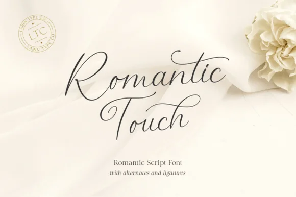
Ultra-fine airy fountain-pen calligraphy script
Romantic Touch is a feather-light, fluid handwritten script featuring wide looped capitals, flying t-crossbars, and delicate nib movement.
Ideas for this font
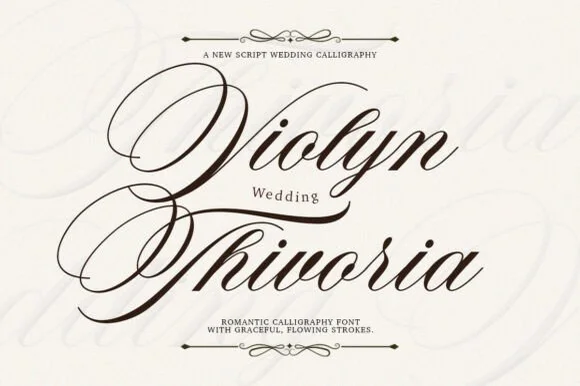
Grand copperplate wedding calligraphy with multi-looped capitals
Violyn Wedding Thivoria is a formal slanted calligraphy script distinguished by sweeping multi-looped capitals and smooth shaded lowercase.
Ideas for this font
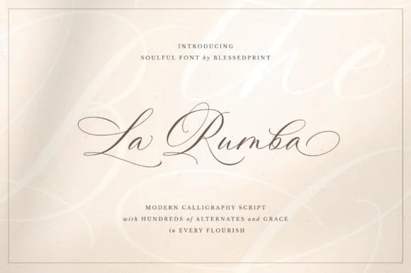
Fine-pointed copperplate wedding calligraphy with hundreds of alternates
La Rumba is a delicate, slanted copperplate calligraphy script featuring sweeping hairline entry loops, shaded downstrokes, and hundreds of alternates.
Ideas for this font
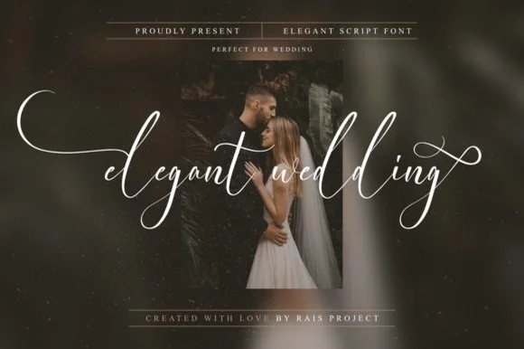
PUA-encoded ultra-delicate wide-swashed bridal script
Elegant Wedding is a PUA-encoded wispy fine-art calligraphy script stretching dramatic horizontal wing swashes from lowercase initial and final letters.
Same independent foundry
Allow optional Google Analytics to measure visits and catalogue actions. Your search words and notes are not included. Privacy & storage