Editorial Serif Anchor

Thirty Pages - Handwritten Script + Evoire
Anchors Thirty Pages - Handwritten Script's fluid strokes with crisp Roman proportions on wedding suites, headers and packaging.
Inspect Evoire specimenDisclosure: MakerFileHub may earn a commission from qualifying purchases via paid links on this page. How our links work.
Clean connected handwritten script with alternates
Thirty Pages is a clean connected handwriting script in near-black on cream felt: tall ascenders, small open bowls and a light even stroke, sold with seven stylistic alternates for the capitals.
Paid link
Get this fontProject & layout blueprintsAt-a-glance maker compatibility
Fine grain and micro-texture excel in 300 DPI print, sublimation, and screen print rather than small vinyl weeding.
Visual anatomy & craft review
The specimen sets the two words in one line, and the letterforms are close to a careful hand written with a fine pen: the T is a tall stem with a sweeping crossbar, the h and the l rise well above the x-height, the r is a small hook and the s closes tight. The stroke is monoline and light, the joins are short and clean, and the slant is slight, so the face stays legible at sizes where a flamboyant script would fall apart. Around the words a drawn red bird and a pressed flower sit on a cream felt ground, and two columns of small text explain the alternates: an uppercase set with seven swappable forms, which is what lets a designer repeat a letter without a visible twin. The face is a stationery handwriting for invitations, notes, labels and short brand lines, and it prints best in one dark ink on a light textured ground.
A neat hand with tall ascenders and seven alternates
Two-font hierarchy recipes
Tested contrast partners — pairing Thirty Pages - Handwritten Script with grounded secondary typography.
Thirty Pages - Handwritten Script + Evoire
Anchors Thirty Pages - Handwritten Script's fluid strokes with crisp Roman proportions on wedding suites, headers and packaging.
Inspect Evoire specimen
Thirty Pages - Handwritten Script + One More
Keeps small-scale dates, URLs, nutrition facts and care instructions crisp and legible below script titles.
Inspect One More specimenPractical applications
Concrete hierarchy, scale and production guidance tailored to Thirty Pages - Handwritten Script’s stroke geometry.
A clean hand keeps a date and a place readable at a small size, and the alternates stop repeated letters from looking like a stamp.
Hierarchy & layout recipe
Print a 105 by 148 mm card: set the date line at 22 pt on one row, keep 12 mm of clear ground beneath before the venue at 9 pt, and hold 12 mm of margin on all sides.
Pre-production check
Light joins can break at twenty-two points on textured card; print one card on the intended stock and check a connector before the run.
A neat hand reads as the baker's own writing on the bag, which is warmer than a typed label and cheaper than a custom mark.
Hierarchy & layout recipe
Print a 70 by 45 mm label: set the shop name at 15 pt on one row, keep 5 mm of clear ground beneath before the address at 5.5 pt, and hold 4 mm of margin on all sides.
Pre-production check
A fine stroke on a bag can fill with ink; print one label on the real material and check the thin letters before the order.
A handwriting script on an envelope is the cheapest way to make a posted invitation feel personal, and the light stroke suits a printed address.
Hierarchy & layout recipe
Print a C6 envelope front: set the name at 16 pt, keep the address line at 9.5 pt with 4 mm of leading, and hold 18 mm of clear space from the right edge so the stamp is not crowded.
Pre-production check
Envelopes feed unevenly and the hand can drift; print one envelope on the real stock and check the baseline before the batch.
Technical & licence verification
Confirm included OTF/TTF/WOFF formats, full glyph tables and licence coverage on the live store page before batch production.
Closest visual alternatives
Matched across letterform anatomy, stroke behaviour and craft applications.
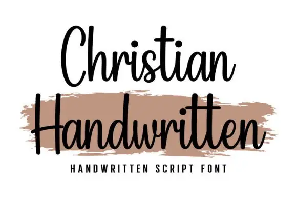
Upright compact connected script
Christian is an upright connected script with a compact rhythm, a heavy-brush companion line beneath it and no forward slant at all across the alphabet.
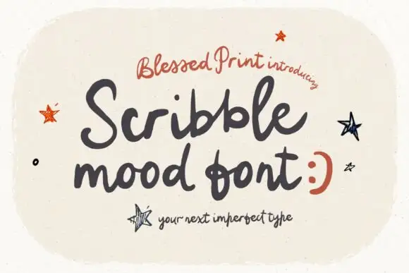
Loose rough handwritten script
Scribblemood is a loose rough handwritten script in charcoal on speckled cream: fat uneven strokes, letters of different heights and a deliberately unpolished line, presented as an imperfect type with drawn stars around it.
Ideas for this font
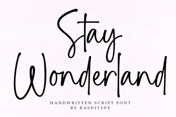
Thin monoline signature script
Stay Wonderland is a thin monoline signature script in black on white: tall narrow loops, a stem on the S that rises above the cap line, a straight-tailed y, and a spacing wide enough that the word reads as a signature written quickly.
Ideas for this font
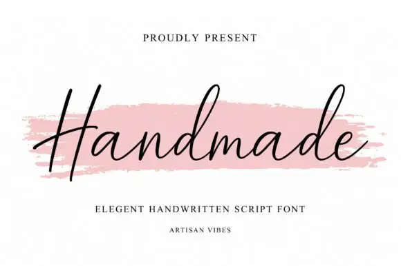
Fine slanted handwriting with a long flat entry and an even light stroke
Handmade is fine slanted handwriting in a single even weight, with one long flat entry stroke crossing the whole word and letters that stay lean and open throughout.
Ideas for this font
Same independent foundry
Allow optional Google Analytics to measure visits and catalogue actions. Your search words and notes are not included. Privacy & storage