Modern Grotesque Body

Super Quirky + Kohilo
Creates crisp high-hierarchy contrast beneath Super Quirky headlines across menus, websites and labels.
Inspect Kohilo specimenDisclosure: MakerFileHub may earn a commission from qualifying purchases via paid links on this page. How our links work.
Quirky serif with uneven feet and a bouncy baseline
Super Quirky is a playful serif in warm grey on pale pink: fat rounded letters with small quirky serifs, uneven feet and a baseline that rises and falls, set as two stacked words with a tracked line beneath.
Paid link
Get this fontProject & layout blueprintsAt-a-glance maker compatibility
Sturdy stroke walls and open counters weed cleanly on adhesive vinyl, HTV apparel film, and cut cardstock.
Visual anatomy & craft review
Two words are stacked and the face is a playful serif: the stems are thick with rounded terminals, the serifs are small wedges that do not sit level, the bowls are almost circular, the Q carries a tail that curls out below, the r ends in a small hook and the y drops a tail that lifts back to the right, while the baseline moves between letters so the words look hand-set. The quirk is in the details rather than in the proportions, which keeps the face readable: at a distance it reads as a soft serif, and up close the uneven feet and small hooks appear. A tracked capital line beneath names the style in the same face at a small size, and the ground is a pale pink scattered with small white dots. Super Quirky is a display face for cards, packaging, children's products and social graphics, and it needs short phrases and a light ground.
Quirky, soft, playful
Two-font hierarchy recipes
Tested contrast partners — pairing Super Quirky with grounded secondary typography.
Super Quirky + Kohilo
Creates crisp high-hierarchy contrast beneath Super Quirky headlines across menus, websites and labels.
Inspect Kohilo specimen
Super Quirky + Simple Handwriting
Adds a warm human signature touch for 1-to-3-word callouts without competing against structured serif capitals.
Inspect Simple Handwriting specimenPractical applications
Concrete hierarchy, scale and production guidance tailored to Super Quirky’s stroke geometry.
A soft quirky serif sets a warm tone without the formality of a classic face, and the uneven feet keep a short greeting from looking mechanical.
Hierarchy & layout recipe
Print a 105 by 148 mm card: set the greeting at 30 pt over two lines, keep 14 mm of clear ground beneath before the note at 9 pt, and hold 12 mm of margin on all four sides.
Pre-production check
A bouncy baseline on two lines needs more leading; print one card and check the descenders clear.
A friendly serif marks a reading area politely, and the heavy strokes stay legible on a sign seen from the far side of a classroom.
Hierarchy & layout recipe
Print an A4 sign at 210 by 297 mm: set the words at 48 pt over two lines, keep 20 mm of clear ground beneath before the rules at 12 pt, and hold 18 mm of margin on all four sides.
Pre-production check
Soft grey on a pale wall loses contrast; print one sign and view it on the actual wall before laminating.
A quirky serif gives a jar a handmade identity, and the small serifs survive a simple one-colour print on a paper label.
Hierarchy & layout recipe
Print a 50 by 65 mm label: set the brand at 13 pt on one line, keep 5 mm of clear ground beneath before the scent at 4.5 pt, and hold 4 mm of margin on all four sides.
Pre-production check
Small serifs can fill on a rough paper; print one label on the real stock and check the joins.
Technical & licence verification
Confirm included OTF/TTF/WOFF formats, full glyph tables and licence coverage on the live store page before batch production.
Closest visual alternatives
Matched across letterform anatomy, stroke behaviour and craft applications.
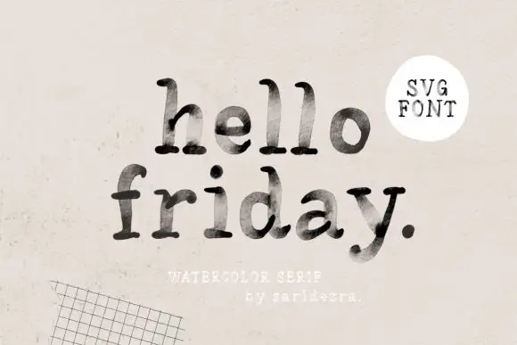
Lowercase typewriter-like forms with mottled gray-black interiors
Hello Friday is a lowercase typewriter-style serif in which the feet round off, the ascenders keep small upper terminals and the fill mottles from pale grey to near black, so a short line reads as uneven ink on a machine-typed page.
Ideas for this font
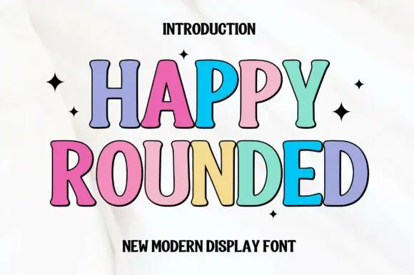
Tall display capitals with softly flared ends and gently bowed stems
Happy Rounded is a tall display serif in which the stems bow gently, the ends flare into soft spurs and the bowls stay wide, so a greeting reads as friendly lettering rather than as a formal title.
Ideas for this font
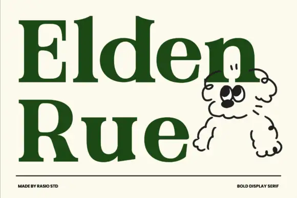
Bold display serif with wide bowls and a low contrast
Elden Rue is a bold display serif in which the bowls run wide, the contrast stays low and the serifs stay blunt, so a two-word title reads as a confident printed masthead rather than as a delicate one.
Ideas for this font
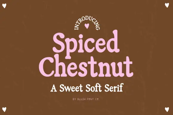
Sweet soft serif with rounded serifs
Spiced Chestnut is a sweet soft serif in pink on brown: heavy rounded letters with softened slab serifs, generous curves and a comfortable weight, set as two stacked words with a line beneath in the same family.
Ideas for this font
Same independent foundry
Allow optional Google Analytics to measure visits and catalogue actions. Your search words and notes are not included. Privacy & storage