High-Contrast Display Serif

Bergham + Orvelia
Pairs sculptural editorial warmth with Bergham's clean modern geometry.
Inspect Orvelia specimenDisclosure: MakerFileHub may earn a commission from qualifying purchases via paid links on this page. How our links work.
Experimental gothic display mixing blackletter and swash forms
Bergham is an experimental display alphabet in which blackletter skeletons meet wide swashes, the stems break into angular joints and some letters carry long tails, so a word reads as a modern take on a gothic sign.
Paid link
Get this fontProject & layout blueprintsAt-a-glance maker compatibility
Sturdy stroke walls and open counters weed cleanly on adhesive vinyl, HTV apparel film, and cut cardstock.
Visual anatomy & craft review
The B keeps two angular bowls on a broken stem, the E turns three short arms with a swash foot, the R throws a hooked leg, the G closes a square bowl with a spur and the H sets a low bar, all at a heavy weight with angular terminals and wide flourishes drawn from the letterforms. The gothic skeleton with modern swashes is the character: the face looks historical without being a copy of a fraktur, which is why the sample sets one word across a dark field. Because the joints are angular, the face needs 40 pt before they read cleanly, and it prints best in one colour at high contrast. The dark interior, the gold hairlines and the small caps are presentation; the white display word is the face.
Blackletter · Experimental · Swash
Two-font hierarchy recipes
Tested contrast partners — pairing Bergham with grounded secondary typography.
Bergham + Orvelia
Pairs sculptural editorial warmth with Bergham's clean modern geometry.
Inspect Orvelia specimen
Bergham + I Heart You
Introduces organic movement on pull-quotes, signatures and gift tags.
Inspect I Heart You specimenPractical applications
Concrete hierarchy, scale and production guidance tailored to Bergham’s stroke geometry.
The angular gothic shapes suit a dark event, and the wide swashes keep a single word readable at 90 mm in white on black.
Hierarchy & layout recipe
Print an A2 poster: set the title at 90 mm in white, keep 35 mm of border so the swash tails finish inside the sheet, and set the venue line in a 14 pt caps sans at the foot.
Pre-production check
A swash tail printed to the edge of a poster looks cut; check the imposed poster and pull the word in by 10 mm.
The gothic register gives a brewery a mark with history, and the heavy stems hold a short beer name at 22 pt on a paper label.
Hierarchy & layout recipe
Print a 70 by 50 mm label: set the beer name at 22 pt, set the strength in a 7 pt sans beneath, and keep 5 mm from the die so the angular joints are inside the cut.
Pre-production check
Angular joints cut by a small die lose their corners; check the imposed label and keep 4 mm of clear ground around the word.
The experimental gothic gives a history feature a period edge without a literal blackletter, and the heavy weight holds at 64 pt.
Hierarchy & layout recipe
Print an A4 spread: set the section head at 64 pt across the top, set the standfirst in a 10 pt serif beneath, and keep 18 mm of clearance so the swash feet clear the copy.
Pre-production check
A swash foot running into the first line of text reads as a collision; check the proof and open 6 mm of space under the head.
Technical & licence verification
Confirm included OTF/TTF/WOFF formats, full glyph tables and licence coverage on the live store page before batch production.
Closest visual alternatives
Matched across letterform anatomy, stroke behaviour and craft applications.

Contrasting sans capitals and fine signature duo
Brown Carolina Duo contrasts broad high-contrast capitals with a much finer narrow slanted script, set dark on a plain cream field, where the capital R legs sweep below the neighbouring letters and the script carries long tails that run past the ends of both words.
Ideas for this font
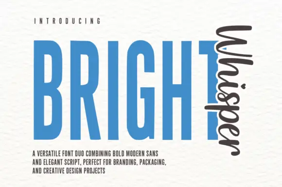
Very tall condensed bold sans paired with a loose script set vertically
Bright Whisper Duo pairs an extremely tall condensed sans in heavy weight with a loose upright script, and the sample sets the script sideways against the sans so the two voices sit at right angles.
Ideas for this font
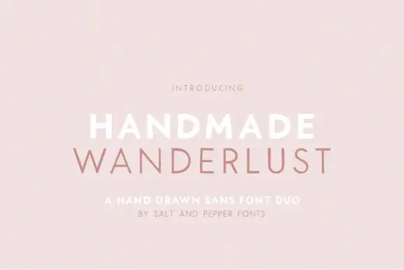
Spaced sans capitals shown in thick white and thin muted-pink lines
Handmade Wanderlust Duo shows two centred uppercase words on a soft pink background, where Handmade is white and noticeably heavier while Wanderlust beneath is thin, muted pink and more widely spaced, with slightly uneven edges and broad A and M diagonals.
Ideas for this font
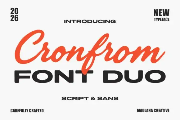
Slanted retro script paired with a wide bold sans in capitals
Cronfrom pairs a slanted retro script with a wide bold sans, so one lockup can carry a handwritten sign name and a hard-edged second line beneath it.
Ideas for this font
Same independent foundry
Allow optional Google Analytics to measure visits and catalogue actions. Your search words and notes are not included. Privacy & storage