Neutral Sans Workhorse

Tanod + Corven
Lets Tanod own the focal silhouette while handling secondary copy, sizing and subheads cleanly.
Inspect Corven specimenDisclosure: MakerFileHub may earn a commission from qualifying purchases via paid links on this page. How our links work.
Heavy rounded logo display
Tanod is a heavy rounded lowercase display in white on near-black: wide strokes with squared outer corners, circular bowls, an extended t arm and a final pair of letters drawn as an interwoven knot, with two pill labels at the upper right naming the style and the glyph count.
Paid link
Get this fontProject & layout blueprintsAt-a-glance maker compatibility
Sturdy stroke walls and open counters weed cleanly on adhesive vinyl, HTV apparel film, and cut cardstock.
Visual anatomy & craft review
The word is set in lowercase and runs the width of the plate, and the drawing is a heavy rounded display built for logos: the strokes are wide, the outer corners are squared while the interiors stay round, and the last two letters interlock, which is what gives the word its mark-like quality. That interlock is a deliberate construction rather than an effect, so the face is meant to be customised per word, and the plate is honest about it by showing one word at full width. The two pill labels at the upper right name the category and the glyph count, and the header row carries the foundry and the features. Because the strokes are heavy, the face works at screen and signage sizes, and the near-black ground makes the white read as a mark.
Display, logo, rounded, modern
Two-font hierarchy recipes
Tested contrast partners — pairing Tanod with grounded secondary typography.
Tanod + Corven
Lets Tanod own the focal silhouette while handling secondary copy, sizing and subheads cleanly.
Inspect Corven specimen
Tanod + Cronelo
Grounds bold display lettering with classic typographic authority on posters, badges and apparel.
Inspect Cronelo specimenPractical applications
Concrete hierarchy, scale and production guidance tailored to Tanod’s stroke geometry.
A heavy rounded display reads as a technology mark, and the interlocking letters let a short name become a memorable lockup without an icon.
Hierarchy & layout recipe
Set the mark at 20 pt in a footer, 70 mm on a screen mock and 110 mm on a hoarding, keeping the interlock only above 30 mm. Keep one colour and clear space equal to the stroke width.
Pre-production check
Check the 20 pt footer, where an interlock can close; drop it at that size. Confirm the hoarding reads at twelve metres and that the squared corners stay sharp in vinyl.
A logo display gives a studio a mark that reads as built rather than licensed, which is what a studio's own signage has to prove.
Hierarchy & layout recipe
Paint a 1,000 by 350 mm fascia: the name at 120 mm cap height, the discipline in a 22 mm sans, and a 4 mm rule. Keep 25 mm margins and paint one colour on a dark board.
Pre-production check
Check the fascia at six metres, where the interlock can read as a smudge; keep the gap above 8 mm. Confirm the 22 mm discipline reads at three metres and that the rule clears the fixings.
A heavy rounded mark prints as one screen and looks like real merchandise, which is exactly what a team shirt is meant to do.
Hierarchy & layout recipe
Print a 220 mm chest graphic: the name at 55 mm cap height, the year at 26 mm, and one ink on a dark shirt. Keep the interlock above 30 mm and place the graphic 80 mm below the collar.
Pre-production check
Check the screen at actual mesh, where an interlock can fill; open the gap. Wash-test one shirt and confirm the mark stays legible after five cycles.
Technical & licence verification
Confirm included OTF/TTF/WOFF formats, full glyph tables and licence coverage on the live store page before batch production.
Closest visual alternatives
Matched across letterform anatomy, stroke behaviour and craft applications.
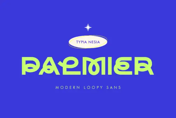
Low geometric display with interlaced loops
Palmier is a low geometric display in lime on royal blue: wide capitals with interlaced loops, flat extended lower arms, a squared o and a P whose bowl folds into the stem, set as one large word with a small badge above and a tracked line beneath.
Ideas for this font
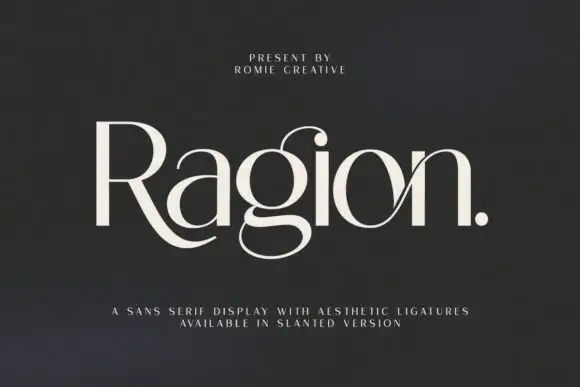
High-contrast display with ligatures
Ragion is a high-contrast display in cream on a dark ground: mixed case with a sweeping R leg that curls under the following letters, a looped g, a crossing join between o and n, hairline arms and rounded terminals, set as one large word with a full stop and two small tracked lines beneath.
Ideas for this font
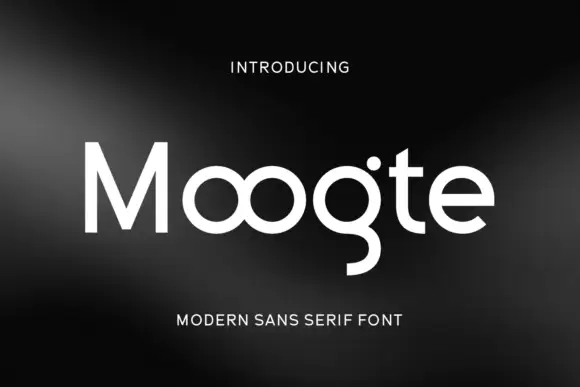
Joined circular display
Moogte is a joined circular display in white on a black ground: mixed case built from near-perfect circles, with the two o bowls fused into a single loop, a curling g descender and a cut on the t, set as one word with a small tracked line above and beneath.
Ideas for this font
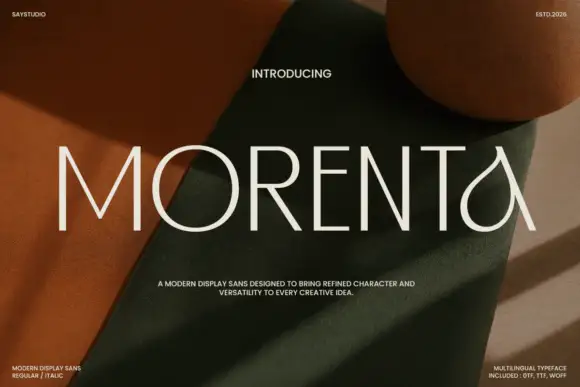
Thin straight display with teardrop forms
Morenta is a thin display in off-white over a rust and olive fabric still life: straight capitals with hairline-thin strokes, a teardrop-shaped A and a curved tail on the final letter, high contrast between the geometric stems and the curved finish, set as one large word with small tracked notes in each corner.
Ideas for this font
Same independent foundry
Allow optional Google Analytics to measure visits and catalogue actions. Your search words and notes are not included. Privacy & storage