Neutral Sans Workhorse

Dog Lover + Montreal
Lets Dog Lover own the focal silhouette while handling secondary copy, sizing and subheads cleanly.
Inspect Montreal specimenDisclosure: MakerFileHub may earn a commission from qualifying purchases via paid links on this page. How our links work.
Heavy rounded capitals with paw-shaped details overlapping counters and outer edges
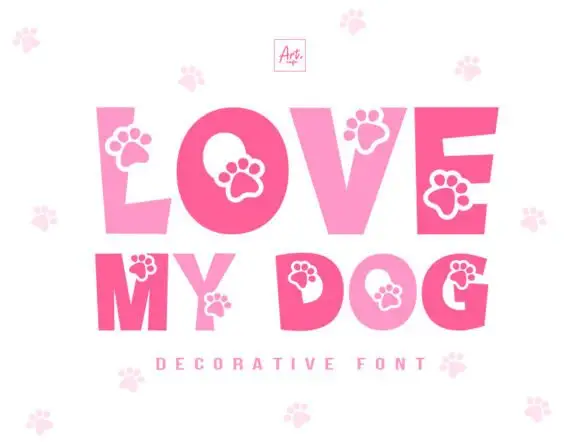
Dog Lover draws heavy rounded capitals in four shades of brown and cuts a paw print out of each letter, with a pale paw pattern repeating on the ground behind the words.
Paid link
Get this fontProject & layout blueprintsAt-a-glance maker compatibility
Weld or Unite overlapping script joins into one continuous vector path before sending to the blade.
Visual anatomy & craft review
DOG over LOVER fills the card, and each letter is a fat rounded shape in a different brown with a white paw print knocked out of it: one paw in the counter of the O, one in the bowl of the D, two in the E. The palette runs from dark chocolate to caramel, so the rows read as a graduated set rather than a random mix, and the ground is a pale cream scattered with faint paw prints at a much lower contrast. A small framed monogram sits at the top centre, and the letters are set tight with small overlaps. The construction is a colour font with the paw as part of the glyph, which is what makes it work at label size: the paw is drawn large enough to read, and the heavy outline holds the shapes apart.
Heavy rounded capitals with paw-shaped details overlapping counters and outer edges
Two-font hierarchy recipes
Tested contrast partners — pairing Dog Lover with grounded secondary typography.
Dog Lover + Montreal
Lets Dog Lover own the focal silhouette while handling secondary copy, sizing and subheads cleanly.
Inspect Montreal specimen
Dog Lover + Grandeur – Elegant Classic Serif
Grounds bold display lettering with classic typographic authority on posters, badges and apparel.
Inspect Grandeur – Elegant Classic Serif specimenPractical applications
Concrete hierarchy, scale and production guidance tailored to Dog Lover’s stroke geometry.
The paw prints say who the product is for before a customer reads a single word, and the four warm browns sit easily on a shelf of biscuits and chews.
Hierarchy & layout recipe
Print a 60 by 45 mm treat-bag label: set the bakery name at 16 pt on one row, keep 6 mm of clear ground beneath before the weight at 5 pt, and hold 5 mm from the paw shape to the die line.
Pre-production check
Paws close up below 18 pt; print one label on the real stock and check that the print still reads before the order.
The paws carry the theme in one word, and the heavy brown shapes read across a garden where a thinner face would vanish among balloons, bunting and a table full of paper plates.
Hierarchy & layout recipe
Print a 500 by 350 mm board: set the greeting at 90 pt across two rows, keep 24 mm of clear ground between the rows, and hold 26 mm of border so no paw is cut.
Pre-production check
Warm browns go flat on foam board; print one sign and check the contrast between the four shades.
One word does the introducing for a small business, and the paw cut gives a thin card a mark of its own without paying a designer for a logo first.
Hierarchy & layout recipe
Print a 105 by 148 mm card: set the greeting at 42 pt across two rows, keep 16 mm of clear ground beneath before the message at 9 pt, and hold 13 mm from the widest letter to the card edge.
Pre-production check
The pale ground pattern is not part of the font; print one card without it to check the letters stand alone.
Technical & licence verification
Confirm included OTF/TTF/WOFF formats, full glyph tables and licence coverage on the live store page before batch production.
Closest visual alternatives
Matched across letterform anatomy, stroke behaviour and craft applications.
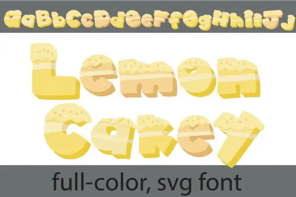
Cake-textured lettering
Lemon Cakey is a colour font on a white ground: irregular yellow letters built like slices of cake, with pale frosting across the top, small sprinkles and darker shaded sides, shown once as a full alphabet row at the head and then as two large words with a plain footer naming the format.
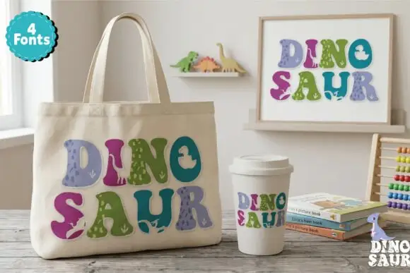
Soft chunky multicolour forms with small dinosaur-like silhouettes
Dinosaur Profonts fills chunky pastel capitals with dinosaur-skin textures, from scales to smooth hide, and sells four versions of the same alphabet so one word can mix four patterns.
Ideas for this font
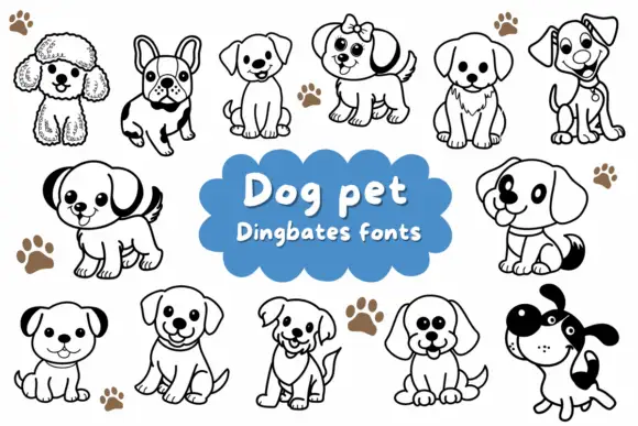
Rounded puppy outlines with dark ears, collars and varied facial expressions
Dog Pet is a typable set of about fifteen puppies — a poodle, a French bulldog, a spaniel, a terrier, a labrador, a dalmatian — drawn in a bold outline with a few patches solid black.
Ideas for this font
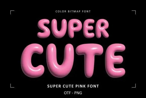
Glossy pink rounded display
Super Cute Font is a colour display on a black ground: glossy pink rounded capitals with soft highlights, dark shaded undersides and a slight taper, set in two lines inside small corner brackets, with a small note above and two plain lines beneath naming the style and the formats.
Ideas for this font
Same independent foundry
Allow optional Google Analytics to measure visits and catalogue actions. Your search words and notes are not included. Privacy & storage