High-Contrast Display Serif

Grizo Sans + Askinо
Pairs sculptural editorial warmth with Grizo Sans's clean modern geometry.
Inspect Askinо specimenDisclosure: MakerFileHub may earn a commission from qualifying purchases via paid links on this page. How our links work.
Heavy rounded capitals with compact counters and softly slanted outer edges
Grizo Sans stacks cream capitals around a burger photograph on navy, where broad rounded O and G bowls contain compact dark openings, the R carries a heavy angled leg and the Z a substantial diagonal, and the outer edges lean slightly.
Paid link
Get this fontProject & layout blueprintsAt-a-glance maker compatibility
Sturdy stroke walls and open counters weed cleanly on adhesive vinyl, HTV apparel film, and cut cardstock.
Visual anatomy & craft review
The bowls stay broad and round, the counters close compact, the outer edges slant a few degrees and the weight stays heavy across the row. That slant is the character: a rounded cap face gains a little momentum without becoming a slanted style, which is why the sample stacks lines around a photograph. The photograph covers several strokes, so check the letters on a plain proof, keep 32 pt and treat any branding claim as a caption rather than a test.
Heavy rounded capitals with compact counters and softly slanted outer edges
Two-font hierarchy recipes
Tested contrast partners — pairing Grizo Sans with grounded secondary typography.
Grizo Sans + Askinо
Pairs sculptural editorial warmth with Grizo Sans's clean modern geometry.
Inspect Askinо specimen
Grizo Sans + Easy Handwriting
Introduces organic movement on pull-quotes, signatures and gift tags.
Inspect Easy Handwriting specimenPractical applications
Concrete hierarchy, scale and production guidance tailored to Grizo Sans’s stroke geometry.
The heavy rounded caps suit a food sign, and the compact counters read at 56 mm on a painted panel, where the slanted edges keep the row lively.
Hierarchy & layout recipe
Paint a 500 by 250 mm panel: set the name at 56 mm on one row, keep the compact counters at 4 mm minimum, keep 22 mm of border all round, and varnish the panel so a wiped surface keeps its edges.
Pre-production check
Compact counters painted at 2 mm close; check the mask artwork and hold the name at 48 mm or above.
The rounded weight sets a friendly banner, and the broad bowls hold a name at 54 pt across an A3 sheet, where the slant keeps it from looking static.
Hierarchy & layout recipe
Print an A3 banner: set the name at 54 pt on one row, keep 22 mm beneath before the details at 13 pt, keep 20 mm of margin all round, and proof the slant on one sheet first.
Pre-production check
Two heavy rows on one sheet merge; check the banner and keep the second line in a lighter sans.
The heavy caps read from a corridor, and the compact forms hold a short sign at 48 pt on a printed sheet, where the rounded bowls stay clear at distance.
Hierarchy & layout recipe
Print an A4 sign: set the sign at 48 pt on one row, keep 20 mm of clear ground beneath before the opening hours at 13 pt, keep 20 mm of margin, and keep the letters on plain colour only.
Pre-production check
A photograph behind the type hides strokes; check the mounted sign and keep the letters on plain colour.
Technical & licence verification
Confirm included OTF/TTF/WOFF formats, full glyph tables and licence coverage on the live store page before batch production.
Closest visual alternatives
Matched across letterform anatomy, stroke behaviour and craft applications.
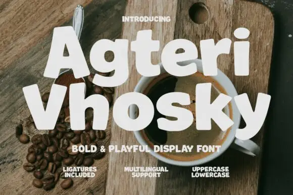
Heavy informal mixed case with tilted bodies and small round counters
Agteri Vhosky shows white mixed-case words over a coffee photograph, where heavy near-even strokes and softly irregular outlines create broad rounded bodies, a small triangular A counter and a lower y that descends into a wide curve.
Ideas for this font
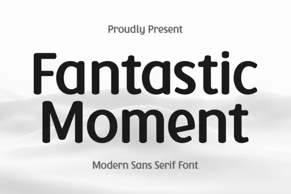
Soft-ended upright mixed case with broad bowls and a compact t crossbar
Fantastic Moment sets a rounded sans in black on a soft grey scene, its bowls open, its stems slightly flared and its weight even enough to read as a neutral modern voice.
Ideas for this font
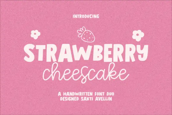
Chunky print and fine food-label script
Strawberry Cheesecake is a duo on chalky pink: a chunky rounded capital print for the loud word and a fine joined script for the flavour line, with a drawn strawberry and two small flowers.
Ideas for this font

Heavy round lowercase forms with a long K leg and deep j hook
Kohilo shows pale yellow heavy lettering against vivid red, where the dotted descending letter appears in a brighter yellow, the opening K sends a broad curved leg beneath the first round bowl and the central descender turns into a deep rounded hook.
Same independent foundry
Allow optional Google Analytics to measure visits and catalogue actions. Your search words and notes are not included. Privacy & storage