High-Contrast Display Serif

Fantastic Moment + Svara
Pairs sculptural editorial warmth with Fantastic Moment's clean modern geometry.
Inspect Svara specimenDisclosure: MakerFileHub may earn a commission from qualifying purchases via paid links on this page. How our links work.
Soft-ended upright mixed case with broad bowls and a compact t crossbar
Fantastic Moment sets a rounded sans in black on a soft grey scene, its bowls open, its stems slightly flared and its weight even enough to read as a neutral modern voice.
Paid link
Get this fontProject & layout blueprintsAt-a-glance maker compatibility
Sturdy stroke walls and open counters weed cleanly on adhesive vinyl, HTV apparel film, and cut cardstock.
Visual anatomy & craft review
The two rows fill the card, the F and the M keeping wide shoulders and the a a single-storey bowl that gives the word a younger feel than a grotesque would. Curves are generous, terminals cut at an angle so the letters stay crisp rather than soft, and the spacing sits open enough that the word never looks crowded. Two small captions frame the sample in a lighter weight of something else. This is the everyday kind of sans a small business reaches for: it holds a heading, it reads on a menu, and it does not insist on being noticed, which makes it useful and easy to replace.
Soft-ended upright mixed case with broad bowls and a compact t crossbar
Two-font hierarchy recipes
Tested contrast partners — pairing Fantastic Moment with grounded secondary typography.
Fantastic Moment + Svara
Pairs sculptural editorial warmth with Fantastic Moment's clean modern geometry.
Inspect Svara specimen
Fantastic Moment + Honey
Introduces organic movement on pull-quotes, signatures and gift tags.
Inspect Honey specimenPractical applications
Concrete hierarchy, scale and production guidance tailored to Fantastic Moment’s stroke geometry.
The open rounded forms stay friendly at sign size, and the even weight keeps a short cafe name clear from the pavement outside the door.
Hierarchy & layout recipe
Print a 700 by 300 mm board: set the cafe name at 74 mm on one row, keep 26 mm of clear ground beneath before the hours at 16 mm, and keep 30 mm of border so the flared stems keep their edge.
Pre-production check
Thin joints thin further in vinyl; check a cut test before the board is produced. Have the printer send a physical sample first.
The rounded shapes suit a small child's card, and the plain letterforms leave the photograph or the age number to carry the message.
Hierarchy & layout recipe
Print a 148 by 105 mm card: set the greeting at 34 pt on one row, keep 14 mm of clear ground beneath before the details at 9 pt, and keep 12 mm of margin on each side of the fold.
Pre-production check
Angled terminals clog at small sizes; check the printed card before the batch. Request a proof on the actual stock before signing off.
The neutral weight holds a heading without shouting, and the open bowls stay readable at the modest sizes a local paper prints at.
Hierarchy & layout recipe
Print an A4 page: set the heading at 36 pt across one row, keep 12 mm of clear ground beneath before the body text at 10 pt, and keep 14 mm of margin from the text block edge.
Pre-production check
Newsprint absorbs ink and thickens strokes; check a proof on the actual paper stock. Order one sample before committing to the run.
Technical & licence verification
Confirm included OTF/TTF/WOFF formats, full glyph tables and licence coverage on the live store page before batch production.
Closest visual alternatives
Matched across letterform anatomy, stroke behaviour and craft applications.
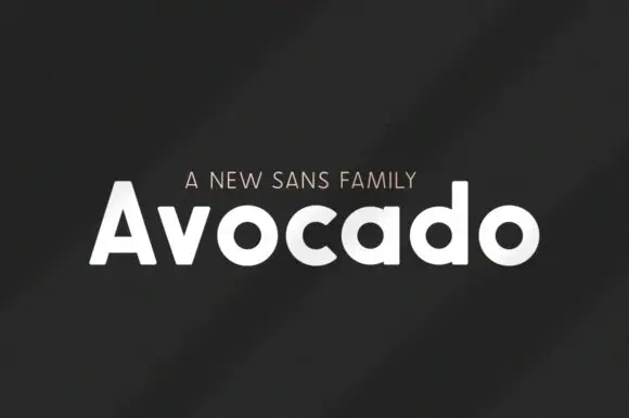
Heavy rounded mixed case with broad circular bowls and softly cut ends
Avocado is a bold geometric sans built on near-circular bowls, set in white on charcoal so the family reads as a clean modern voice rather than a decorative display face.
Ideas for this font
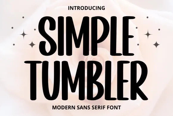
Tall informal sans
Simple Tumbler is a tall informal sans in black over a pale rose photograph: condensed capitals with rounded ends, uneven bowl widths and a slight bounce, with four sparkles at the sides and tracked lines above and beneath.
Ideas for this font
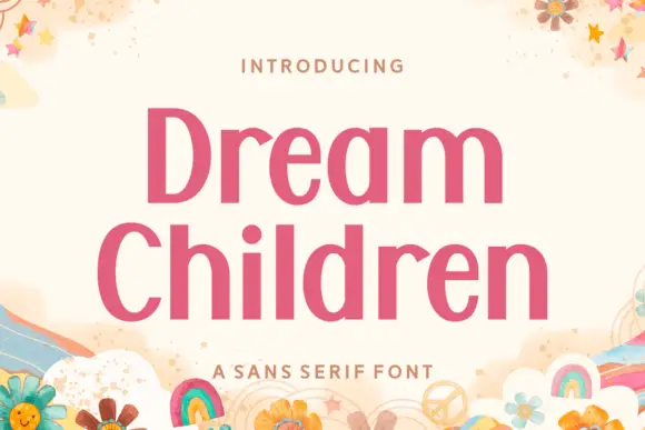
Upright contrast mixed case with oval bowls and a round i dot
Dream Children sets a bold pink grotesque in two stacked rows on a cream card, its bowls open, its terminals flat and its spacing tight enough that the pair reads as one block of colour.
Ideas for this font

Heavy round lowercase forms with a long K leg and deep j hook
Kohilo shows pale yellow heavy lettering against vivid red, where the dotted descending letter appears in a brighter yellow, the opening K sends a broad curved leg beneath the first round bowl and the central descender turns into a deep rounded hook.
Same independent foundry
Allow optional Google Analytics to measure visits and catalogue actions. Your search words and notes are not included. Privacy & storage