High-Contrast Display Serif

Agteri Vhosky + Cervelique
Pairs sculptural editorial warmth with Agteri Vhosky's clean modern geometry.
Inspect Cervelique specimenDisclosure: MakerFileHub may earn a commission from qualifying purchases via paid links on this page. How our links work.
Heavy informal mixed case with tilted bodies and small round counters
Agteri Vhosky shows white mixed-case words over a coffee photograph, where heavy near-even strokes and softly irregular outlines create broad rounded bodies, a small triangular A counter and a lower y that descends into a wide curve.
Paid link
Get this fontProject & layout blueprintsAt-a-glance maker compatibility
Sturdy stroke walls and open counters weed cleanly on adhesive vinyl, HTV apparel film, and cut cardstock.
Visual anatomy & craft review
The strokes stay heavy and even, the outlines wander slightly, the bodies tilt a few degrees and the counters close small. That tilt is the character: the word reads as hand-set by a sign painter rather than typed, which is why the sample stacks two rows over a photograph. The picture belongs to the presentation, so test the face on flat colour, keep 30 pt as the floor and allow 20 mm beneath for the wide y curve. The small counters are the first thing to plug: they fill at about 20 pt and the o and e turn into solid dots, so keep the floor at 30 pt and proof one print before the order.
Heavy informal mixed case with tilted bodies and small round counters
Two-font hierarchy recipes
Tested contrast partners — pairing Agteri Vhosky with grounded secondary typography.
Agteri Vhosky + Cervelique
Pairs sculptural editorial warmth with Agteri Vhosky's clean modern geometry.
Inspect Cervelique specimen
Agteri Vhosky + Coastal Honey
Introduces organic movement on pull-quotes, signatures and gift tags.
Inspect Coastal Honey specimenPractical applications
Concrete hierarchy, scale and production guidance tailored to Agteri Vhosky’s stroke geometry.
The heavy informal letters give a roaster warmth, and the rounded bodies hold a two-word name at 24 pt on a 55 mm panel, where the small counters stay open.
Hierarchy & layout recipe
Print a 55 by 40 mm label: set the name at 24 pt on one row, keep 8 mm of clear ground beneath for the y, and set the roast at 6 pt in a plain sans at the foot.
Pre-production check
Small counters close under 18 pt; check the plate proof and hold the name at 22 pt or above.
The tilted caps read across a counter, and the heavy strokes hold a short sign at 52 pt on a printed board, where the irregular outline keeps it approachable.
Hierarchy & layout recipe
Print a 500 by 250 mm board: set the sign at 52 pt on one row, keep 22 mm of clear ground beneath before the prices at 14 pt, and keep 22 mm of border all round.
Pre-production check
Prices set in the same tilted face look crooked; check the board and keep figures in a plain sans.
The informal weight keeps a note friendly, and the broad bodies hold a short line at 28 pt on an A6 card, where the tilt adds a personal tone.
Hierarchy & layout recipe
Print an A6 card: set the line at 28 pt across the upper third, keep 16 mm of clear ground beneath for the descender, and leave the lower half blank for handwriting.
Pre-production check
Two tilted rows stacked look like a printing error; check the card and keep the second line in a sans.
Technical & licence verification
Confirm included OTF/TTF/WOFF formats, full glyph tables and licence coverage on the live store page before batch production.
Closest visual alternatives
Matched across letterform anatomy, stroke behaviour and craft applications.
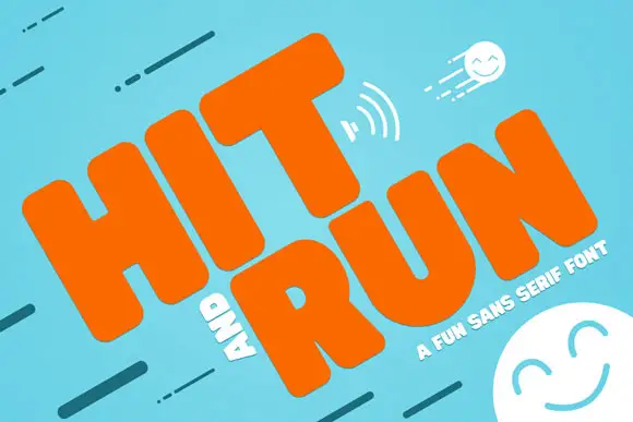
Heavy rounded capitals with soft block bodies and a tiny compact R opening
Hit and Run tilts orange uppercase words across turquoise, where thick soft-edged H and I stems sit beside a broad T crossbar and the R carries a small rounded counter with a substantial leg, while motion marks and smiling faces fill the cover around the words.
Ideas for this font
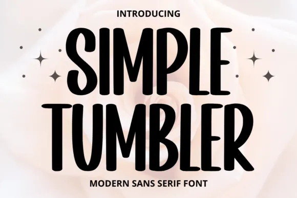
Tall informal sans
Simple Tumbler is a tall informal sans in black over a pale rose photograph: condensed capitals with rounded ends, uneven bowl widths and a slight bounce, with four sparkles at the sides and tracked lines above and beneath.
Ideas for this font

Heavy round lowercase forms with a long K leg and deep j hook
Kohilo shows pale yellow heavy lettering against vivid red, where the dotted descending letter appears in a brighter yellow, the opening K sends a broad curved leg beneath the first round bowl and the central descender turns into a deep rounded hook.
Bold rounded geometric display
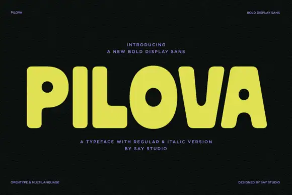
Pilova is a bold display sans in yellow on near-black: very wide rounded letters with almost circular counters, a short waist, and a dot on the i that sits clear of the stem, presented with small technical notes in the corners, so the plate reads as a contemporary display release.
Ideas for this font
Same independent foundry
Allow optional Google Analytics to measure visits and catalogue actions. Your search words and notes are not included. Privacy & storage