High-Contrast Display Serif

Strawberry Chesscake + Amor Hadena
Pairs sculptural editorial warmth with Strawberry Chesscake's clean modern geometry.
Inspect Amor Hadena specimenDisclosure: MakerFileHub may earn a commission from qualifying purchases via paid links on this page. How our links work.
Chunky print and fine food-label script
Strawberry Cheesecake is a duo on chalky pink: a chunky rounded capital print for the loud word and a fine joined script for the flavour line, with a drawn strawberry and two small flowers.
Paid link
Get this fontProject & layout blueprintsAt-a-glance maker compatibility
Weld or Unite overlapping script joins into one continuous vector path before sending to the blade.
Visual anatomy & craft review
STRAWBERRY fills the width in heavy rounded capitals, and the letters are drawn as thick tubes with flat sides and rounded ends: the S is a broad double curve, the W is wide, the B carries two even bowls and the whole row sits tight. cheesecake follows beneath in a fine joined script that is closer to handwriting than to calligraphy, with small loops and a light line that contrasts with the block above. A drawn strawberry with a leaf sits between the two words, two small flowers flank the first row, and a two-line caption at the foot names the duo and the designer. The pair is a food-packaging combination: the capitals carry the product, the script carries the flavour or the volume, and the weight contrast is what makes a small label read as a designed one.
A chalky pink duo for food packaging
Two-font hierarchy recipes
Tested contrast partners — pairing Strawberry Chesscake with grounded secondary typography.
Strawberry Chesscake + Amor Hadena
Pairs sculptural editorial warmth with Strawberry Chesscake's clean modern geometry.
Inspect Amor Hadena specimen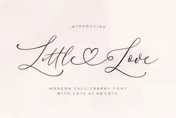
Strawberry Chesscake + Little Love
Introduces organic movement on pull-quotes, signatures and gift tags.
Inspect Little Love specimenPractical applications
Concrete hierarchy, scale and production guidance tailored to Strawberry Chesscake’s stroke geometry.
A chunky product word plus a fine flavour line is the standard hierarchy on a dessert label, and the pair supplies both without a second family.
Hierarchy & layout recipe
Print a 60 by 45 mm label: set the product at 15 pt in the caps, set the flavour at 8 pt in the script beneath with 5 mm of clear ground, and hold 4 mm of margin on all sides.
Pre-production check
Fine script at eight points can disappear on a coated label; print one on the real stock and check the loops before the order.
The pair sets a cheerful tone for a food-led celebration, and the drawn strawberry gives a plain card its one illustration.
Hierarchy & layout recipe
Print a 120 by 120 mm square card: set the greeting at 34 pt in the caps, set the detail at 10 pt in the script with 14 mm of clear ground, and hold 13 mm of margin.
Pre-production check
Two very different weights at close sizes look unbalanced; print one card and check the ratio reads as intended before the batch.
A chalky pink board above a counter reads at a glance, and the heavy capitals survive being seen at an angle behind glass.
Hierarchy & layout recipe
Print a 400 by 250 mm board: set the product at 70 pt in the caps, set the price at 24 pt beneath with 20 mm of clear ground, and hold 18 mm of border on all sides.
Pre-production check
Pastel chalk on a printed board can look washed out in a bright shop; print one board and check it in the actual lighting before the set.
Technical & licence verification
Confirm included OTF/TTF/WOFF formats, full glyph tables and licence coverage on the live store page before batch production.
Closest visual alternatives
Matched across letterform anatomy, stroke behaviour and craft applications.
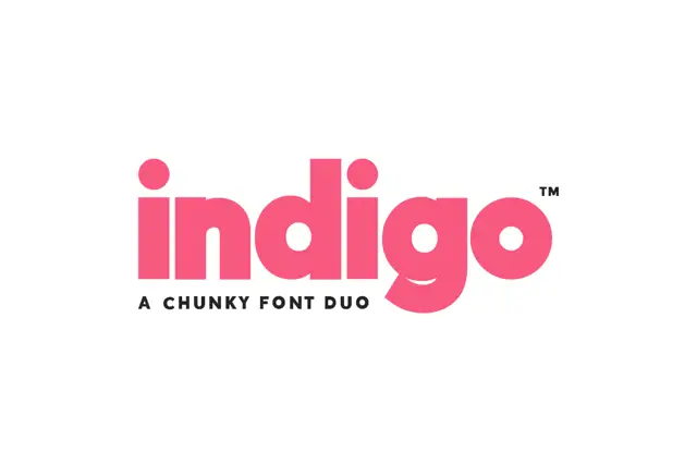
Very heavy geometric lowercase sans paired with a matching outline cut
Indigo is a two-cut duo in which a very heavy lowercase sans leaves small round counters and its outline twin keeps the same skeleton, so a header can be set solid, hollow, or stacked as a two-layer block.
Ideas for this font
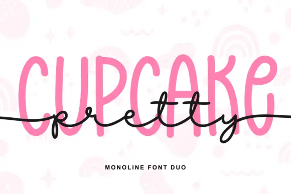
Tall monoline capitals with a flowing script
Pretty Cupcake is a monoline duo in pink and black: very tall condensed capitals with rounded stems, and a thin flowing script that runs across them at the waist, crossing the cap line on purpose.
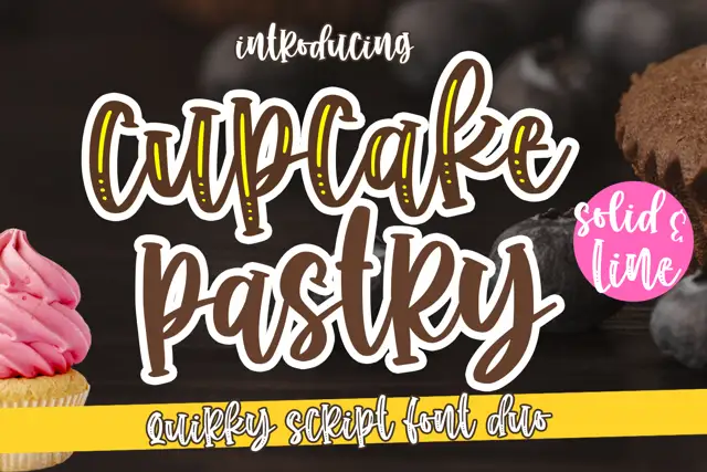
Chunky outlined script paired with a slim line script
Cupcake Pastry is a duo: a heavy rounded script with an outlined variant that stacks a light inline inside each stroke, paired with a thin monoline script that carries the second line of a title without competing with the first.
Ideas for this font
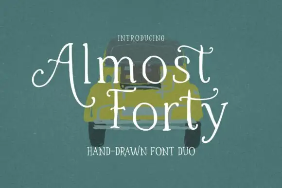
Light hand-drawn serif with curled crossbars paired with a plain companion cut
Almost Forty pairs a light hand-drawn serif whose crossbars curl at the ends with a plainer companion cut, so a title can be drawn and a supporting line can stay quiet in the same family.
Ideas for this font
Same independent foundry
Allow optional Google Analytics to measure visits and catalogue actions. Your search words and notes are not included. Privacy & storage