Modern Grotesque Body

Gritty Medieval + Miniplate
Creates crisp high-hierarchy contrast beneath Gritty Medieval headlines across menus, websites and labels.
Inspect Miniplate specimenDisclosure: MakerFileHub may earn a commission from qualifying purchases via paid links on this page. How our links work.
Rough stone-chipped medieval tavern & folklore serif
Gritty Medieval is a rugged, rough-edged medieval serif with hand-chipped contours that feel carved into tavern oak or iron.
Paid link
Get this fontProject & layout blueprintsAt-a-glance maker compatibility
Fine grain and micro-texture excel in 300 DPI print, sublimation, and screen print rather than small vinyl weeding.
Visual anatomy & craft review
Gritty Medieval is a sturdy medieval serif with hand-chipped contours, so the stems read as carved into oak or hammered iron rather than drawn with a distressed brush. The mixed-case serifs are broad and blunt, the terminals are nibbled rather than pointed, and the texture sits on the outside edges, which means the face gains roughness as it grows. It holds a short word strongly at 25 mm and above, pairs naturally with a plain text serif for detail, and is honest about being decoration: setting a paragraph in it would turn the chipped edges into noise.
Rough-hewn-serif · Tavern-brushstroke · Rustic-chronicler
Two-font hierarchy recipes
Tested contrast partners — pairing Gritty Medieval with grounded secondary typography.
Gritty Medieval + Miniplate
Creates crisp high-hierarchy contrast beneath Gritty Medieval headlines across menus, websites and labels.
Inspect Miniplate specimen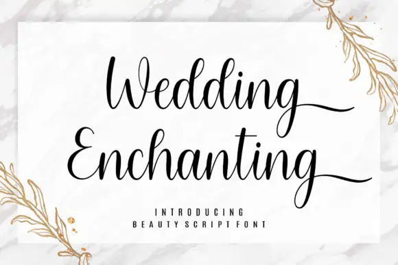
Gritty Medieval + Wedding Enchanting
Adds a warm human signature touch for 1-to-3-word callouts without competing against structured serif capitals.
Inspect Wedding Enchanting specimenPractical applications
Concrete hierarchy, scale and production guidance tailored to Gritty Medieval’s stroke geometry.
Chips on the outline read as a stamp struck into leather or a brand burned into a barrel, which is the material signal a faire vendor or a small brewery wants. Blunt serifs stay solid when the artwork is printed on a textured label stock.
Hierarchy & layout recipe
Tankard print 80 x 70 mm, word 18 mm, 6 mm margin. Ale label 90 x 110 mm, name 16 mm, abv 4.5 pt, 5 mm top arc. Sign 800 x 300 mm, word 140 mm, 60 mm margins, mounted on 12 mm oak.
Pre-production check
Textured label stock adds its own grain and the chipped edges read as a printing fault. Print a test on the actual stock, and if it looks muddy, drop the label to a smooth uncoated sheet and keep the texture for the sign.
A carved, blunt serif reads as an old document heading rather than a costume font, which lets a history podcast stay serious while still feeling period. The chipped edge survives heavy audio-platform thumbnails, where fine detail would vanish.
Hierarchy & layout recipe
Cover 3000 x 3000 px, title 380 px, subtitle 110 px, safe area 10 percent. Tavern sign 900 x 400 mm, word 180 mm. Jar label 70 x 50 mm, contents 12 mm, warning 4.5 pt.
Pre-production check
Podcast covers are shown at 55 px in some apps, where a chipped display serif turns to mush. Check the title rendered at 55 px, and simplify to a short word or two initials if the chips close.
Rough carved letterforms read as a printed farm sign, which suits a harvest ale better than a clean modern slab. Heavy outlines hold on a price board that is read from a car.
Hierarchy & layout recipe
Label 80 x 100 mm, name 14 mm, abv 4.5 pt. Poster A2, title 160 mm, details 20/26 pt, 35 mm margins. Price board 600 x 400 mm, item 40 mm, price 34 mm on a 60 mm column.
Pre-production check
Posters go up outdoors on bonfire night, and humid air curls thin paper against the ink. Print on 170 gsm with a matt laminate or mount on 3 mm board, then check one fixed poster after a damp evening.
Technical & licence verification
Confirm included OTF/TTF/WOFF formats, full glyph tables and licence coverage on the live store page before batch production.
Closest visual alternatives
Matched across letterform anatomy, stroke behaviour and craft applications.
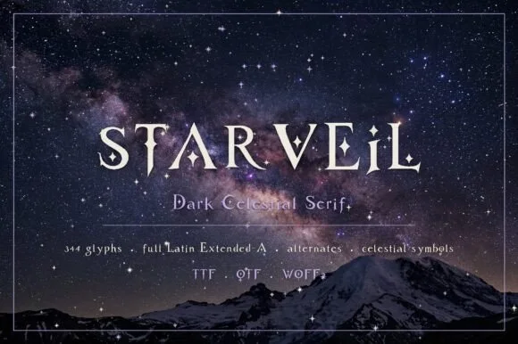
Dark celestial serif with crescent moons & stars (344 glyphs, OTF/TTF/WOFF2)
Starveil is a dark celestial display serif (344 glyphs, Latin Extended-A, TTF/OTF/WOFF2) embedding crescent moons and star sparkles into flared stems.
Ideas for this font
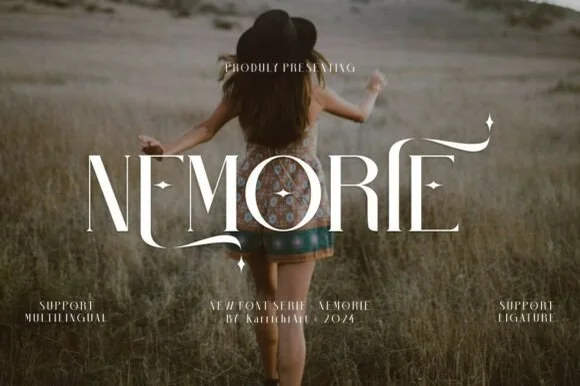
Celestial high-contrast art-nouveau & fantasy ligature serif
Nemorie is a refined high-contrast display serif featuring sweeping scythe-like swash bars, sculpted ligatures, and four-point star accents.
Ideas for this font
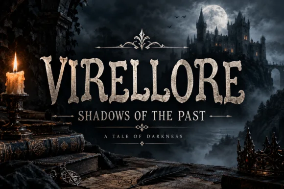
Rugged ornamental display serif
Virellore is an ornate display serif in weathered cream on a dark gothic scene: heavy bracketed serifs, split terminals, small thorns along the strokes, and rules with diamond finials between the lines, so the plate reads as a fantasy title card rather than as an editorial serif.
Ideas for this font
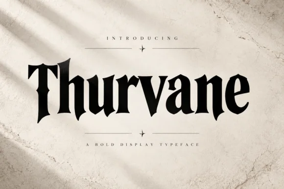
Heavy blade-spurred gothic wedge serif (OTF)
Thurvane is a bold hybrid gothic-wedge serif merging heavy Roman readability with sharp medieval diamond spurs and blade hooks (OTF).
Ideas for this font
Same independent foundry
Allow optional Google Analytics to measure visits and catalogue actions. Your search words and notes are not included. Privacy & storage



