Neutral Sans Workhorse

Graffiti + Helina
Lets Graffiti own the focal silhouette while handling secondary copy, sizing and subheads cleanly.
Inspect Helina specimenDisclosure: MakerFileHub may earn a commission from qualifying purchases via paid links on this page. How our links work.
Angular graffiti capitals with heavy outline styling
Graffiti shows large irregular capitals with pointed corners, uneven heights and sharply angled joins, where a thick white border and a dark shadow separate the multicolour word from the wall behind it and the letters overlap their own baseline.
Paid link
Get this fontProject & layout blueprintsAt-a-glance maker compatibility
Sturdy stroke walls and open counters weed cleanly on adhesive vinyl, HTV apparel film, and cut cardstock.
Visual anatomy & craft review
The caps stay angular, the heights wander, the joins cut sharp and the outline holds the silhouette together. That outline is the character: the word survives a busy wall because a pale border repeats its whole contour, which is why the sample keeps a filled gradient behind it. The gradient fill and the surrounding graffiti belong to the cover, so build the outline yourself in layout, keep 44 pt before the angular joins merge and avoid stacking two outlined rows.
Angular graffiti capitals with heavy outline styling
Two-font hierarchy recipes
Tested contrast partners — pairing Graffiti with grounded secondary typography.
Graffiti + Helina
Lets Graffiti own the focal silhouette while handling secondary copy, sizing and subheads cleanly.
Inspect Helina specimen
Graffiti + Brenco
Grounds bold display lettering with classic typographic authority on posters, badges and apparel.
Inspect Brenco specimenPractical applications
Concrete hierarchy, scale and production guidance tailored to Graffiti’s stroke geometry.
The angular caps set a street poster, and the irregular heights hold a two-word title at 56 pt on an A2 sheet, where the thick outline keeps the letters apart.
Hierarchy & layout recipe
Print an A2 poster: set the title at 56 pt on one row, keep 24 mm of clear ground beneath before the times at 15 pt, and add the pale outline in layout at 1.5 mm so the file stays one colour.
Pre-production check
An outline drawn too thin at 30 pt reads as a halo; check the proof and keep the title at 46 pt or above.
The pointed forms suit a shirt print, and the heavy bodies hold a short name at 55 mm across a printed panel, where the outline separates the word from the fabric.
Hierarchy & layout recipe
Print a 250 mm chest panel: set the name at 55 mm on one row, keep 12 mm between letters so the pointed joins stay distinct, and keep 18 mm of margin from the side seams.
Pre-production check
Pointed corners under 3 mm fill in on a screen; check the pull and keep the name at 48 mm or above.
The angular lettering reads on a wall sign, and the uneven heights hold a short phrase at 50 mm on a painted panel, where the dark shadow gives it lift.
Hierarchy & layout recipe
Paint a 700 by 350 mm panel: set the phrase at 50 mm on one row, keep 24 mm of clear ground beneath before the rules at 14 pt, and keep 26 mm of border so the outline is not cut.
Pre-production check
A painted shadow drifts off the contour; check the mask and keep the shadow offset even, cutting one panel before the rest are painted.
Technical & licence verification
Confirm included OTF/TTF/WOFF formats, full glyph tables and licence coverage on the live store page before batch production.
Closest visual alternatives
Matched across letterform anatomy, stroke behaviour and craft applications.
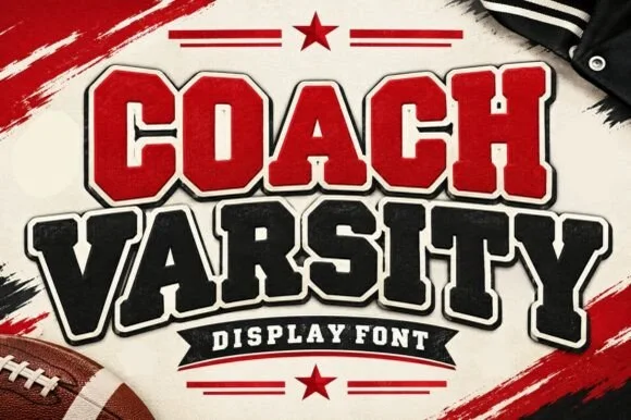
Stadium varsity block with layered outlines and a heavy shadow cut
Coach Varsity is a stadium-style block alphabet supplied with layered outlines, so one word can be built as a red fill, a white inner keyline and a black shadow without redrawing.
Ideas for this font
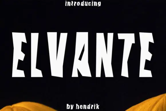
Tall irregular block capitals with wedge-shaped cuts
Elvante shows white uppercase letters with long straight sides and abrupt angled cuts, where the E has sloping arm ends, the V forms a narrow deep notch and the A uses a small triangular counter beside a long diagonal.
Ideas for this font
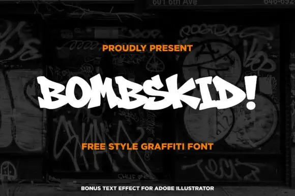
Compact graffiti capitals with sharp irregular joins and a heavy stroke
Bombskid is a compact graffiti alphabet in which the strokes are heavy, the joins sit at sharp irregular angles and the letters lean into each other, so a word reads as a tag rather than as a sign.
Ideas for this font
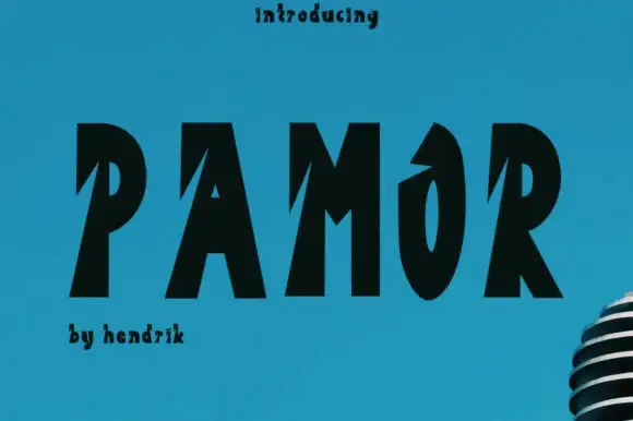
Heavy sloping capitals with deep diagonal notches
Pamor uses five black capitals on blue, where sharp diagonal cuts enter the left sides of the P, A and M, the O keeps a narrow tall counter and a pointed upper opening, and the letters lean slightly as a group while a microphone fragment sits behind.
Ideas for this font
Same independent foundry
Allow optional Google Analytics to measure visits and catalogue actions. Your search words and notes are not included. Privacy & storage