Neutral Sans Workhorse

Ariel + Furion
Lets Ariel own the focal silhouette while handling secondary copy, sizing and subheads cleanly.
Inspect Furion specimenDisclosure: MakerFileHub may earn a commission from qualifying purchases via paid links on this page. How our links work.
Heavy outlined capitals with curled terminals and small curved interior cut-ins
Ariel is a heavy ornamental display script: thick swelling strokes, curled entry and exit ligatures, and a white inline drawn inside a heavy dark edge so the letters look carved and lit.
Paid link
Get this fontProject & layout blueprintsAt-a-glance maker compatibility
Sturdy stroke walls and open counters weed cleanly on adhesive vinyl, HTV apparel film, and cut cardstock.
Visual anatomy & craft review
ARIEL fills the frame on a sheet of aged parchment, the strokes fat and rounded with a white groove running through the middle of each and a thick black contour around the outside. The A opens with a curl at the foot, the R throws a leg out to the right, the E ends in a flourish, and the L curls back under the word, so the whole line reads as one continuous ornament rather than five separate letters. Above it a small serif caption introduces the face, and below it a line in a plainer display face names the style, with two file badges and a gold seal at the foot. A quill and an ink bottle sit at the top right of the photograph. The double outline makes the letters work on dark grounds as well as light ones, and it is the only reason to choose this face over a plain script: at small sizes the inline and the contour merge into a single grey band.
Heavy outlined capitals with curled terminals and small curved interior cut-ins
Two-font hierarchy recipes
Tested contrast partners — pairing Ariel with grounded secondary typography.
Ariel + Furion
Lets Ariel own the focal silhouette while handling secondary copy, sizing and subheads cleanly.
Inspect Furion specimen
Ariel + Majestic Letters
Grounds bold display lettering with classic typographic authority on posters, badges and apparel.
Inspect Majestic Letters specimenPractical applications
Concrete hierarchy, scale and production guidance tailored to Ariel’s stroke geometry.
The ornament gives a paper bag a period feel without a printed seal, and the thick outline holds the word on kraft stock where a fine script would sink in.
Hierarchy & layout recipe
Print a 90 by 60 mm bag label: set the bakery name at 24 pt on one row, keep 8 mm of clear ground beneath before the word bread at 5 pt, and hold 6 mm from the lowest curl to the label edge.
Pre-production check
The inline closes up on kraft paper; print one label on the real stock and check the groove before the batch is run.
The carved-looking letters set a nostalgic tone on a cover that has no photograph, and the ornamental line holds a long title in one strong shape.
Hierarchy & layout recipe
Print a 210 by 250 mm cover: set the title at 52 pt across two rows, keep 22 mm of clear ground beneath before the author at 10 pt, and hold 18 mm from the flourish of the L to the trim.
Pre-production check
Textured covers break the fine inline; print one cover on the intended board and look at it under a lamp first.
One word carries the front of the card, and the heavy contour keeps it looking deliberate on cream stock where a plain script would look thin and cheap.
Hierarchy & layout recipe
Print a 120 by 170 mm card: set the word at 44 pt at the optical centre, keep 18 mm of clear ground beneath before the written message at 9 pt, and hold 14 mm from the outer contour to the card edge.
Pre-production check
Heavy contours show through from the reverse when scored; print one card and fold it before the box is ordered.
Technical & licence verification
Confirm included OTF/TTF/WOFF formats, full glyph tables and licence coverage on the live store page before batch production.
Closest visual alternatives
Matched across letterform anatomy, stroke behaviour and craft applications.
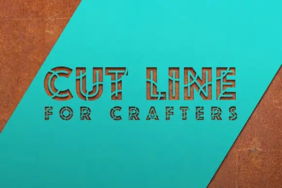
Angular outlined capitals divided into segments by narrow crossing gaps
Cut Line shows straight-sided outlined capitals on a turquoise diagonal panel, where thin bars and breaks divide the strokes into irregular segments, circular cuts appear around some joints and a dimensional shadow sits behind the whole word.
Ideas for this font
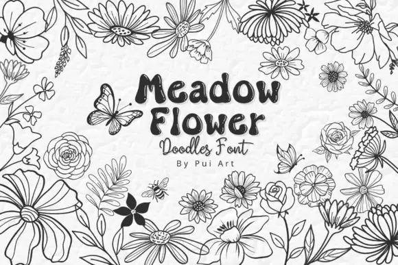
Meadow flower doodle set
Meadow Flower Doodles is a dingbat set drawn in black outline on a pale ground: loose meadow flowers with varied petals, leaves, buds and scattered butterflies, arranged as a border around a central panel that carries the name in a rounded hand, a script line and a small credit.
Ideas for this font
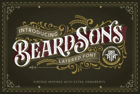
Curled high-contrast capitals with offset inline-like decoration
Beardsons rises diagonally across an ornate olive cover, where white capitals carry thin internal lines, narrow waists and extended curled terminals around the opening B and the central S, a dark red offset behind the letters adds depth and fine gold foliage frames the name.
Ideas for this font
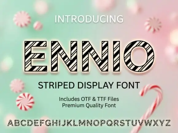
Geometric outlined capitals filled with tightly grouped diagonal black stripes
Ennio draws squat slab capitals with a heavy outline and a diagonal stripe running through each letter, so a word looks cut from a barber's pole or a fairground awning.
Same independent foundry
Allow optional Google Analytics to measure visits and catalogue actions. Your search words and notes are not included. Privacy & storage