Neutral Sans Workhorse

Bombskid + Inkora
Lets Bombskid own the focal silhouette while handling secondary copy, sizing and subheads cleanly.
Inspect Inkora specimenDisclosure: MakerFileHub may earn a commission from qualifying purchases via paid links on this page. How our links work.
Compact graffiti capitals with sharp irregular joins and a heavy stroke
Bombskid is a compact graffiti alphabet in which the strokes are heavy, the joins sit at sharp irregular angles and the letters lean into each other, so a word reads as a tag rather than as a sign.
Paid link
Get this fontProject & layout blueprintsAt-a-glance maker compatibility
Sturdy stroke walls and open counters weed cleanly on adhesive vinyl, HTV apparel film, and cut cardstock.
Visual anatomy & craft review
The B closes two heavy lobes with a knife-cut corner, the O holds an oval counter cut at an angle, the M splays from a low vertex and the K breaks its arm at a hard turn, all at a maximal weight with flat ends and joins that overlap rather than meet. The overlap is the character: letters share a millimetre of space, which is what makes a short word read as one written object at 50 pt and what makes the face a poor choice for long lines. Because the strokes are wide, it holds at 30 pt on a sticker and fails below 20 pt. The graffiti wall, the white ink, the orange labels and the bonus-effect line are presentation; the display face is the word shown.
Graffiti · Compact · Sharp
Two-font hierarchy recipes
Tested contrast partners — pairing Bombskid with grounded secondary typography.
Bombskid + Inkora
Lets Bombskid own the focal silhouette while handling secondary copy, sizing and subheads cleanly.
Inspect Inkora specimen
Bombskid + Majestic Letters
Grounds bold display lettering with classic typographic authority on posters, badges and apparel.
Inspect Majestic Letters specimenPractical applications
Concrete hierarchy, scale and production guidance tailored to Bombskid’s stroke geometry.
The compact overlapping blocks read at 25 mm on a die-cut sticker, and the sharp joins give a small mark the look of a sprayed tag.
Hierarchy & layout recipe
Print a 60 mm die-cut sticker: set the word at 25 mm, keep the overlapping joins at 2 mm minimum, and leave 4 mm between the letter edges and the cut line so the tag does not tear at a corner.
Pre-production check
A die cut through an overlapping join leaves a weak bridge; check the cut file at full size and open the overlap rather than the letters.
The graffiti weight gives a zine cover its voice at 80 pt, and the sharp junctions hold over a printed wall texture where a clean face would look borrowed.
Hierarchy & layout recipe
Print an A4 cover: set the title at 80 pt across the middle, set the issue line in a 9 pt caps sans beneath, and keep 16 mm of margin so the flat ends stay inside the trim.
Pre-production check
A tag-style face printed on a busy photograph loses its edge; check the cover and lay a plain band behind the title rather than thickening the strokes.
The heavy compact strokes screen-print as a single shape at 65 mm, and the irregular joins stay legible on fleece where a thin tag would sink in.
Hierarchy & layout recipe
Screen a 260 mm chest print: set the word at 65 mm through a 110-thread mesh, keep the knife-cut corners at 1.5 mm, and stay 55 mm below the collar so the print clears the yoke seam.
Pre-production check
A sharp corner under 1 mm rounds off on fleece; check a pull on the actual garment and blunt the corner rather than thinning the stroke.
Technical & licence verification
Confirm included OTF/TTF/WOFF formats, full glyph tables and licence coverage on the live store page before batch production.
Closest visual alternatives
Matched across letterform anatomy, stroke behaviour and craft applications.
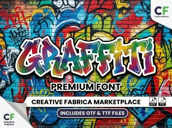
Angular graffiti capitals with heavy outline styling
Graffiti shows large irregular capitals with pointed corners, uneven heights and sharply angled joins, where a thick white border and a dark shadow separate the multicolour word from the wall behind it and the letters overlap their own baseline.
Ideas for this font
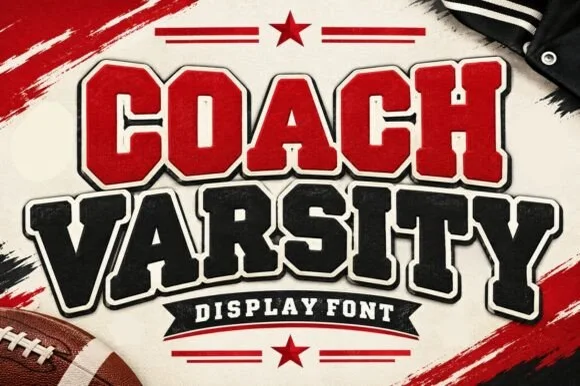
Stadium varsity block with layered outlines and a heavy shadow cut
Coach Varsity is a stadium-style block alphabet supplied with layered outlines, so one word can be built as a red fill, a white inner keyline and a black shadow without redrawing.
Ideas for this font
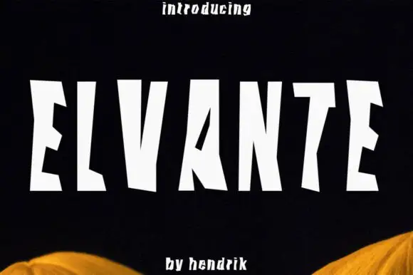
Tall irregular block capitals with wedge-shaped cuts
Elvante shows white uppercase letters with long straight sides and abrupt angled cuts, where the E has sloping arm ends, the V forms a narrow deep notch and the A uses a small triangular counter beside a long diagonal.
Ideas for this font
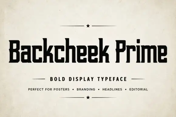
Compact squared lettering with slab-like feet and tiny clipped corners
Backcheek Prime shows heavy black mixed case on a pale paper-like cover, where the B and P have narrow rectangular counters, the c and e use squared openings, the k branches into a blunt diagonal and small clipped corners break an otherwise blocky silhouette.
Ideas for this font
Allow optional Google Analytics to measure visits and catalogue actions. Your search words and notes are not included. Privacy & storage