Neutral Sans Workhorse

Davin + Cultivo
Lets Davin own the focal silhouette while handling secondary copy, sizing and subheads cleanly.
Inspect Cultivo specimenDisclosure: MakerFileHub may earn a commission from qualifying purchases via paid links on this page. How our links work.
Heavy rounded capitals with small pale curved shine marks near their upper edges
Davin shows a compact black uppercase name on cream, where rounded corners soften the broad D, A, V and N strokes, the I carries wide rounded top and bottom bars and small pale curved marks near the upper-left edges suggest reflected highlights without breaking the solid silhouettes.
Paid link
Get this fontProject & layout blueprintsAt-a-glance maker compatibility
Sturdy stroke walls and open counters weed cleanly on adhesive vinyl, HTV apparel film, and cut cardstock.
Visual anatomy & craft review
The strokes stay broad and puffy, the corners round off, the bars widen and the inner highlights sit inside the fill rather than at the edge. That puffy build is the character: the word reads as inflatable lettering rather than a heavy sans, which is why the bubbles and hearts stay outside the block. The highlights may be baked into the glyphs or added later, and the punctuation on the cover is separate. Keep 44 pt, check whether the shine marks come with the file and print on a matte stock.
Heavy rounded capitals with small pale curved shine marks near their upper edges
Two-font hierarchy recipes
Tested contrast partners — pairing Davin with grounded secondary typography.
Davin + Cultivo
Lets Davin own the focal silhouette while handling secondary copy, sizing and subheads cleanly.
Inspect Cultivo specimen
Davin + Things
Grounds bold display lettering with classic typographic authority on posters, badges and apparel.
Inspect Things specimenPractical applications
Concrete hierarchy, scale and production guidance tailored to Davin’s stroke geometry.
The bubble caps give a teen party card a soft, current look, and the compact block leaves room for the details beneath it.
Hierarchy & layout recipe
Print a 120 by 170 mm card: set the greeting at 48 pt on one row, keep 20 mm of clear ground beneath before the time and address at 11 pt, and keep 15 mm of margin.
Pre-production check
The highlight marks may be added styling; check the file before planning a one-colour print.
The puffy caps give a drinks can a friendly mark, and the rounded bars keep a short brand name readable at just 45 mm wide.
Hierarchy & layout recipe
Print a 60 by 90 mm can label: set the brand at 26 pt on one row, keep 10 mm of clear ground beneath before the flavour at 8 pt, and keep 6 mm to the die edge.
Pre-production check
The bubbles and hearts on the cover are separate; check the files before promising them with the type.
The inflated letters read at the poolside, and the solid silhouettes survive a large painted panel without breaking up at all.
Hierarchy & layout recipe
Print a 600 by 300 mm board: set the greeting at 56 mm on one row, keep 24 mm of clear ground beneath before the date at 15 pt, and keep 26 mm of border all round.
Pre-production check
The shine marks disappear when painted by hand; check the mask artwork before the board is made.
Technical & licence verification
Confirm included OTF/TTF/WOFF formats, full glyph tables and licence coverage on the live store page before batch production.
Closest visual alternatives
Matched across letterform anatomy, stroke behaviour and craft applications.
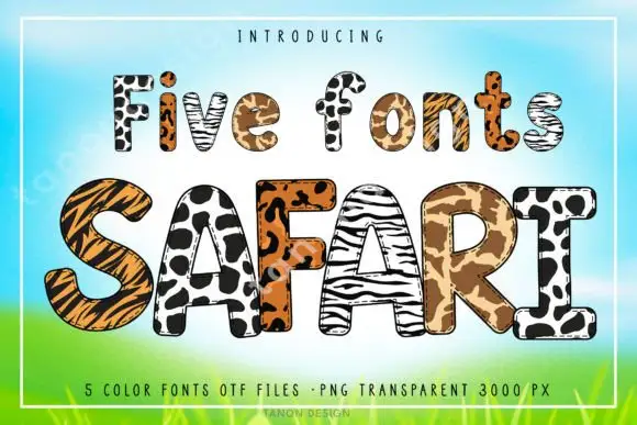
Animal-print patterned display
Safari is a patterned display set on a painted savannah sky: rounded block capitals, each filled with a different animal print — tiger, leopard, zebra, cheetah and giraffe — with a heavy outline, a pale keyline and a small serif line above that names the count of fonts.
Ideas for this font
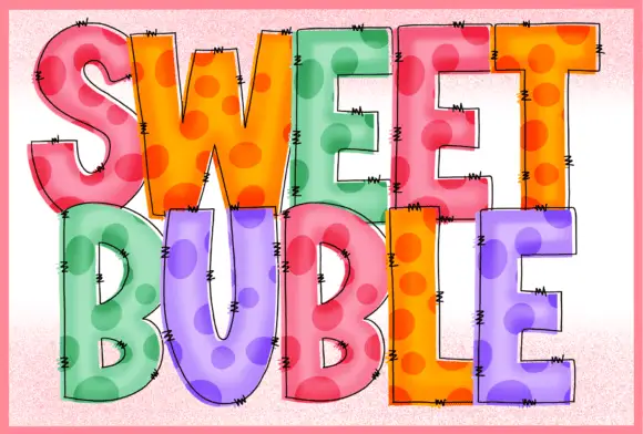
Stitched dotted translucent blocks
Sweet Buble is a colour display on a pale textured ground: tall blocks in pastel pink, orange, green and violet with large darker dots inside, a translucent-looking overlay, fine drawn edge stitches and dark outlines, set in two stacked words.
Ideas for this font
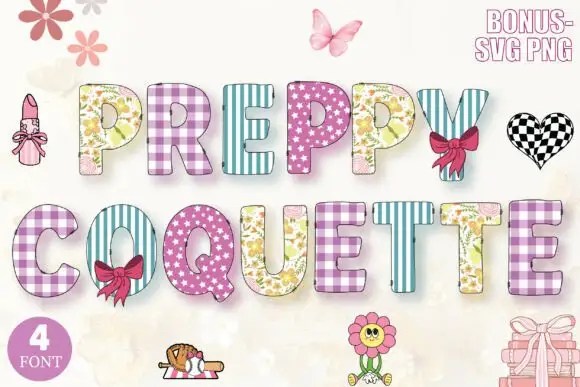
Patterned preppy block bundle
Preppy Coquette Decorative is a colour bundle on a pale ground: upright block capitals filled with gingham, candy stripes, floral and scattered-star patterns in lilac, pink, mint and cream, decorated with bows, a lipstick, a flower and a checkered heart, with a round badge counting the fonts.
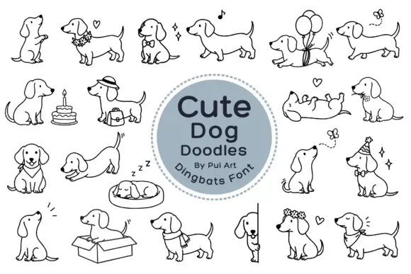
Long-bodied dog outlines with balloons, flowers and playful poses
Cute Dog Doodles is a dingbat set of about two dozen line-drawn dachshunds: sitting, sleeping in a bed, standing in a box, wearing a party hat, carrying a cake, holding a balloon, and one draped over a fence.
Same independent foundry
Allow optional Google Analytics to measure visits and catalogue actions. Your search words and notes are not included. Privacy & storage