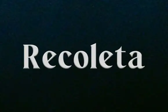
Neutral Sans Workhorse

Elvante + Limited Coffee
Lets Elvante own the focal silhouette while handling secondary copy, sizing and subheads cleanly.
Inspect Limited Coffee specimenDisclosure: MakerFileHub may earn a commission from qualifying purchases via paid links on this page. How our links work.
Tall irregular block capitals with wedge-shaped cuts
Elvante shows white uppercase letters with long straight sides and abrupt angled cuts, where the E has sloping arm ends, the V forms a narrow deep notch and the A uses a small triangular counter beside a long diagonal.
Paid link
Get this fontProject & layout blueprintsAt-a-glance maker compatibility
Sturdy stroke walls and open counters weed cleanly on adhesive vinyl, HTV apparel film, and cut cardstock.
Visual anatomy & craft review
The sides stay straight and tall, the cuts arrive at an angle rather than a curve, the widths vary visibly and the triangular counter reads as a sharp wedge. That wedge is the character: the title holds a lively uneven rhythm instead of a uniform condensed grid, which is why the sample sets one word plain on a dark ground. The yellow shapes below are artwork, so keep 34 pt before the narrow counters pinch and check the real contour in your phrase.
Tall caps · Wedge cuts · Irregular widths
Two-font hierarchy recipes
Tested contrast partners — pairing Elvante with grounded secondary typography.
Elvante + Limited Coffee
Lets Elvante own the focal silhouette while handling secondary copy, sizing and subheads cleanly.
Inspect Limited Coffee specimen
Elvante + Kernova
Grounds bold display lettering with classic typographic authority on posters, badges and apparel.
Inspect Kernova specimenPractical applications
Concrete hierarchy, scale and production guidance tailored to Elvante’s stroke geometry.
The wedge-cut caps give a studio a sharp mark, and the tall sides hold a short name at 28 pt on a card, where the angled cuts read as deliberate notches.
Hierarchy & layout recipe
Print an 85 by 55 mm card: set the wordmark at 28 pt on one row, keep 14 mm of clear ground at each end, and set the contact line at 7 pt in a plain sans beneath.
Pre-production check
A triangular counter printed at 20 pt closes into a solid wedge; check the proof and keep 26 pt or above.
The irregular caps set a feature title, and the tall forms hold a one-word heading at 62 pt across a page, where the uneven widths keep the row alive.
Hierarchy & layout recipe
Print a 210 mm page: set the title at 62 pt on one row, keep 22 mm beneath before the standfirst at 10 pt, and keep the block on the upper third so the uneven widths read as intentional.
Pre-production check
Mixed widths on a justified row open odd gaps; check the page and keep the title ranged left.
The wedge cuts suit a workshop sign, and the heavy sides read at 56 pt on a printed board, big enough that every angled notch stays visible.
Hierarchy & layout recipe
Print a 500 by 250 mm board: set the bay name at 56 pt on one row, keep 22 mm of clear ground beneath before the number at 16 pt, and keep 22 mm of border all round.
Pre-production check
An angled cut at 26 pt looks like damage; check the mounted board and hold the name at 48 pt or above.
Technical & licence verification
Confirm included OTF/TTF/WOFF formats, full glyph tables and licence coverage on the live store page before batch production.
Closest visual alternatives
Matched across letterform anatomy, stroke behaviour and craft applications.
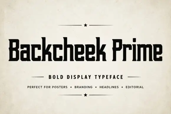
Compact squared lettering with slab-like feet and tiny clipped corners
Backcheek Prime shows heavy black mixed case on a pale paper-like cover, where the B and P have narrow rectangular counters, the c and e use squared openings, the k branches into a blunt diagonal and small clipped corners break an otherwise blocky silhouette.
Ideas for this font
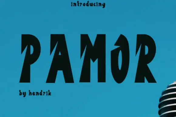
Heavy sloping capitals with deep diagonal notches
Pamor uses five black capitals on blue, where sharp diagonal cuts enter the left sides of the P, A and M, the O keeps a narrow tall counter and a pointed upper opening, and the letters lean slightly as a group while a microphone fragment sits behind.
Ideas for this font
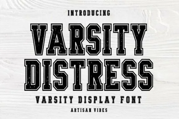
Varsity blocks with a double outline and wear
Varsity Distress is a varsity display face in black on white wood: heavy slab capitals described by a double outline, with the interior filled by a speckled, worn texture that reads as a screen printed block.
Ideas for this font
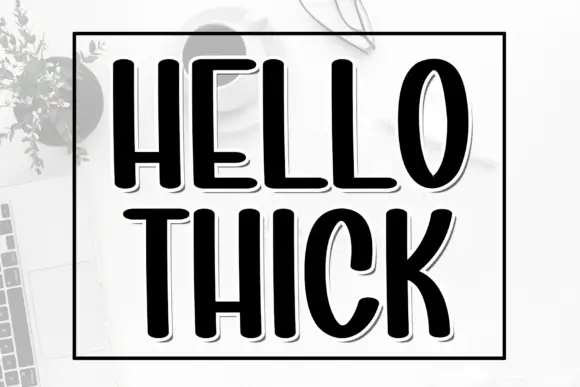
Tall heavy condensed capitals with a fine offset shadow
Hello Thick is a tall condensed capital alphabet in which the stems are fat, the width is narrow and a fine shadow sits behind each letter, so a word reads as a printed block with depth.
Ideas for this font
Same independent foundry
Allow optional Google Analytics to measure visits and catalogue actions. Your search words and notes are not included. Privacy & storage