Neutral Sans Workhorse

Debra + Helina
Lets Debra own the focal silhouette while handling secondary copy, sizing and subheads cleanly.
Inspect Helina specimenDisclosure: MakerFileHub may earn a commission from qualifying purchases via paid links on this page. How our links work.
Heavy contrast serif capitals with curled lower terminals in D, B and R
Debra places dark teal capitals on warm cream, where broad vertical strokes meet fine triangular serifs and the D curls inward at its lower-left corner, the B carries a small lower curl and the R adds a similar turn under its leg.
Paid link
Get this fontProject & layout blueprintsAt-a-glance maker compatibility
Sturdy stroke walls and open counters weed cleanly on adhesive vinyl, HTV apparel film, and cut cardstock.
Visual anatomy & craft review
The stems stay broad, the serifs cut thin and triangular, and three letters curl low. Those small curls are the character: a display serif gains a signature on three specific letters, which is why the sample keeps a short word. The gold background and depth effects are cover styling, so check the real contours, confirm whether the separate flourishes ship with the file and leave 14 mm beneath the curls. The curls are the wear point: they are drawn as a single thin stroke under the bowl, so they break in foil and rip during weeding, and a 24 mm monogram is the smallest size at which they still read as a curl rather than a nick.
Heavy contrast serif capitals with curled lower terminals in D, B and R
Two-font hierarchy recipes
Tested contrast partners — pairing Debra with grounded secondary typography.
Debra + Helina
Lets Debra own the focal silhouette while handling secondary copy, sizing and subheads cleanly.
Inspect Helina specimen
Debra + The Lumina Awesome
Grounds bold display lettering with classic typographic authority on posters, badges and apparel.
Inspect The Lumina Awesome specimenPractical applications
Concrete hierarchy, scale and production guidance tailored to Debra’s stroke geometry.
The contrast serif gives a bottle gravity, and the curled D holds a two-word name at 24 pt on a 55 by 70 mm label, where the fine serifs stay crisp on coated paper.
Hierarchy & layout recipe
Print a 55 by 70 mm label: set the name at 24 pt on one row, keep 12 mm of clear ground beneath for the curls, and keep the label cream so the dark letters separate.
Pre-production check
The curls closing under 16 pt look like damage; check the plate proof and hold the name at 22 pt.
The display serif sets an elegant title, and the broad stems hold a two-word heading at 60 pt on a coated page, where the triangular serifs read as engraving.
Hierarchy & layout recipe
Print a 210 mm page: set the heading at 60 pt on one row, keep 24 mm of clear ground beneath for the curled terminals, and keep the photograph clear of the descender area.
Pre-production check
A photograph behind the fine serifs hides the joins; check the page and keep the title on flat colour.
The cream-and-teal contrast suits a formal suite, and the curled terminals give a pair of names a finish at 28 pt on heavy card, where the fine serifs stay restrained.
Hierarchy & layout recipe
Letterpress a 130 by 180 mm invitation: set the names at 28 pt on one row, keep 20 mm of clear ground beneath for the curls, and ask for a light impression so the serifs stay intact.
Pre-production check
Separate flourishes may be artwork; check the file before planning them as part of the suite.
Technical & licence verification
Confirm included OTF/TTF/WOFF formats, full glyph tables and licence coverage on the live store page before batch production.
Closest visual alternatives
Matched across letterform anatomy, stroke behaviour and craft applications.
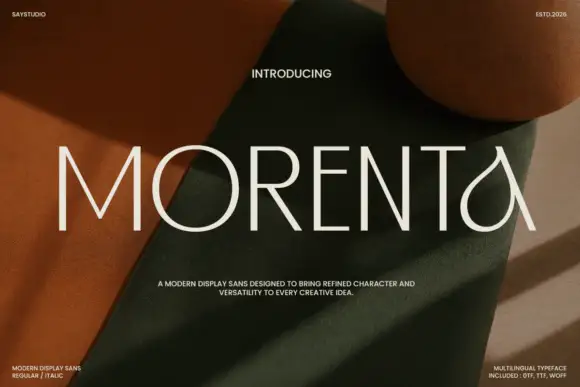
Thin straight display with teardrop forms
Morenta is a thin display in off-white over a rust and olive fabric still life: straight capitals with hairline-thin strokes, a teardrop-shaped A and a curved tail on the final letter, high contrast between the geometric stems and the curved finish, set as one large word with small tracked notes in each corner.
Ideas for this font
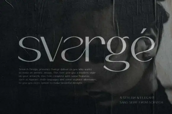
Fine contrast lowercase display
Svarge is a fine contrast lowercase shown in pale grey over a dark close portrait: reversed-looking a curves, a broad lower g loop, hairline joins and a tall ascender, with a small paragraph of description at the lower left and a right-aligned credit at the foot.
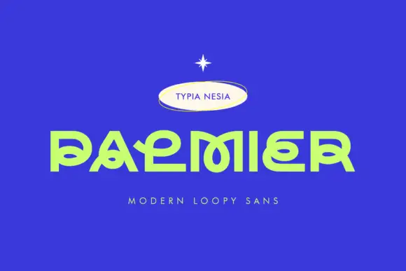
Low geometric display with interlaced loops
Palmier is a low geometric display in lime on royal blue: wide capitals with interlaced loops, flat extended lower arms, a squared o and a P whose bowl folds into the stem, set as one large word with a small badge above and a tracked line beneath.
Ideas for this font
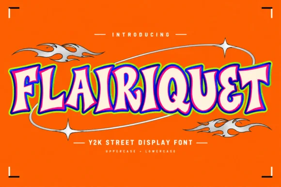
Y2K street display in rounded retro caps with an inner fill and keyline
Flairiquet is a rounded retro display alphabet in which the fat italic caps carry a white inner fill inside a coloured keyline, so the word reads as a spray-can sticker from the early 2000s rather than as plain type.
Ideas for this font
Same independent foundry
Allow optional Google Analytics to measure visits and catalogue actions. Your search words and notes are not included. Privacy & storage