Modern Grotesque Body

Glass Grunge + Lemon Milk Pro FTR
Creates crisp high-hierarchy contrast beneath Glass Grunge headlines across menus, websites and labels.
Inspect Lemon Milk Pro FTR specimenDisclosure: MakerFileHub may earn a commission from qualifying purchases via paid links on this page. How our links work.
Shattered-glass & cracked-concrete heavy slab serif
Glass Grunge is a massive, chunky slab serif fractured across every stem and foot by sharp shattered-glass crack lines.
Paid link
Get this fontProject & layout blueprintsAt-a-glance maker compatibility
Fine grain and micro-texture excel in 300 DPI print, sublimation, and screen print rather than small vinyl weeding.
Visual anatomy & craft review
Glass Grunge is a heavy slab serif built from shattered glass and cracked concrete: the stems carry fracture lines that split into shards at the terminals, the counters are chipped and the surface shows a fine crackle texture across the whole letter. The fracture lines are drawn, so a one-colour print keeps them, and the shard terminals are what closes first at small sizes. It needs roughly 34 mm for the shard edge and the crackle to read, and it is best in one dense ink on a cold grey or bone stock, or white on black where the cracks stay as thin lights.
Shattered · Heavy-slab · Explosive
Two-font hierarchy recipes
Tested contrast partners — pairing Glass Grunge with grounded secondary typography.
Glass Grunge + Lemon Milk Pro FTR
Creates crisp high-hierarchy contrast beneath Glass Grunge headlines across menus, websites and labels.
Inspect Lemon Milk Pro FTR specimen
Glass Grunge + Farmhouse
Adds a warm human signature touch for 1-to-3-word callouts without competing against structured serif capitals.
Inspect Farmhouse specimenPractical applications
Concrete hierarchy, scale and production guidance tailored to Glass Grunge’s stroke geometry.
A shattered slab reads as a broken pane rather than a styled headline, which is what a crime or investigation issue wants on the cover. The fracture lines hold at 64 pt in one ink, and the heavy stems keep the title solid on a dark ground.
Hierarchy & layout recipe
Opener 210 x 297 mm, title 64 pt with 10 mm shard clearance, standfirst 11/15 pt, body 9/13 pt, 18 mm margins. Cover band 210 x 70 mm, word 44 pt. Pull quote 40 pt.
Pre-production check
Reversed white on black at 44 pt the crackle texture fills and the title reads as a worn white bar. Print the band in flat white without the crackle, and proof one spread at 1:1.
A fractured slab gives a skate brand the look of a smashed kerb rather than a clean logo, which is the register its buyers want. The shard terminals read at 40 mm on a deck, and one black pass prints the deck and the sticker sheet in a single order.
Hierarchy & layout recipe
Deck graphic 200 x 500 mm, word 90 mm with 12 mm shard clearance, 15 mm edge clearance. Sticker 90 x 60 mm, word 24 mm, 5 mm die margin. Card 85 x 55 mm, word 14 mm, 5 mm margins.
Pre-production check
At 24 mm on a die-cut sticker the crackle turns to dirt and the shred edge tears during weeding. Raise the sticker word to 32 mm or use the plain slab cut, and weed one sheet before the batch.
A glass-shard slab reads as something broken rather than a cartoon monster, which is what a serious scare attraction wants on its front. The fracture lines read at 130 mm across a poster, and one white ink on black prints the poster, the ticket and the jar labels for one night.
Hierarchy & layout recipe
Poster A2, word 130 mm with 15 mm shard clearance, times 40 mm, 20 mm margins. Ticket 100 x 50 mm, word 14 mm, 4 mm perforation. Jar label 70 x 50 mm, word 12 mm, 4 mm margins.
Pre-production check
A 70 x 50 mm jar label at 12 mm closes the shard terminals into a solid block and the word stops reading in the dark. Raise labels to 18 mm, and check one jar under venue lighting before the night.
Technical & licence verification
Confirm included OTF/TTF/WOFF formats, full glyph tables and licence coverage on the live store page before batch production.
Closest visual alternatives
Matched across letterform anatomy, stroke behaviour and craft applications.
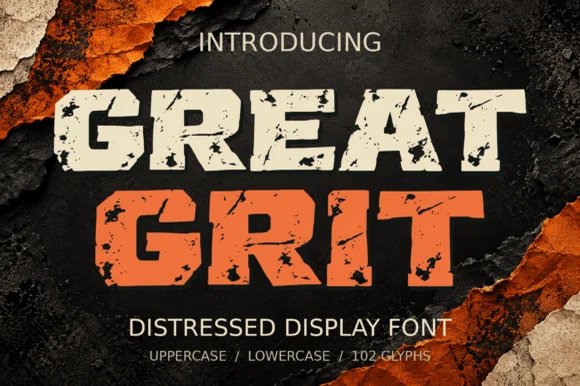
Heavy wide-stance rough-stamped slab display (102 glyphs)
Great Grit is a wide, muscular distressed slab-display font (102 glyphs, uppercase & lowercase) with notched outer edges and sparse surface grit.
Ideas for this font
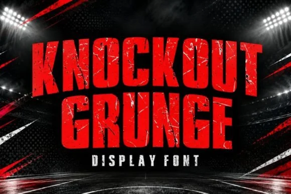
Heavy weathered stadium & boxing-poster athletic slab
Knockout Grunge is a towering, heavy-impact athletic slab-display font textured with gritty stadium-concrete and fight-poster wear.
Ideas for this font
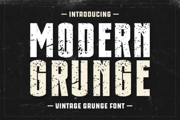
Condensed heavy grunge sans
Modern Grunge is a condensed heavy sans in white and cream on black: tall narrow caps, thick even stems, and a distress that flakes out of the fills in sharp fragments, framed by a dashed rule on a scratched ground.
Ideas for this font
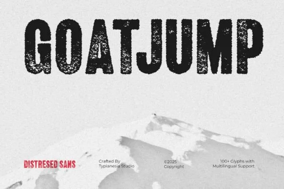
Tall condensed dry-roller & woodblock distressed sans (100+ glyphs, Multilingual)
Goatjump is a commanding, tall condensed distressed sans (100+ glyphs, Multilingual) stamped with vertical woodgrain & dry-roller grit!
Ideas for this font
Same independent foundry
Allow optional Google Analytics to measure visits and catalogue actions. Your search words and notes are not included. Privacy & storage