Modern Grotesque Body

Modern Grunge + Corven
Creates crisp high-hierarchy contrast beneath Modern Grunge headlines across menus, websites and labels.
Inspect Corven specimenDisclosure: MakerFileHub may earn a commission from qualifying purchases via paid links on this page. How our links work.
Condensed heavy grunge sans
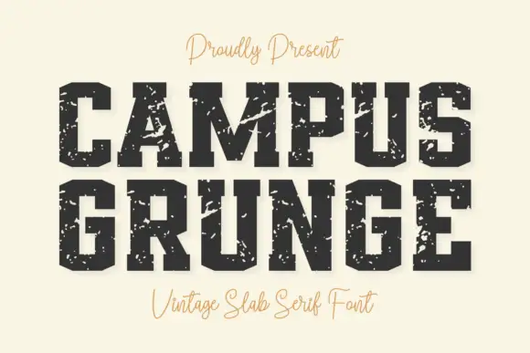
Modern Grunge is a condensed heavy sans in white and cream on black: tall narrow caps, thick even stems, and a distress that flakes out of the fills in sharp fragments, framed by a dashed rule on a scratched ground.
Paid link
Get this fontProject & layout blueprintsAt-a-glance maker compatibility
Fine grain and micro-texture excel in 300 DPI print, sublimation, and screen print rather than small vinyl weeding.
Visual anatomy & craft review
The two words are stacked and share a skeleton: condensed capitals with square shoulders, tight spacing and a narrow O, so the pair reads as a single industrial sans rather than a novelty pair. The texture is the product: large flakes are cut out of the stems and counters rather than a uniform speckle, which reads as a screen print that has been scraped rather than as a photograph of worn paint. Because the flakes are large, the letters stay legible only because the stems are thick, which is why the face works at poster sizes and fails below about 40 pt. The ground is a black panel with a faint scratched texture and a dashed rule inset from the edge, and the two caption lines at top and bottom are set in a small tracked sans, so the specimen reads as a print sample rather than a product mockup.
Grunge, condensed, heavy, worn
Two-font hierarchy recipes
Tested contrast partners — pairing Modern Grunge with grounded secondary typography.
Modern Grunge + Corven
Creates crisp high-hierarchy contrast beneath Modern Grunge headlines across menus, websites and labels.
Inspect Corven specimen
Modern Grunge + Abigail
Adds a warm human signature touch for 1-to-3-word callouts without competing against structured serif capitals.
Inspect Abigail specimenPractical applications
Concrete hierarchy, scale and production guidance tailored to Modern Grunge’s stroke geometry.
A heavy condensed grunge face gives a skate graphic the look of a worn screen print, and the condensed proportions let a long phrase fit across a chest width.
Hierarchy & layout recipe
Print a 300 mm chest graphic: the word at 70 mm cap height, one ink on a dark shirt, and a 2 mm keyline around the lockup. Keep the flakes large enough that the shirt colour reads through them rather than looking like a printing flaw.
Pre-production check
Check the screen at actual mesh, where large flakes need a lower mesh to hold clean edges; confirm the shop's choice. Wash-test one shirt and verify the flakes do not grow until the countes break, then read the word from three metres.
A grunge face signals the subject of a zine before the coverlines are read, and the distilled texture keeps a photocopied cover from turning into noise.
Hierarchy & layout recipe
Set the title at 110 pt on an A5 cover, the issue line in an 8 pt sans at the foot, and a dashed rule 6 mm inside the trim. Print one ink on a mid stock and keep the title as the only textured element on the page.
Pre-production check
Check the title after photocopying, where large flakes can merge into the black and lose the wear; print from a laser original. Confirm the 8 pt issue line survives the copy and that the dashed rule stays clear of the trim.
A worn industrial face gives a market sign the look of a board that has been reused for years, which is the tone of an outdoor stall rather than a shop.
Hierarchy & layout recipe
Print 600 by 400 mm on rigid board: the word at 130 mm cap height, the prices in a 22 mm sans, and a 5 mm dashed border at 25 mm. Keep the lettering large and the wear moderate so the prices stay legible beside it.
Pre-production check
Check the sign in daylight at five metres, where heavy flakes can read as damage on a large board; reduce the texture for the large format. Confirm the 22 mm prices read at arm's length and that the border does not cross a mounting hole.
Technical & licence verification
Confirm included OTF/TTF/WOFF formats, full glyph tables and licence coverage on the live store page before batch production.
Closest visual alternatives
Matched across letterform anatomy, stroke behaviour and craft applications.
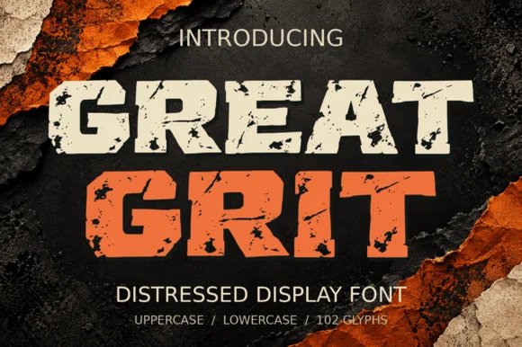
Heavy wide-stance rough-stamped slab display (102 glyphs)
Great Grit is a wide, muscular distressed slab-display font (102 glyphs, uppercase & lowercase) with notched outer edges and sparse surface grit.
Ideas for this font
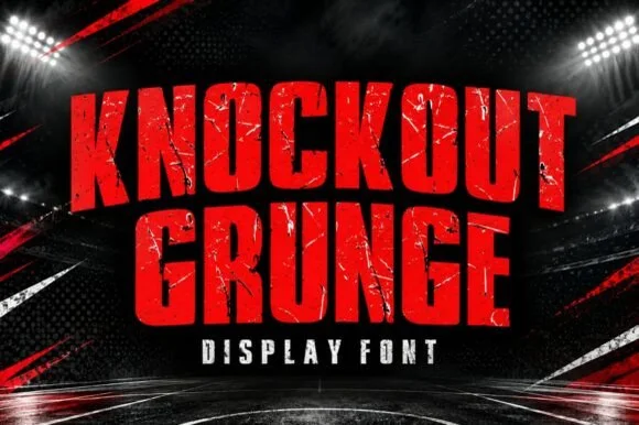
Heavy weathered stadium & boxing-poster athletic slab
Knockout Grunge is a towering, heavy-impact athletic slab-display font textured with gritty stadium-concrete and fight-poster wear.
Ideas for this font
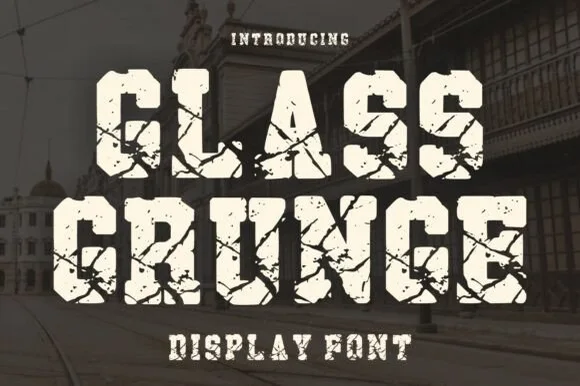
Shattered-glass & cracked-concrete heavy slab serif
Glass Grunge is a massive, chunky slab serif fractured across every stem and foot by sharp shattered-glass crack lines.
Ideas for this font
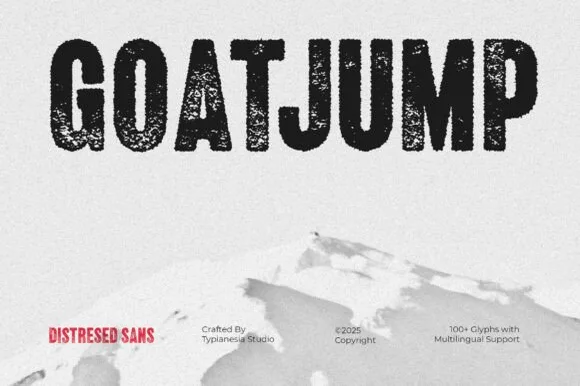
Tall condensed dry-roller & woodblock distressed sans (100+ glyphs, Multilingual)
Goatjump is a commanding, tall condensed distressed sans (100+ glyphs, Multilingual) stamped with vertical woodgrain & dry-roller grit!
Ideas for this font
Same independent foundry
Allow optional Google Analytics to measure visits and catalogue actions. Your search words and notes are not included. Privacy & storage