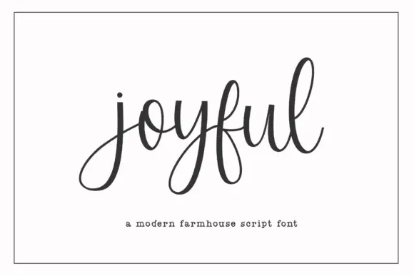
Modern Grotesque Body

Front Porch + Sailors
Creates crisp high-hierarchy contrast beneath Front Porch headlines across menus, websites and labels.
Inspect Sailors specimenDisclosure: MakerFileHub may earn a commission from qualifying purchases via paid links on this page. How our links work.
Tall condensed organic farmhouse & country porch serif (NOT cursive handwriting!)
Front Porch is actually a crisp, tall condensed farmhouse serif ('A COUNTRY SERIF FONT'—not casual handwriting!) built for vertical wooden welcome signs!
Paid link
Get this fontProject & layout blueprintsAt-a-glance maker compatibility
Sturdy stroke walls and open counters weed cleanly on adhesive vinyl, HTV apparel film, and cut cardstock.
Visual anatomy & craft review
Front Porch is a tall condensed serif drawn from painted farmhouse boards rather than calligraphy: narrow bracketed serifs, a high waist, level baselines and slightly flared stems that look cut with a brush and a straightedge. The condensation lets a long phrase fit on a single porch board, and the small serifs are the part that closes when the face shrinks. It needs roughly 28 mm for the bracket and flare to read, and it is best in one dark ink on cream, or white paint on weathered timber.
Country-porch-serif · Tall-farmhouse · Shiplap-crisp
Two-font hierarchy recipes
Tested contrast partners — pairing Front Porch with grounded secondary typography.
Front Porch + Sailors
Creates crisp high-hierarchy contrast beneath Front Porch headlines across menus, websites and labels.
Inspect Sailors specimen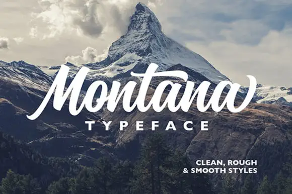
Front Porch + Montana
Adds a warm human signature touch for 1-to-3-word callouts without competing against structured serif capitals.
Inspect Montana specimenPractical applications
Concrete hierarchy, scale and production guidance tailored to Front Porch’s stroke geometry.
A tall painted farmhouse serif reads as a sign nailed to a porch rather than a printed greeting, which is what a farm shop wants beside its door. The condensed letters fit a full thank-you line on one board at 80 mm, and one ink covers the sign, the card and the crate label from a single artwork.
Hierarchy & layout recipe
Sign 600 x 900 mm, word 80 mm with 10 mm serif clearance, line two 50 mm, 40 mm margins. Card A6, greeting 18 mm, note 8/11 pt, 12 mm margins. Crate label 120 x 80 mm, word 16 mm, 6 mm margins.
Pre-production check
On a crate label at 16 mm the bracketed serif fills and the word reads as a condensed sans. Keep labels at 20 mm and above, and print one label on the actual crate stock before the batch.
A farmhouse serif carries a Christmas message without a drawn illustration, which suits a card sent from a house rather than a brand. The tall brackets hold the greeting at 22 mm on a card, and one deep ink prints the card, the tag and the board stencil on the same cream stock.
Hierarchy & layout recipe
Card 105 x 148 mm, greeting 22 mm, message 8/11 pt, 12 mm margins. Board 800 x 300 mm, word 140 mm, 30 mm margins. Tag 50 x 90 mm, word 10 mm with a 5 mm hole and 8 mm clear.
Pre-production check
A 50 x 90 mm tag at 10 mm closes the bracket into a smear and the word reads as a bar. Raise the tag word to 14 mm or use fewer words, and check one tag on the actual card.
A tall farmhouse serif is the lettering already painted on a harvest stall, so a board in it looks made on the farm rather than ordered. The narrow stems hold a long stall name at 100 mm, and one ink prints the board and the pie labels in a single order without a second plate.
Hierarchy & layout recipe
Stall board 900 x 600 mm, word 100 mm with 12 mm serif clearance, prices 40 mm, 30 mm margins. Pie label 90 x 60 mm, word 16 mm, 5 mm margins. A-frame panel 600 x 900 mm, word 80 mm, 30 mm margins.
Pre-production check
A painted A-frame in one coat lets the grain lift the thin serif at 80 mm and the letters look chewed. Ask for two coats or use cut vinyl, and inspect one panel in daylight before the pair is painted.
Technical & licence verification
Confirm included OTF/TTF/WOFF formats, full glyph tables and licence coverage on the live store page before batch production.
Closest visual alternatives
Matched across letterform anatomy, stroke behaviour and craft applications.
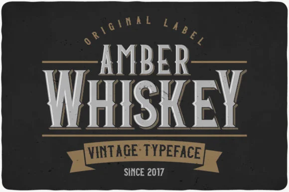
Tall condensed Victorian bottle-label display serif
Amber Whiskey is a tall, condensed Victorian display serif built for stacked spirits labels, apothecary crests, and heritage posters.
Ideas for this font
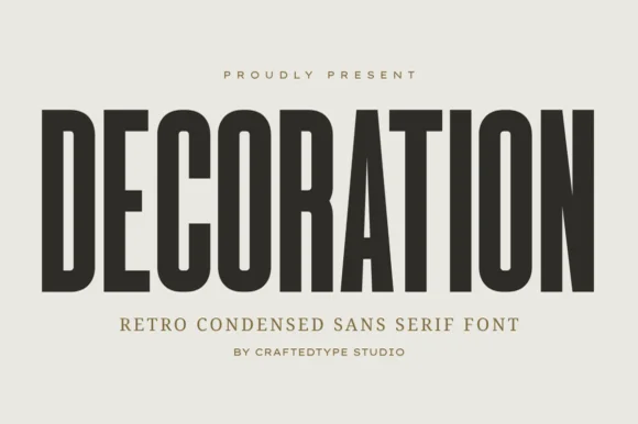
Tall narrow flat-sided retro condensed sans (PUA, OTF & TTF)
Decoration is a sleek, tall flat-sided condensed sans (narrower and taller than sister font Collection #963!) built for clean architectural posters & labels (OTF/TTF).
Ideas for this font
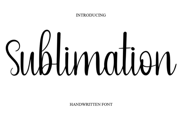
Thin handwritten script with heart detail
Sublimation is a thin handwritten script in black on white: a monoline stroke that swells slightly on the downstrokes, tall loose ascenders, a bouncy baseline, and a small heart replacing the dot on the i, so the phrase reads as a friendly handwritten note.
Ideas for this font
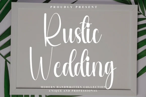
Tall condensed bouncy farmhouse sign script
Rustic Wedding (by Preketek texs) is a tall, narrow bouncy farmhouse script built to fill framed wood signs and vertical chalkboard easels.
Ideas for this font
Same independent foundry
Allow optional Google Analytics to measure visits and catalogue actions. Your search words and notes are not included. Privacy & storage