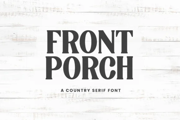
Editorial Serif Anchor

Joyful Script + Gorga
Anchors Joyful Script's fluid strokes with crisp Roman proportions on wedding suites, headers and packaging.
Inspect Gorga specimenDisclosure: MakerFileHub may earn a commission from qualifying purchases via paid links on this page. How our links work.
Modern farmhouse script with open descenders and long exit tails
Joyful Script is a modern farmhouse script with light even strokes, wide open descenders and long exit tails, drawn so a single word sits evenly across a wide card.
Paid link
Get this fontProject & layout blueprintsAt-a-glance maker compatibility
Weld or Unite overlapping script joins into one continuous vector path before sending to the blade.
Visual anatomy & craft review
The j drops a long open loop below the baseline and returns close to the x-height before the next letter, and the o and the y that follow keep wide circular bowls so the word has three visible openings inside it. The f rises into a tall loop crossed by a short bar, the u keeps a shallow bowl, and the l finishes as a straight stem without a loop, which stops the word from looking repetitive. Weight is light and constant, and every join crosses rather than merges, so the letters stay distinct. The final stroke exits in a long flat tail that runs right and slightly up, giving the word a direction, and the terminal is softly rounded. The plain ground, the thin border line and the tracked caption below are presentation; the script is the word.
Airy · Modern · Looped
Two-font hierarchy recipes
Tested contrast partners — pairing Joyful Script with grounded secondary typography.
Joyful Script + Gorga
Anchors Joyful Script's fluid strokes with crisp Roman proportions on wedding suites, headers and packaging.
Inspect Gorga specimen
Joyful Script + Swaraga
Keeps small-scale dates, URLs, nutrition facts and care instructions crisp and legible below script titles.
Inspect Swaraga specimenPractical applications
Concrete hierarchy, scale and production guidance tailored to Joyful Script’s stroke geometry.
The airy letterforms and the open descenders keep a short greeting from feeling dense, and the long exit tail fills a landscape card without needing extra ornament.
Hierarchy & layout recipe
Set the greeting at 26 pt on a 148 by 105 mm card, keep the shop name in a 7 pt serif at the foot, and leave 18 mm on the right so the tail finishes inside the trim.
Pre-production check
A light script printed on a textured card can look broken; print one card on the actual stock and go to 28 pt if the joins start to drop.
A loose modern script suits a venue with timber and wildflowers, and the open descenders keep the lettering from looking stiff against rough material.
Hierarchy & layout recipe
Set the greeting at 12 cm on a 600 by 800 mm board, keep the couple's names in the same face at 6 cm, and hold 10 cm at the base so the j loop does not touch the frame.
Pre-production check
Lettering on raw timber follows the grain; prime the surface and check that the long descender does not break along a crack.
The light strokes print cleanly on a small label and the exit tail gives a short product name a finished look, which most scripts in this register fail to do.
Hierarchy & layout recipe
Set the brand at 13 pt on a 50 by 70 mm label, keep the flavour in a 7 pt sans, and leave 6 mm under the tail so it does not run into the ingredient line.
Pre-production check
Jam labels go into a water bath and the print must survive condensation; check a printed label on a chilled jar before approving the run.
Technical & licence verification
Confirm included OTF/TTF/WOFF formats, full glyph tables and licence coverage on the live store page before batch production.
Closest visual alternatives
Matched across letterform anatomy, stroke behaviour and craft applications.

Tall connected script with a long y descender and open round bowls
Hello Honey is a tall connected script in which the ascenders rise high, the bowls stay round and the y drops a descender that runs far below the line before curling away.
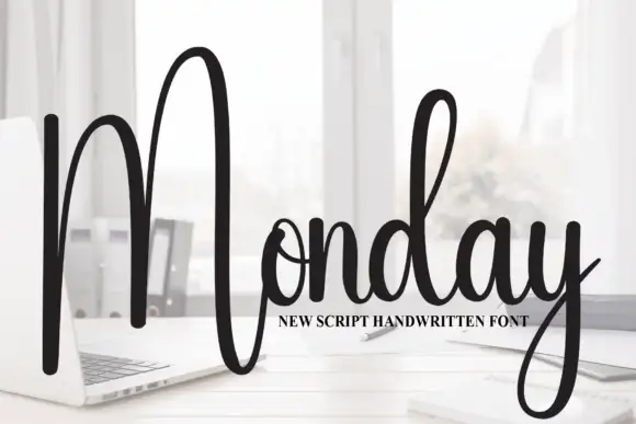
Tall script with an oversized narrow M
Monday is a tall script in black over a photograph of a desk: a very tall narrow capital M drawn as two long strokes with a shallow valley between, a compact connected body and a y whose descender curls below the word.
Ideas for this font
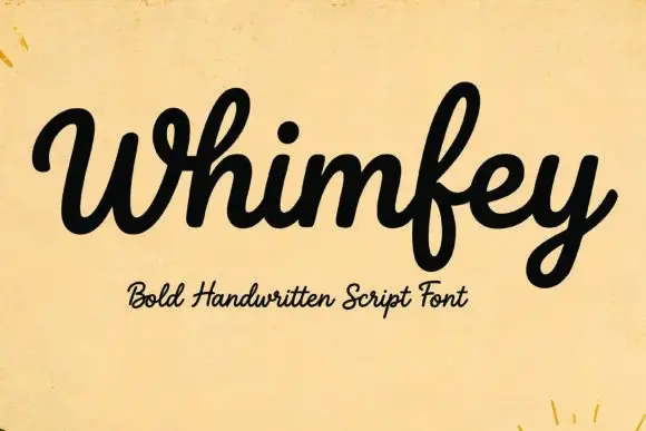
Bold handwritten script
Whimfey is a bold handwritten script in black on aged yellow paper: fat even strokes, a high x-height, short ascenders and a tight rhythm that reads as a confident everyday hand.
Ideas for this font
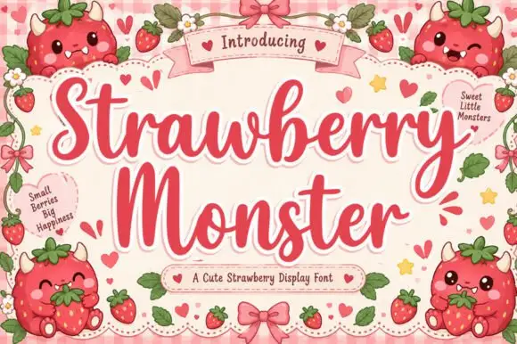
Sweet display script with heart flourishes
Strawberry Monster is a display script in strawberry red on pink gingham: fat rounded strokes, tight loops, hearts worked into the flourishes and small berry characters drawn around the frame.
Same independent foundry
Allow optional Google Analytics to measure visits and catalogue actions. Your search words and notes are not included. Privacy & storage