Editorial Serif Anchor

Sublimation + Lumera Editorial
Anchors Sublimation's fluid strokes with crisp Roman proportions on wedding suites, headers and packaging.
Inspect Lumera Editorial specimenDisclosure: MakerFileHub may earn a commission from qualifying purchases via paid links on this page. How our links work.
Thin handwritten script with heart detail
Sublimation is a thin handwritten script in black on white: a monoline stroke that swells slightly on the downstrokes, tall loose ascenders, a bouncy baseline, and a small heart replacing the dot on the i, so the phrase reads as a friendly handwritten note.
Paid link
Get this fontProject & layout blueprintsAt-a-glance maker compatibility
Weld or Unite overlapping script joins into one continuous vector path before sending to the blade.
Visual anatomy & craft review
The word is set across the middle of the page and the drawing is a quick hand: the strokes are thin and mostly even, the ascenders are tall and slightly uneven, and the letters connect with short loops that keep the word legible at small sizes. The baseline rises and falls, which is what gives the line its handwritten bounce, and the heart above the i is the single decoration inside the letterforms. Because the stroke is thin, the face needs a decent size to hold, roughly 20 pt and above, which the sample respects by setting it once at display scale with wide margins. The ground is plain white, and the two caption lines are set in a tracked serif at the top and bottom, so the specimen is put together like a stationery sample rather than a poster.
Thin, handwritten, playful, personal
Two-font hierarchy recipes
Tested contrast partners — pairing Sublimation with grounded secondary typography.
Sublimation + Lumera Editorial
Anchors Sublimation's fluid strokes with crisp Roman proportions on wedding suites, headers and packaging.
Inspect Lumera Editorial specimen
Sublimation + Monure
Keeps small-scale dates, URLs, nutrition facts and care instructions crisp and legible below script titles.
Inspect Monure specimenPractical applications
Concrete hierarchy, scale and production guidance tailored to Sublimation’s stroke geometry.
A thin handwriting mark reads as personal and light, which suits a cosmetics brand that wants to look informal, and the monoline stroke prints reliably in one ink.
Hierarchy & layout recipe
Set the mark at 30 pt on the carton, 15 pt on the label, and 80 mm wide for the window. Keep the mark one colour, and remove the heart below 16 pt where it turns into a speck.
Pre-production check
Check the 15 pt label version, where the heart and the thin joins disappear; thicken the stroke slightly for that size. Confirm the window decal weeds cleanly at 80 mm and that the mark holds on a pale carton.
A handwritten line makes an order feel like a gift, and a monoline script prints cleanly on the small insert a shop includes with a parcel.
Hierarchy & layout recipe
Print a 70 by 100 mm insert: the phrase at 22 pt, three lines of 8.5 pt serif beneath, and the shop name in 7 pt caps at the foot. Keep 10 mm margins and print on the same stock as the business card.
Pre-production check
Check the 22 pt phrase on the insert, where a thin stroke can break under a light ink film; ask for a heavier film. Confirm the 8.5 pt lines keep a 4.5:1 contrast and that the insert fits the envelope without folding across the type.
A light handwritten script suits an informal ceremony, and the bouncy baseline gives a simple card a personal feel without a formal calligraphy.
Hierarchy & layout recipe
A6 card: the names at 24 pt, the details in a 9 pt sans beneath, and the heart kept only on the first capital. Keep 15 mm margins and print one ink on a warm stock so the line reads as ink.
Pre-production check
Check the names at 24 pt on the card, where the thin joins can break; proof one card before the run. Confirm the 9 pt details keep a 4.5:1 contrast and that the bouncy baseline does not push a letter into the trim.
Technical & licence verification
Confirm included OTF/TTF/WOFF formats, full glyph tables and licence coverage on the live store page before batch production.
Closest visual alternatives
Matched across letterform anatomy, stroke behaviour and craft applications.
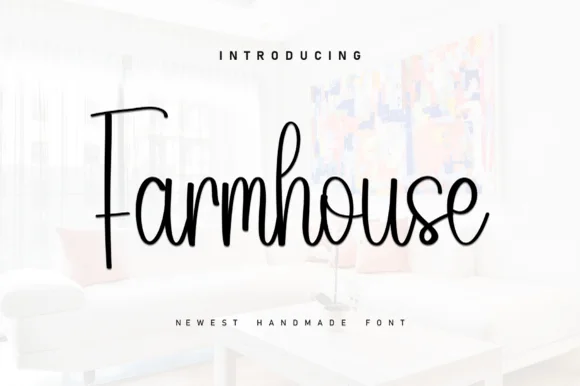
Tall slender modern-rustic farmhouse cursive script
Farmhouse (by KC Production) is a tall, slender monoline-brush farmhouse script pairing a towering straight 'F' stem with airy upright loops.
Ideas for this font
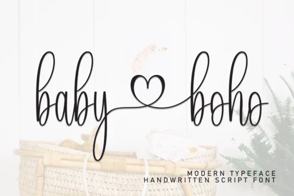
Tall skinny monoline nursery script with center heart connector
Baby Boho is a delicate, tall-looped monoline handwritten script linking words smoothly through an open center heart flourish.
Ideas for this font
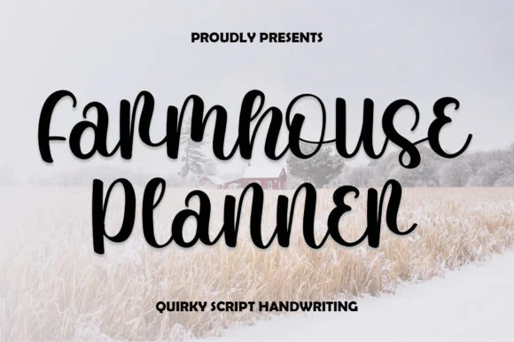
Quirky looped-curl bouncy farmhouse script
Farmhouse Planner is a playful, bouncy connected cursive script curling whimsical little eyelet loops onto 'F', 'r', 's', 'e', and 'n'!
Ideas for this font
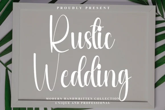
Tall condensed bouncy farmhouse sign script
Rustic Wedding (by Preketek texs) is a tall, narrow bouncy farmhouse script built to fill framed wood signs and vertical chalkboard easels.
Ideas for this font
Same independent foundry
Allow optional Google Analytics to measure visits and catalogue actions. Your search words and notes are not included. Privacy & storage