Neutral Sans Workhorse

Faye + Lemon Milk Pro FTR
Lets Faye own the focal silhouette while handling secondary copy, sizing and subheads cleanly.
Inspect Lemon Milk Pro FTR specimenDisclosure: MakerFileHub may earn a commission from qualifying purchases via paid links on this page. How our links work.
Heavy tactical steel-plate stencil sans (OTF, TTF & Webfonts)
Faye is a wide, ultra-heavy industrial stencil sans featuring diagonal tactical bridge cuts across massive block capitals (OTF, TTF & Webfonts).
Paid link
Get this fontProject & layout blueprintsAt-a-glance maker compatibility
Open counter bridges hold interior islands intact on laser-cut wood, acrylic, and mylar stencils.
Visual anatomy & craft review
Faye is a heavy stencil sans built on a steel-plate template: thick slab stems, square corners, and a bridge cutting each closed counter open, with a tactical spacing that reads as industrial signage. The bridges are structural, so a word only works when they stay wide enough for paint or a blade to pass. It needs roughly 30 mm for the bridge to survive, and it is best in one flat black or olive on raw board and white, and it ships as OTF, TTF and Webfonts.
Heavy-industrial · Forged-stencil · Tactical
Two-font hierarchy recipes
Tested contrast partners — pairing Faye with grounded secondary typography.
Faye + Lemon Milk Pro FTR
Lets Faye own the focal silhouette while handling secondary copy, sizing and subheads cleanly.
Inspect Lemon Milk Pro FTR specimen
Faye + Askinо
Grounds bold display lettering with classic typographic authority on posters, badges and apparel.
Inspect Askinо specimenPractical applications
Concrete hierarchy, scale and production guidance tailored to Faye’s stroke geometry.
A steel-plate stencil is the mark a workshop already sprays on its own crates, so the identity starts at the wood and moves onto the van. The heavy stems stay solid through a 90 mm spray at arm's length, and one can of paint covers the whole set without a mask.
Hierarchy & layout recipe
Crate stencil 400 x 250 mm, letters 90 mm with 12 mm bridges, 20 mm margins. Van door 600 x 400 mm, letters 140 mm, 30 mm edge clearance. Card 85 x 55 mm, word 14 mm, 5 mm margins.
Pre-production check
At 14 mm on the business card the counter bridge collapses below 0.3 mm and the C prints closed, so the card reads as a solid bowl. Use the face only at 30 mm and above, and check one printed card before the order.
A slab stencil reads as a specification plate rather than a headline, which is what a manufacturing or architecture feature wants at the top of the page. The bridges give the title a stencilled bluntness at 64 pt, and the square corners align to a strict grid without optical correction.
Hierarchy & layout recipe
Feature title 64 pt with 6 mm bridge clearance, body 9/13 pt in three columns, 18 mm margins. Spec plate 120 x 60 mm, label 8 mm, value 10 mm. Tab 40 x 120 mm, word 9 mm, 4 mm margins.
Pre-production check
A 9 mm section tab closes the bridge on the R and the tab reads as a black box at arm's length. Keep tabs at 14 mm or print them as icons, and check one tab sheet at 1:1 before the run.
A stencil sans reads as a workshop notice rather than a classroom worksheet, which is what a design-technology room wants on its wall. The heavy stems cut cleanly from card at 100 mm, and the open counters let a student cut the letters with a knife instead of a laser.
Hierarchy & layout recipe
Poster A2, headline 100 mm, safety lines 24 mm, 20 mm margins. Bench label 120 x 40 mm, word 16 mm, 4 mm margins. Display letters 600 x 200 mm, 180 mm caps with 15 mm bridges.
Pre-production check
Hand-cut card letters collapse the 12 mm bridge at 180 mm to a 4 mm isthmus and the counters fall out during mounting. Cut a second bridge into each closed letter or cut the word from the sheet as one piece, then mount one display before the class set.
Technical & licence verification
Confirm included OTF/TTF/WOFF formats, full glyph tables and licence coverage on the live store page before batch production.
Closest visual alternatives
Matched across letterform anatomy, stroke behaviour and craft applications.
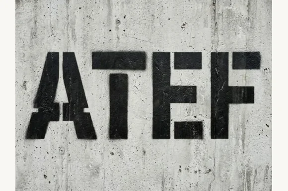
Heavy industrial concrete & military spray-stencil sans
Atef is a heavy, weathered industrial stencil sans featuring bold military bridge cuts and raw concrete spray-paint texture.
Ideas for this font
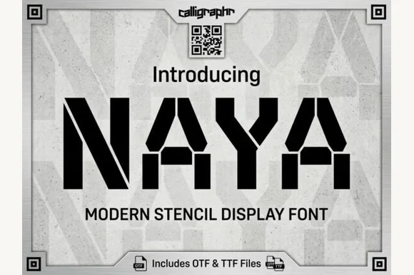
Heavy geometric military & cargo stencil sans
Naya is a heavy, wide-stance industrial stencil sans featuring clean angled bridge cuts and zero trapped enclosed counters.
Ideas for this font
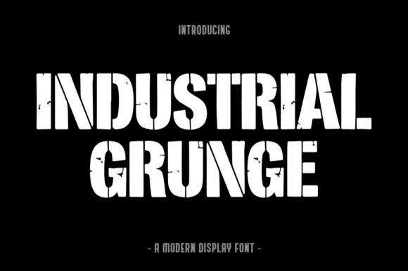
Heavy stencil-slashed & weathered steel industrial block
Industrial Grunge is a heavy, blocky industrial display font combining vertical stencil cuts with chipped concrete/steel edge wear.
Ideas for this font
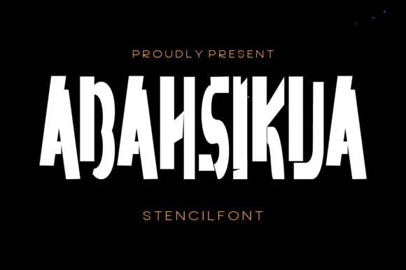
Tall condensed diagonal-sliced architectural stencil display
Abahsikua is a tall, condensed modern stencil display font sliced by bold diagonal negative-space cuts across geometric block pillars.
Ideas for this font
Same independent foundry
Allow optional Google Analytics to measure visits and catalogue actions. Your search words and notes are not included. Privacy & storage