Neutral Sans Workhorse

Rosa + Modern Heritage
Lets Rosa own the focal silhouette while handling secondary copy, sizing and subheads cleanly.
Inspect Modern Heritage specimenDisclosure: MakerFileHub may earn a commission from qualifying purchases via paid links on this page. How our links work.
Gothic blackletter with ornaments
Rosa is a gothic blackletter display in black on white: heavy broken strokes with diamond-shaped counters, sharp spurs and a dense texture, set inside an ornamental corner frame with a scroll divider, a file badge and a complete alphabet line at the foot.
Paid link
Get this fontProject & layout blueprintsAt-a-glance maker compatibility
Sturdy stroke walls and open counters weed cleanly on adhesive vinyl, HTV apparel film, and cut cardstock.
Visual anatomy & craft review
The word is set once, wide, and the drawing is a blackletter: the strokes are dense, the counters are diamonds, and the joins break at sharp angles, which is what gives the face its medieval density. The diamond counters are the detail that separates this cut from a generic gothic, and the specimen sets the letters large enough that they read as shapes. The frame, the scroll divider, the badge and the alphabet line below make the plate a product sheet, which is useful because a blackletter is usually bought for initials and monograms, so seeing the full alphabet matters. The palette is one ink on white, which keeps the dense forms readable.
Blackletter, gothic, ornamental, dramatic
Two-font hierarchy recipes
Tested contrast partners — pairing Rosa with grounded secondary typography.
Rosa + Modern Heritage
Lets Rosa own the focal silhouette while handling secondary copy, sizing and subheads cleanly.
Inspect Modern Heritage specimen
Rosa + Amor Hadena
Grounds bold display lettering with classic typographic authority on posters, badges and apparel.
Inspect Amor Hadena specimenPractical applications
Concrete hierarchy, scale and production guidance tailored to Rosa’s stroke geometry.
A blackletter reads as a period title at poster scale, and the diamond counters keep the letters legible where a softer gothic would clot into a block.
Hierarchy & layout recipe
A2 portrait: the event at 110 mm cap height, the details in a 14 mm serif, and the venue at 12 mm. Keep 30 mm margins, print one colour on a pale ground, and keep the ornaments away from the small type.
Pre-production check
Check the poster at five metres, where the dense texture can merge; keep the spacing between words open. Confirm the 12 mm venue reads at three metres and that the scroll divider clears the type block.
A blackletter initial makes a monogram with weight, and the frame from the family lets a couple build a crest without an illustrator.
Hierarchy & layout recipe
Set the monogram at 30 mm on the invitation, 18 mm on the menu and 12 mm on a favour tag, in one colour. Keep the diamond counters open at every size and reserve clear space equal to the cap height.
Pre-production check
Check the 12 mm tag, where a diamond counter can fill; keep the size above 12 mm or simplify the initial. Confirm the monogram reads on a dark ground and that the frame stays even.
A blackletter frames a gothic title as a printed plate, and the dense texture holds at thumbnail size where a fine serif would fade.
Hierarchy & layout recipe
Set the title at 90 mm cap height across 200 mm, the author in a 12 pt serif, and the imprint at 8 pt. Print one ink on a textured stock and keep the ornamental frame at the corners.
Pre-production check
Check the title at thumbnail size, where the diamond counters can disappear; keep the contrast high. Confirm the 8 pt imprint survives lamination and that the frame clears the trim by 10 mm.
Technical & licence verification
Confirm included OTF/TTF/WOFF formats, full glyph tables and licence coverage on the live store page before batch production.
Closest visual alternatives
Matched across letterform anatomy, stroke behaviour and craft applications.
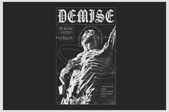
Sharp inline-highlighted underground metal blackletter
Demise is a razor-chiseled underground gothic blackletter featuring crisp vertical facets and grimdark poster presence.
Ideas for this font
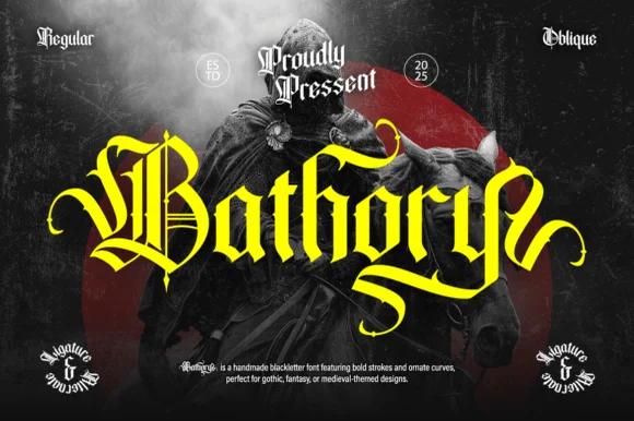
Ornate medieval blackletter family (Regular & Oblique)
Bathory is a lush, handmade medieval blackletter family (Regular & Oblique) featuring double-barred capitals and sweeping flame-curled descenders.
Ideas for this font
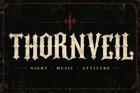
Spurred dark-metal & cathedral all-caps blackletter
Thornveil is an ornamental gothic blackletter display font combining sturdy Roman-width capitals with sharp side thorns and split fishtail serifs.
Ideas for this font
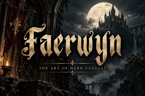
Elven-medieval dark-fantasy calligraphic blackletter
Faerwyn is a mystical dark-fantasy blackletter blending sharp medieval broad-nib calligraphy with sweeping elven ascender curls.
Ideas for this font
Same independent foundry
Allow optional Google Analytics to measure visits and catalogue actions. Your search words and notes are not included. Privacy & storage