Modern Grotesque Body

Hazel + Cultivo
Creates crisp high-hierarchy contrast beneath Hazel headlines across menus, websites and labels.
Inspect Cultivo specimenDisclosure: MakerFileHub may earn a commission from qualifying purchases via paid links on this page. How our links work.
Heavy rough capitals with flared feet and speckled inner texture
Hazel shows substantial black capitals on cream paper above a second character sample: broad flared feet, slightly uneven outlines and scattered pale speckles give the faces a worn printed appearance, and the Q closes with a small curled tail.
Paid link
Get this fontProject & layout blueprintsAt-a-glance maker compatibility
Fine grain and micro-texture excel in 300 DPI print, sublimation, and screen print rather than small vinyl weeding.
Visual anatomy & craft review
The stems stay heavy, the feet flare outward, the outlines wander slightly and pale speckles break the fill without destroying it. The flared foot is the character: the letters look stamped rather than drawn, which is why the sample sets a short word with a second character row beneath. Because the speckles are fine, keep 30 pt before they read as texture, and check the Q tail in any new word since it extends below the baseline. The Q tail is the detail that runs below the baseline, so allow 14 mm under the row, and the fine speckles read as dirt rather than texture below about 30 pt.
Heavy caps · Flared feet · Speckled
Two-font hierarchy recipes
Tested contrast partners — pairing Hazel with grounded secondary typography.
Hazel + Cultivo
Creates crisp high-hierarchy contrast beneath Hazel headlines across menus, websites and labels.
Inspect Cultivo specimen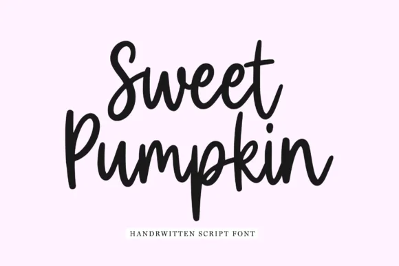
Hazel + Sweet Pumpkin
Adds a warm human signature touch for 1-to-3-word callouts without competing against structured serif capitals.
Inspect Sweet Pumpkin specimenPractical applications
Concrete hierarchy, scale and production guidance tailored to Hazel’s stroke geometry.
The stamped caps suit a studio label, and the flared feet stay solid at 22 pt on a 60 mm panel in one ink. The stamped foot also keeps a label from looking printed flat.
Hierarchy & layout recipe
Print a 60 by 40 mm label: set the studio name at 22 pt, keep the speckles at 0.5 mm, and set the town in a 6 pt caps beneath with 5 mm of clear ground. Keep the label square.
Pre-production check
Speckles printed at 16 pt fill into the counter; check the plate proof and keep the name at 20 pt or above. Ask for a plate proof of the label.
The worn capitals give a note card weight, and the even stems hold a short line at 26 pt on an A6 sheet. The worn outline also keeps a note card warm.
Hierarchy & layout recipe
Print an A6 card: set the line at 26 pt, keep 14 mm of clear ground beneath for the Q tail, and leave the lower half blank for a written message. Keep the card flat under the line.
Pre-production check
A curled tail printed into the writing area is smudged; check the card and keep 12 mm of white beneath it. Keep the Q tail off the writing area.
The stamped look sets a making feature, and the flared feet give a two-word title its base at 52 pt across a spread. The flared feet also give a feature title its base.
Hierarchy & layout recipe
Print a 210 mm spread: set the title at 52 pt on one row, keep 18 mm of clear ground beneath before the standfirst at 10 pt, and keep the block on the upper third. Keep the standfirst on the column.
Pre-production check
A worn outline printed over a photograph loses its edge; check the page and set the title on the plain margin.
Technical & licence verification
Confirm included OTF/TTF/WOFF formats, full glyph tables and licence coverage on the live store page before batch production.
Closest visual alternatives
Matched across letterform anatomy, stroke behaviour and craft applications.
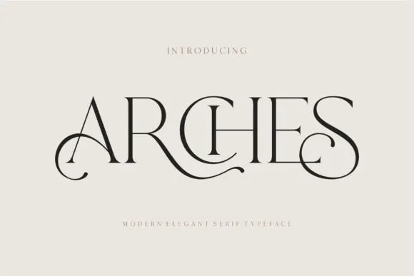
Decorative ligature serif
Arches sets one word in dark ink on a warm neutral field, where wide flat serifs sit on hairline cross strokes, the A climbs to a sharp apex, the R leg sweeps into a long horizontal tail that runs beneath the following letters and the S closes with an extended curl.
Ideas for this font
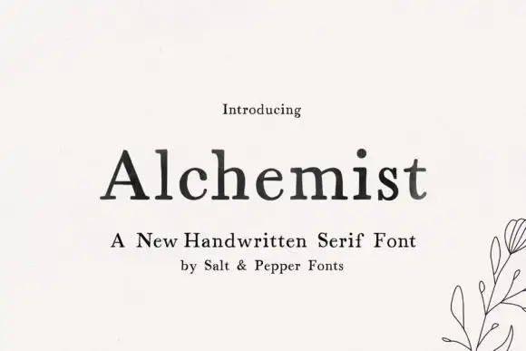
Soft handwritten serif with irregular small details
Alchemist shows black mixed-case letters with modest contrast and softly uneven edges, where a wide A and rounded lowercase bowls sit beside a tall h and a lightly curved t terminal, and the title rests on cream next to a small botanical line drawing and handwritten-serif wording.
Ideas for this font
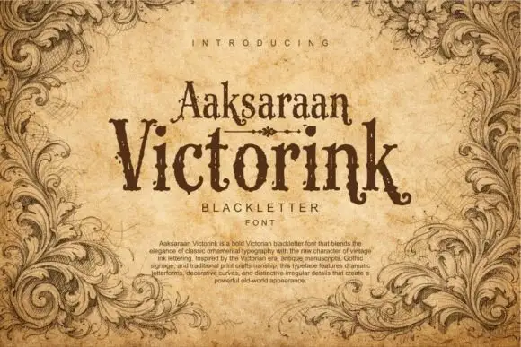
Distressed Victorian serif
Victorink is a narrow ornamental serif printed on aged parchment: uneven spurs, curled ends, chipped edges and a heavy printing texture, set in two stacked lines with a small descriptor beneath and a paragraph of description at the foot, framed by engraved acanthus leaves.
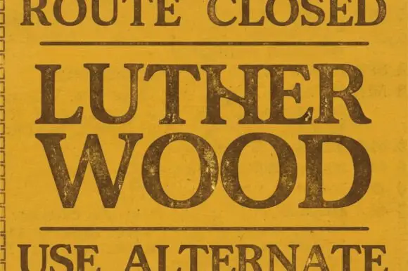
Broad traditional serif with worn fill
Lutherwood is a broad traditional serif in dark brown on a mottled mustard ground: wide capitals with flared serifs, a large bowl on the O and a worn, spotted fill, set in two lines between two rules, with a small line above and below that read as sign copy.
Ideas for this font
Same independent foundry
Allow optional Google Analytics to measure visits and catalogue actions. Your search words and notes are not included. Privacy & storage