Neutral Sans Workhorse

Exodiah + Corven
Lets Exodiah own the focal silhouette while handling secondary copy, sizing and subheads cleanly.
Inspect Corven specimenDisclosure: MakerFileHub may earn a commission from qualifying purchases via paid links on this page. How our links work.
Very heavy block capitals with slanted slit counters and broad flat arm ends
Exodiah stacks dark red capitals on black, where huge squared bodies leave only fine slanted slits inside O, D and B, the X narrows sharply at its middle, flat-ended E arms and a wide L foot reinforce the block silhouette, and the curved letters keep rounded outer corners.
Paid link
Get this fontProject & layout blueprintsAt-a-glance maker compatibility
Sturdy stroke walls and open counters weed cleanly on adhesive vinyl, HTV apparel film, and cut cardstock.
Visual anatomy & craft review
The bodies grow enormous, the counters shrink to slanted slits, the arms end flat and the outer corners round only on the curved letters. That sliver counter is the character: the word reads as a solid mass with light cut into it, which is why the sample stacks two rows on black. The caption names ligatures and alternates without showing selection, so check the real character set, keep 44 pt before the slits close and test the recognition of a short word first.
Very heavy block capitals with slanted slit counters and broad flat arm ends
Two-font hierarchy recipes
Tested contrast partners — pairing Exodiah with grounded secondary typography.
Exodiah + Corven
Lets Exodiah own the focal silhouette while handling secondary copy, sizing and subheads cleanly.
Inspect Corven specimen
Exodiah + Vanielst Elegant Serif Display Stylistic
Grounds bold display lettering with classic typographic authority on posters, badges and apparel.
Inspect Vanielst Elegant Serif Display Stylistic specimenPractical applications
Concrete hierarchy, scale and production guidance tailored to Exodiah’s stroke geometry.
The heavy blocks give a bottle weight, and the slit counters hold a short name at 24 pt on a 55 by 65 mm label, where the slanted opening stays visible in metallic ink.
Hierarchy & layout recipe
Print a 55 by 65 mm label: set the name at 24 pt on one row, keep 10 mm of clear ground beneath before the strength at 6 pt, and keep the ground dark so the slits read as cut light rather than shadow.
Pre-production check
Slits narrower than 0.6 mm fill with ink; check the plate proof and hold the name at 22 pt or above.
The solid mass sets a poster with impact, and the flat arms hold a two-word title at 64 pt on an A2 sheet, where the narrowed X keeps the row from looking like a plain block.
Hierarchy & layout recipe
Print an A2 poster: set the title at 64 pt on one row, keep 26 mm of clear ground beneath before the lineup at 15 pt, and keep the background black so the red mass stays dominant.
Pre-production check
Small words set in this face become unreadable; check the poster and keep only the headline in it.
The slit counters suggest cuts in stone, and the broad bodies hold a short sign at 60 mm on a painted panel, where the rounded outer corners survive at distance.
Hierarchy & layout recipe
Paint a 700 by 350 mm panel: set the sign at 60 mm on one row, keep 26 mm of clear ground beneath before the opening times at 15 pt, and keep 26 mm of border so the flat arms are not cut.
Pre-production check
Painted slits close at 4 mm; check the mask artwork and keep the sign at 52 mm or above, with the slits cut by blade rather than brush.
Technical & licence verification
Confirm included OTF/TTF/WOFF formats, full glyph tables and licence coverage on the live store page before batch production.
Closest visual alternatives
Matched across letterform anatomy, stroke behaviour and craft applications.
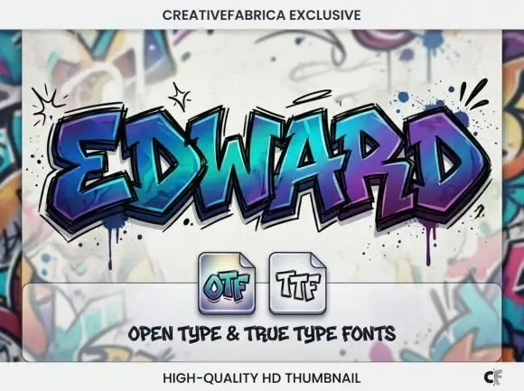
Angular graffiti capitals with overlapping facets and a dripped edge
Edward is an angular graffiti display alphabet in capitals only, built from overlapping faceted strokes in two colours, with short drips running off the lower edges and a hard shadow behind each letter.
Ideas for this font
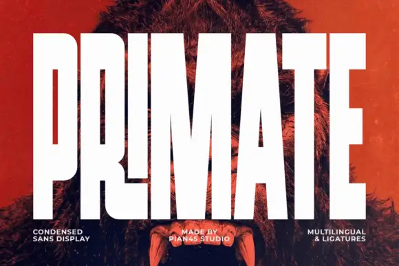
Ultra condensed display sans
Primate is an ultra condensed sans display in white on a red-tinted portrait: very tall narrow caps with flat terminals, a high waist and thin counters, set edge to edge so the letters nearly touch, with three small tracked labels along the foot.
Ideas for this font
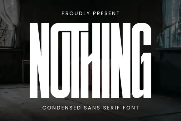
Very tall condensed display
Nothing is an extremely tall condensed display in white on a dark, peeling interior: narrow capitals whose tops join a shared bar, with a central diagonal joint across the middle of the word, flat terminals and hairline counters, and tracked caps above and beneath that name the style.
Ideas for this font
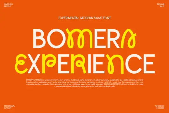
Plain capitals interspersed with looped characters and crossing strokes
Bomera Experience shows two pale capital lines on orange, where selected characters turn yellow and bloom into loose looping structures with bulbous ends, while circular O and plain straight E forms sit beside curling shapes that cross themselves near the body line.
Ideas for this font
Same independent foundry
Allow optional Google Analytics to measure visits and catalogue actions. Your search words and notes are not included. Privacy & storage