Neutral Sans Workhorse

Edward + Bielchon
Lets Edward own the focal silhouette while handling secondary copy, sizing and subheads cleanly.
Inspect Bielchon specimenDisclosure: MakerFileHub may earn a commission from qualifying purchases via paid links on this page. How our links work.
Angular graffiti capitals with overlapping facets and a dripped edge
Edward is an angular graffiti display alphabet in capitals only, built from overlapping faceted strokes in two colours, with short drips running off the lower edges and a hard shadow behind each letter.
Paid link
Get this fontProject & layout blueprintsAt-a-glance maker compatibility
Sturdy stroke walls and open counters weed cleanly on adhesive vinyl, HTV apparel film, and cut cardstock.
Visual anatomy & craft review
Each letter is drawn as a stack of planes rather than a stroke: the E has three parallel bars cut at an angle, the D closes into a faceted bowl, the W is a zigzag of sharp joins, and the whole word leans back slightly as if it were sprayed on a wall. The two-colour fill splits each letter into a light face and a dark face, which is what gives the word its volume, and the hard offset shadow to the right repeats the silhouette. Below the baseline short drips run down at irregular intervals, and the outer contour is thinner than the internal strokes, so the letters read as outlined shapes. Counters are sharp rectangles and there is no lowercase. The painted wall behind, the ink splatter and the format badges are presentation; the typeface is the word.
Angular · Layered · Street
Two-font hierarchy recipes
Tested contrast partners — pairing Edward with grounded secondary typography.
Edward + Bielchon
Lets Edward own the focal silhouette while handling secondary copy, sizing and subheads cleanly.
Inspect Bielchon specimen
Edward + Lumera Editorial
Grounds bold display lettering with classic typographic authority on posters, badges and apparel.
Inspect Lumera Editorial specimenPractical applications
Concrete hierarchy, scale and production guidance tailored to Edward’s stroke geometry.
The faceted two-colour construction reads at the size of a shop logo and survives being cut in vinyl, where a soft graffiti script would lose its edges.
Hierarchy & layout recipe
Set the shop name at 24 cm on the window, keep the opening hours in a narrow bold at 3 cm, and hold 10 cm of clearance so the shadow does not run off the glass.
Pre-production check
Vinyl application on a curved window distorts the offset shadow; check a paper template on the glass before the film is cut.
Angular graffiti capitals place a feature in its context without a photograph, and the layered fill holds up against a full-bleed image on the opposite page.
Hierarchy & layout recipe
Set the header at 72 pt on the opening spread, keep the standfirst in a bold 10 pt grotesque, and hold 20 mm above the header so the drips do not touch the page edge.
Pre-production check
Two-colour registration on a heavy display face shows every misalignment; check the press sheet at final size and keep the shadow on one plate only.
A faceted street alphabet speaks to a teenage guest better than a script, and the heavy planes hold up in a one-colour screen print on a dark shirt.
Hierarchy & layout recipe
Set the name at 90 mm wide across a 280 mm chest print, keep the date at 30 mm, and leave 25 mm between the two so the drips do not merge with the smaller line.
Pre-production check
Light ink on dark fabric needs a white underbase that spreads; check a pull on the actual garment and thin the internal strokes if the facets close.
Technical & licence verification
Confirm included OTF/TTF/WOFF formats, full glyph tables and licence coverage on the live store page before batch production.
Closest visual alternatives
Matched across letterform anatomy, stroke behaviour and craft applications.
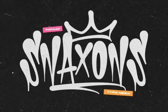
Graffiti tag logo display
Snaxons is a graffiti tag in white on black: letters written as one continuous dripping line, a crown drawn above the word, and a heavy baseline shadow that turns the tag into a logo rather than a scrawl.
Ideas for this font
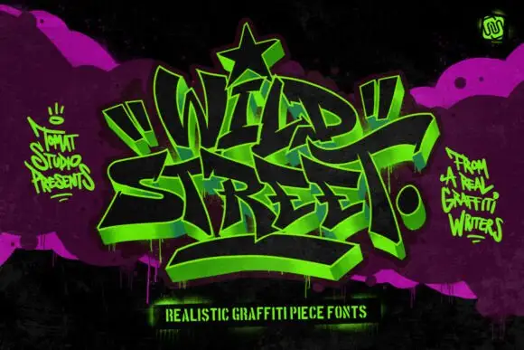
Graffiti piece display
Wild Street is a graffiti piece display in acid green on black and magenta: interlocking letters with a 3D block shadow, heavy outlines, exaggerated arrows and a star at the apex, surrounded by spray marks and a hand-lettered caption, so the plate reads as a wall piece rather than a typeface.
Ideas for this font
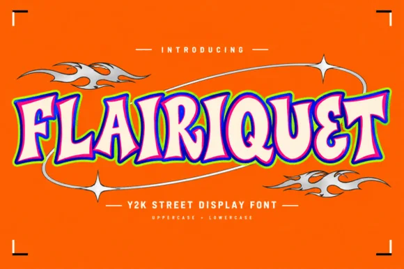
Y2K street display in rounded retro caps with an inner fill and keyline
Flairiquet is a rounded retro display alphabet in which the fat italic caps carry a white inner fill inside a coloured keyline, so the word reads as a spray-can sticker from the early 2000s rather than as plain type.
Ideas for this font
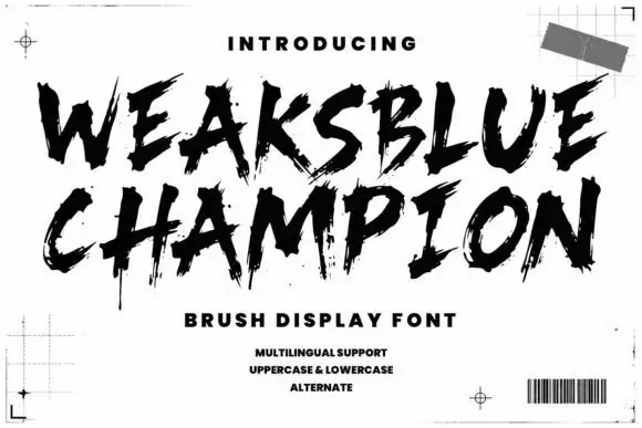
Dry brush capitals with spatter
Weaksblue Champion is a rough dry-brush display in black: heavy capital strokes with spattered edges, set on white inside printer's marks, a grid corner and a barcode.
Ideas for this font
Same independent foundry
Allow optional Google Analytics to measure visits and catalogue actions. Your search words and notes are not included. Privacy & storage